analog works
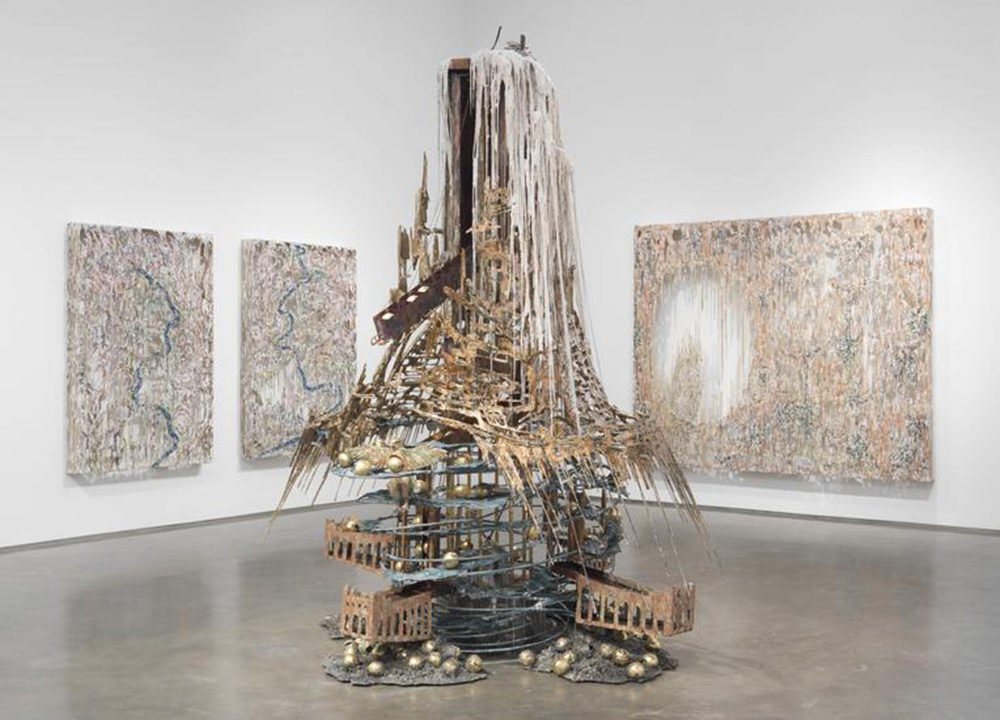
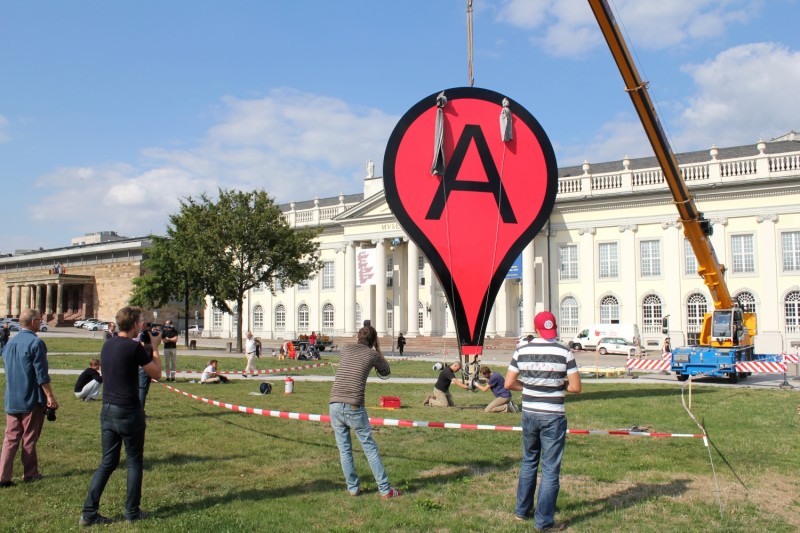
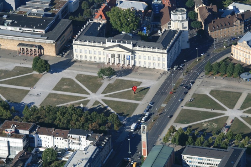
— The Candle Clock in the Citadel by Diana Al-Hadid, 2017. In which Al-Hadid attempts to reconstruct a complicated machine like a badass.
Diana Al-Hadid’s talk on Wednesday was about historical synthesis and new form. It was new to witness an artist give a less prepared/scripted talk, as she seemed to intend. She was using the public space as a means of reflecting on work in a new setting, which probably put some people off as she searched for words. But to me it made her more empathetic. She’s still figuring things out like everyone else. And the work as a collection speaks.
Her experiences show that the work is not coincidental, that it does not come from some mysterious, unknown source. Experimental Jetset calls on the same theme of origins in Statement and Counter-Statement. It’s getting at the question:
“What were my atoms before they were me?”
I’ve been thinking about the why’s of what I do a lot; the roots are traceable, and influences are everywhere. My parents own a nail salon, and doing nails is not dissimilar to the practice of graphic design. Creative labor. A service. … That’s just one part of the big Why.
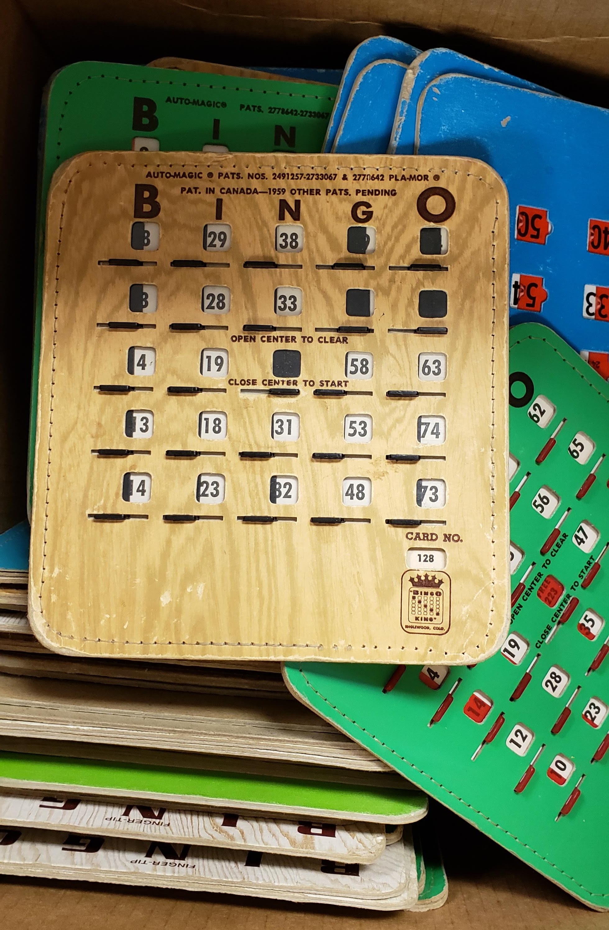
— Well-designed bingo boards
Sliders vs. scroll bars.
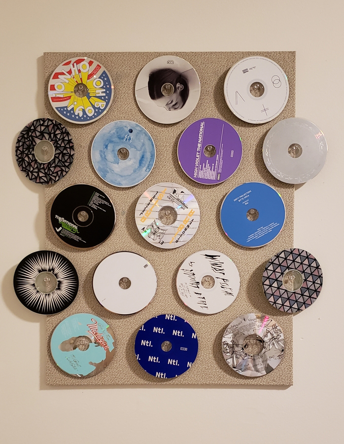
How to make CDs spin again: hang them on push pins.
— from my dorm last year
— Arduino receipt printer that outputs posts from the subreddit r/showerthoughts
An idea that has been brewing for a few months now: print my Instagram feed.
Using a receipt printer can relate to commerce on the internet and in real life, and the form of the receipt paper (a long scroll) can be a physical representation of the infinite scroll. Also relates to the idea of search history / viewing history as evidence of consumption. The low resolution of thermal receipt printers also corresponds to the pixel ≠ atom idea.
Using a commercial receipt printer instead of an Arduino one changes the function of the printer from documentation of business transaction to recorder of digital interaction. Consumption of monetarily-valued objects to consumption of mind space.
In my bookbinding class we are making paper as well as getting a hang of the letterpress. This week has been about experimenting. My group made a mega-paper/community-quilt-type-thing, and it’s honestly kind of meaningful as cheesy and sort of cliché-y as it might me. We just pressed multiple sheets of paper together, and there ended up being a space in the middle from human error and imperfect alignment. The physical negative space also shows that the paper was made from multiple modules. The paper was pressed in a sort of American flag shape with the larger rectangle in the corner, but the whole sheet is one color, which happened to be a blueberry-smoothie color from mixing white pulp with red and blue dye. It was a whole lot of serendipity but also about enabling those moments by saying yes to trying simple but new things.
In any case it’s pretty nice learning more about paper production and taking the time to collaboratively make these things by hand. Getting back on the letterpress is also nice; cranking the rollers, setting the letters. Craft is a good way to slow down and digest and to get intimate with the materials we use to communicate ideas. Sometimes design feels too sterile and clean. Frictionless. The imitation of letterpress aesthetics on the screen also feels disingenuous. So what is native about digitally-based media?
—
— by Adi Goodrich; space and gradients
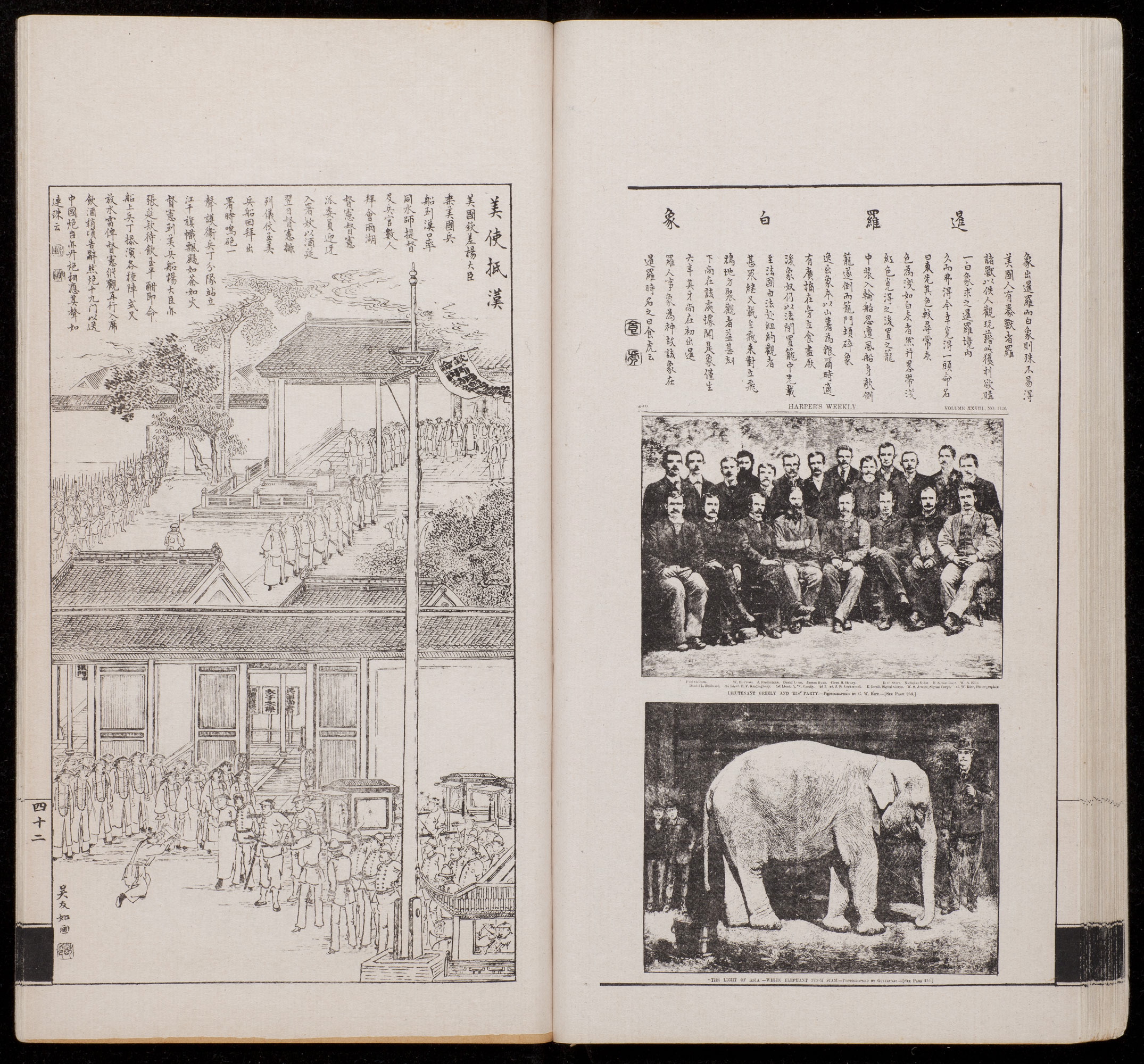
— Vol. 1 of Dianshizhai Pictorial, 1884. Left: “American Consul Arrives at Hankou” by Wu Youru. Right: “A White Elephant from Siam,” a photo taken from Harper’s Weekly, an American publication.
Dianshizhai Pictorial: This was a Shanghai-based magazine that was published after the establishment of Shenbao, a newspaper founded by the Englishman Ernest Major. The spread above is from the first volume and represents the different image-making methods and dominant technologies of the Chinese (woodblock prints) and Westerners (photography).
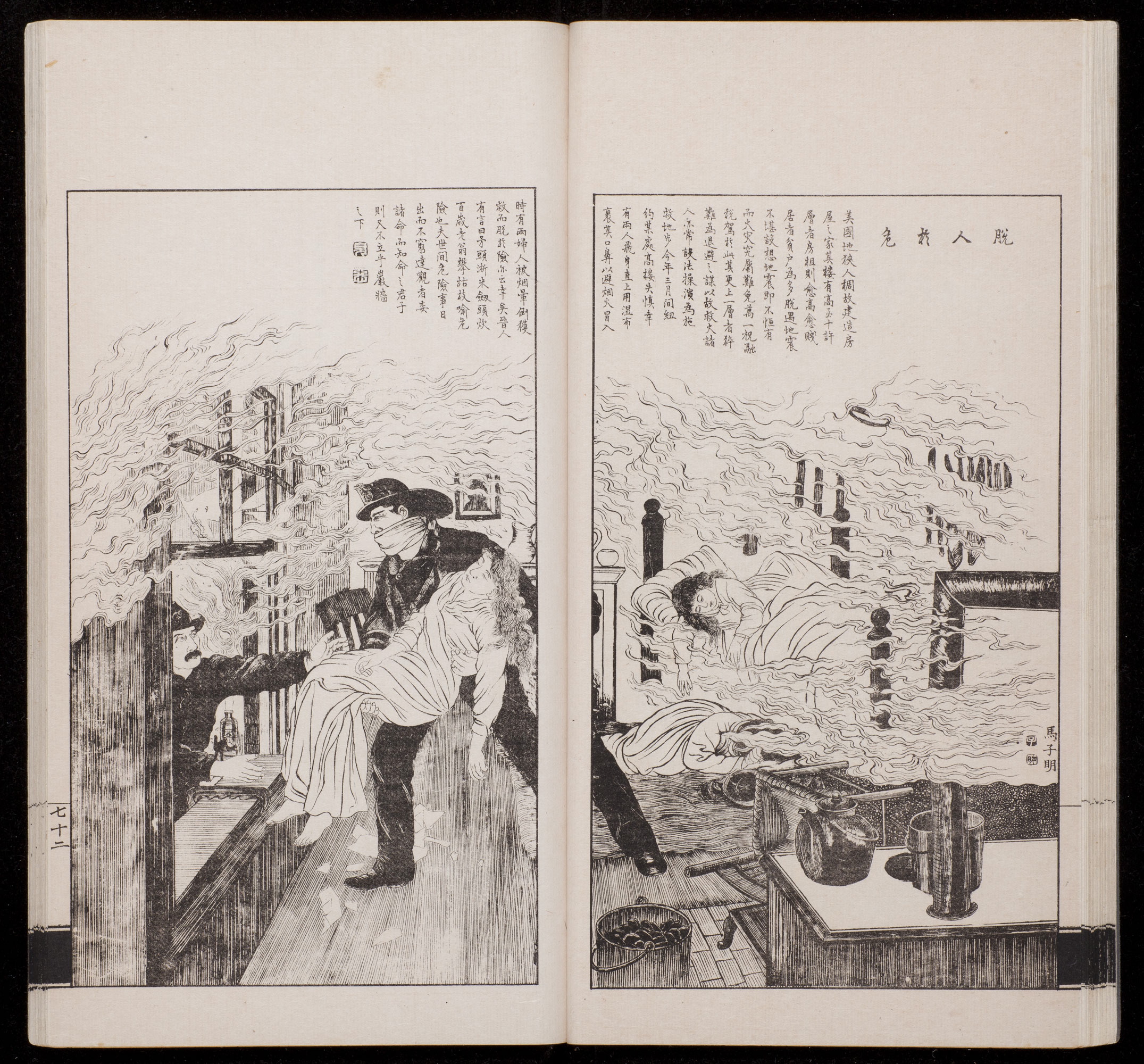
— “Escape from Danger” by Ma Ziming, vol. 2, 1884.
Synthesis, not assimilation
This second spread shows the synthesis of East and West and reflects Shanghai’s culture and population as a trading port. Western technologies were introduced to the Chinese, and lithography pushed past the limitations of woodblock printing, allowing for greater volumes in mass-production along with more detailed prints. Here technology influences form and content, but does not completely override tradition.
— 2014
I took an accidental glitch-panorama of the Arch the summer before senior year of high school. It reflected the state of St. Louis.
The summer of 2017 I studied abroad in Florence. Our final project was about collection and curation. One of my classmates/friends Laurie did hers on glitch panoramas. It resulted in many silly pictures, but in the end considered the possibilities of interaction for divided panels of panoramas.

— 2018
The Sunday of Labor Day weekend, I went to the newly renovated Arch and took some more panoramas, this time deliberately contorting the Arch. The glitch panorama has a new meaning and association and is inseparable from Laurie’s project now, for me and for the people I studied abroad with. Community impacts the work, and connotations can’t be forgotten. But what do these photos mean to others?
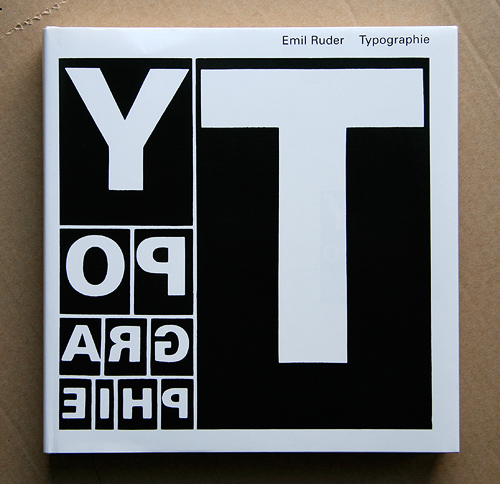
— Typographie cover, Emil Ruder. Hierarchy.
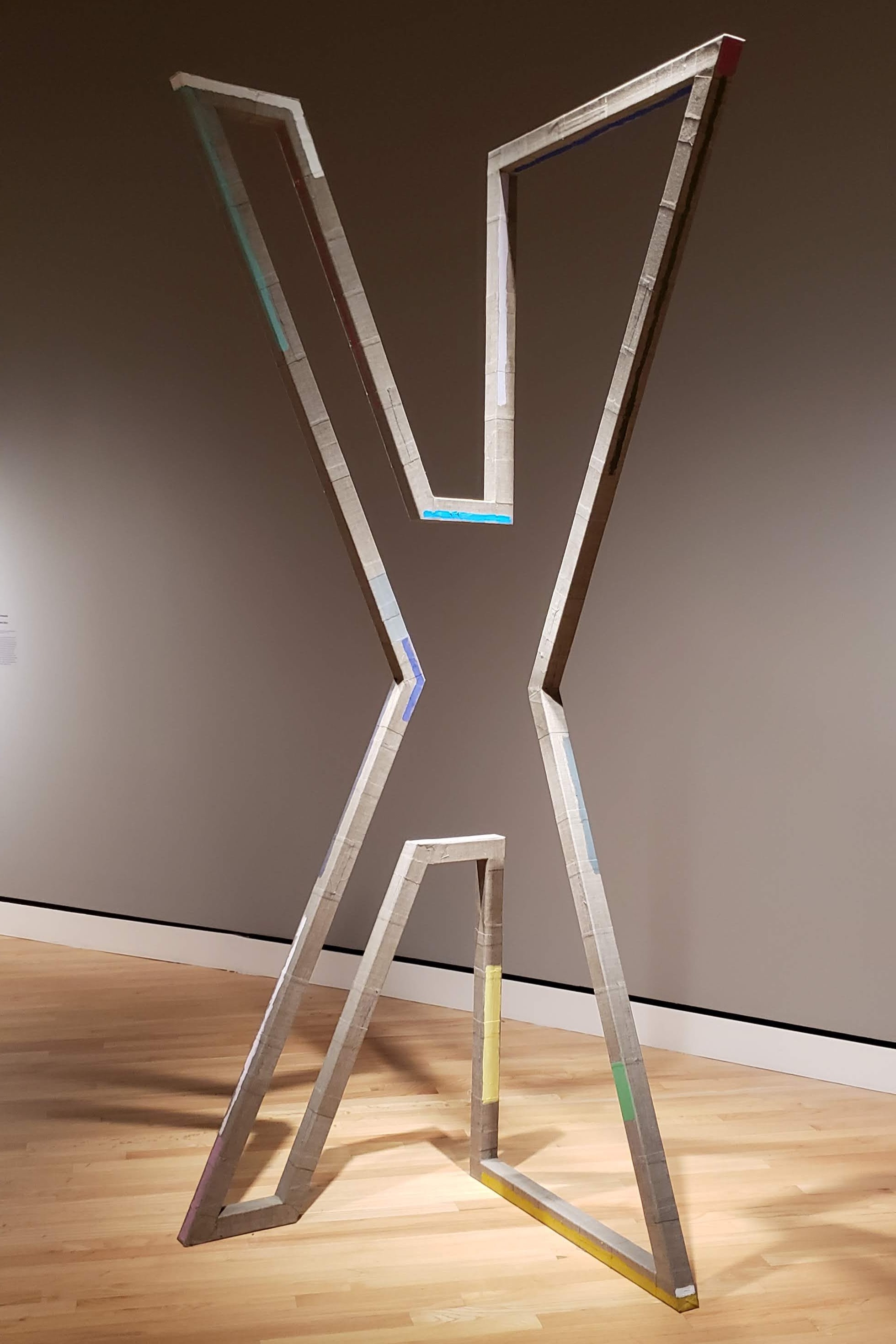
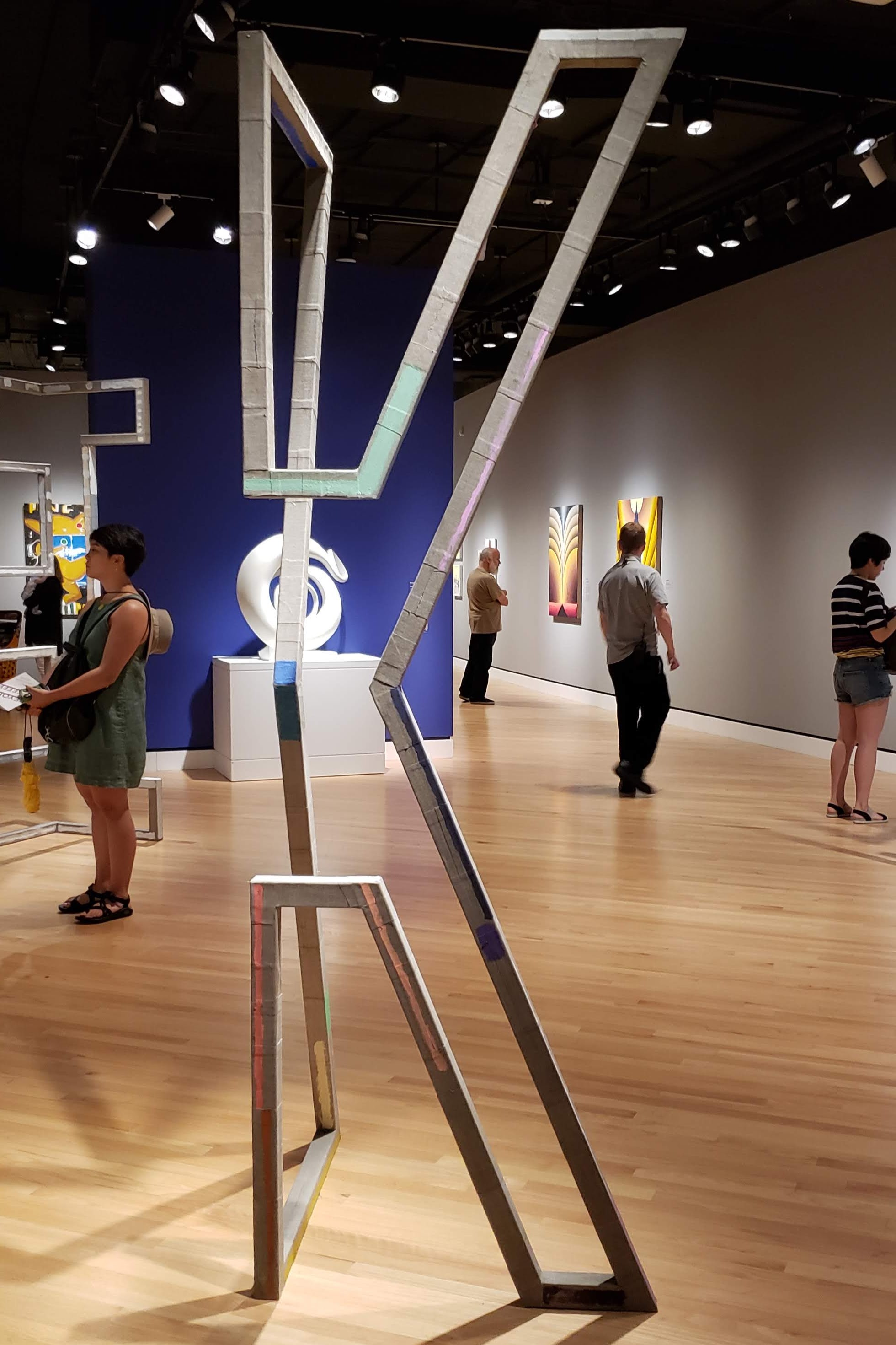
— “Extend” by Molly Larkey at Crystal Bridges.
Same sculpture, different perspectives. I see an X/K. Could also be seen as 2D/3D, drawing/architecture as Larkey suggests. What does interpretation reveal about the biases of the viewer?
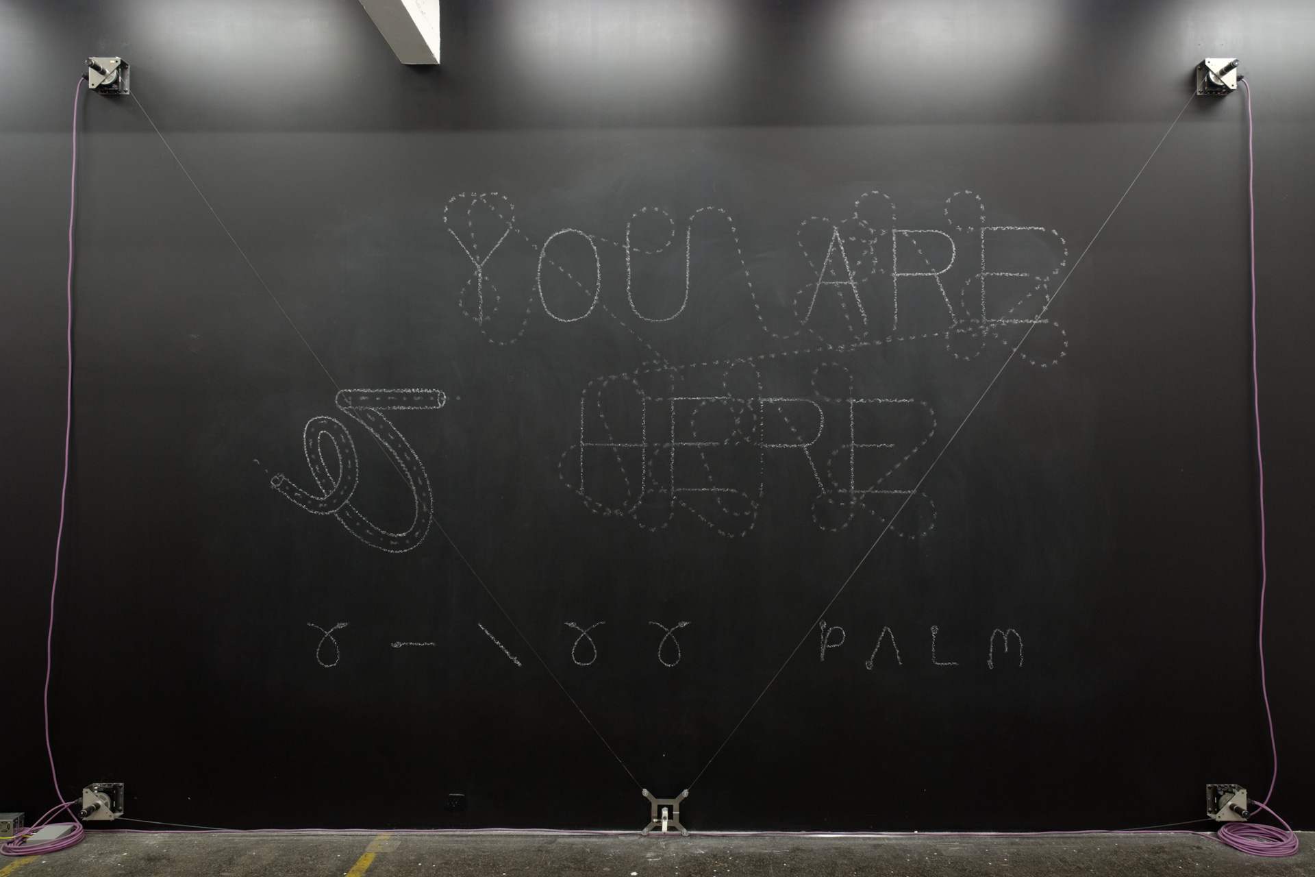
— Viktor, robotic chalk drawing machine
Was reintroduced to Jürg Lehni, and looking at his work beyond Apple Talk got me thinking about not just human error affecting digital platforms, but how Earth’s physics affect precise, programmed tools.
The physics of the internet vs. the physics of Earth
His project “Viktor” is also a nice resolution of the conflict between genuine roughness of material and electronically powered machines.
Jürg was also one of the people who made Scriptographer. Go figure.
The intersection of type, tech, and our relationship to digital forms and the internet is where it’s at.
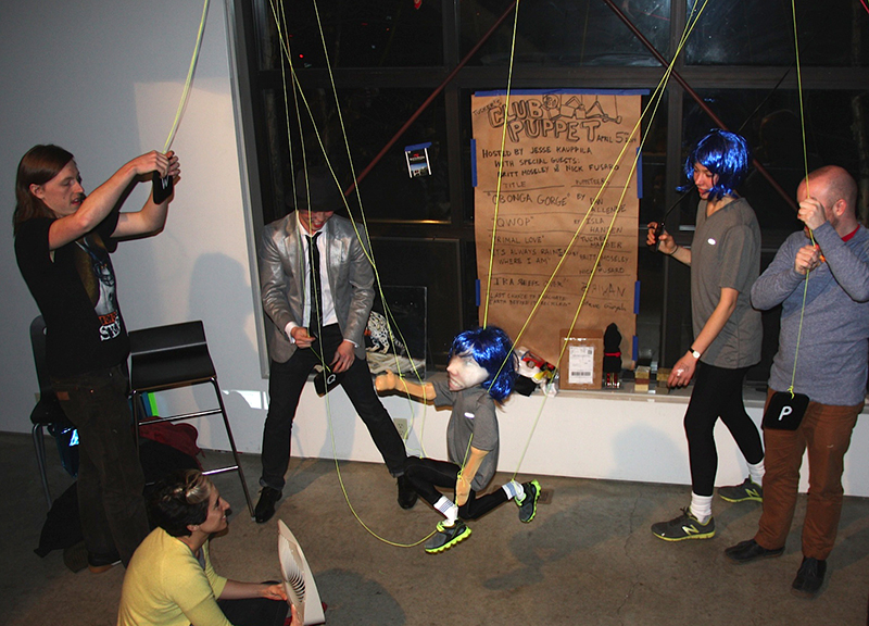
— IRL QWOP by Isla Hansen
Physical manifestations of digitally based creations.
Python/Drawbot → erroneous bitmapped inkjet print → scanned image
“Moiré patterns appear in many different situations. In printing, the printed pattern of dots can negatively interfere with the image. In television and digital photography, a pattern on an object being photographed can interfere with the shape of the light sensors to generate unwanted artifacts. They are also sometimes created deliberately – in micrometers they are used to amplify the effects of very small movements.”
— Wikipedia
Moiré as evidence of noise and distortion that occurs from attempting to compress atoms into pixels or from layering patterns (adding dimension). Also the creation of motion from shifting perspective on static objects.
Static body, moving image vs. active body, static image.
— sun, tree, wind, blinds, wall, low ISO
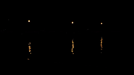
— dock lamps on water, Chicago
Sometimes meditative and random “animations” occur in the everyday natural setting that are just really nice. I think the top GIF would make for an incredibly spacial experience in the browser… maybe something about traveling through divs that fade in and out.
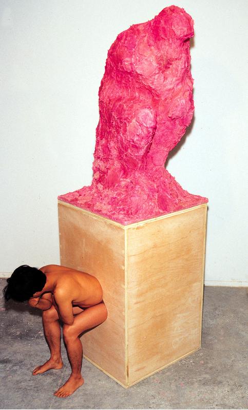
— The Thinker by Cody Choi. Toilet paper, pepto-bismol, wood. A materialization of his “cultural indigestion”.
— CodeProfiles by W. Bradford Paley
“CodeProfiles looks at the computer program as text and visually comments on how code is read by people… the amber line follows the fixation point, tracing how people might read the text, line by line; the white line follows the insertion point and flows like the programmer’s thoughts, calmly in one place then jumping around to make other parts of the code perform; and the green line moves along the execution point of the program, creating wide swaths where the code was executed thousands of times and appearing as a thin thread where the processor rarely visited.” (from exhibition tag)
“Paley thereby foregrounds the conceptual nature of all digital art, which is always driven by a language formulating instructions.”
The Whitney museum in New York had an exhibition called Programmed: Rules, Codes, and Choreographies in Art. It made light of a lot of themes of why I make what I make and why we’re doing what we’re doing in the interaction capstone.
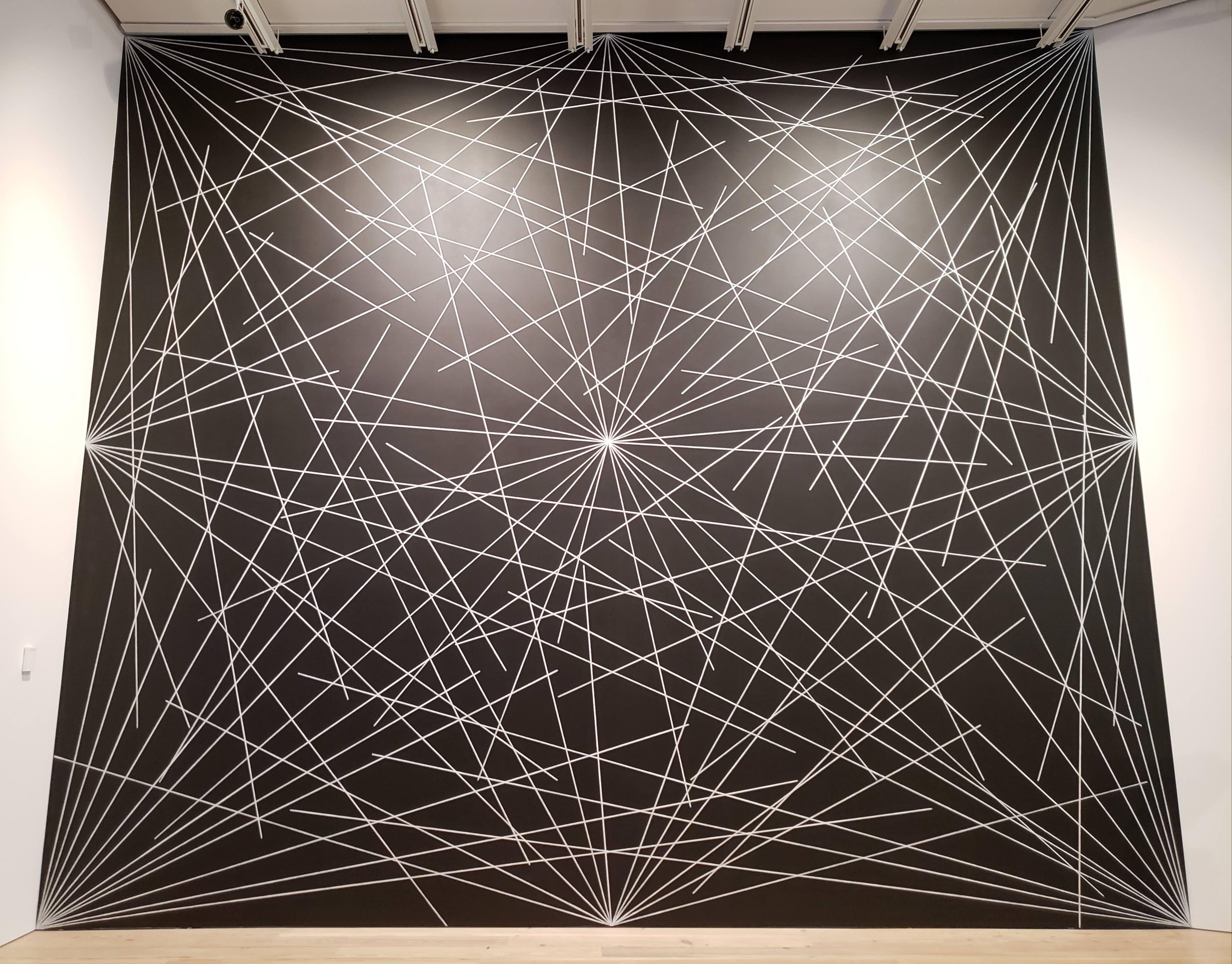
— 4th wall from Wall Drawing #289 by Sol LeWitt
This Sol LeWitt mural coincidentally looks a lot like one of the scroll charette things I made. Which isn’t that crazy; it’s just lines and rules and language. What everything is. But how the two are made changes its outcome. A browser vs. crayon and a wall. Reproducibility and multiplicity is a thing to think about with these rule based works. It coincides with the thought that letters are sensitive but not precious.
I guess I’m wondering how redundant it is to keep making stuff that’s based on these ideas. What about rules and programs? It’s the starting point.
— remote from Lorna by Lynn Hershman Leeson, an early example of non-linear interactive work
— Abstract Browsing 17 03 05 (Google), 2017 by Rafaël Rozendaal. Weaving output from rapier loom machine.
Rectangles. Browsing + plug-in → tapestry.
— Reconstruction 7 by Jim Campbell, LED lights and cast-resin screen
Reducing the digital screen to its material: light and an overlaying screen.
“In the workshop it is the moment that speaks and not the artisan.”
For bookbinding we went to Special Collections. I encountered Botnick’s Diderot for the third time in person, but this time I had the opportunity to actually read some of it more closely.
Every time I thumb through that thing I always leave with a dose of vigor. It’s like all the time and energy that Botnick and others put into the book is being transferred to whomever touches it. The act of making such a book is in itself beautiful. The devotion and conviction to a crafted object and to language is the purest goal.
“How often I found where I should be going only by setting out for somewhere else.”
— Buckminster Fuller, via Botnick’s Diderot colophon
— scratchboard by Jane Masters
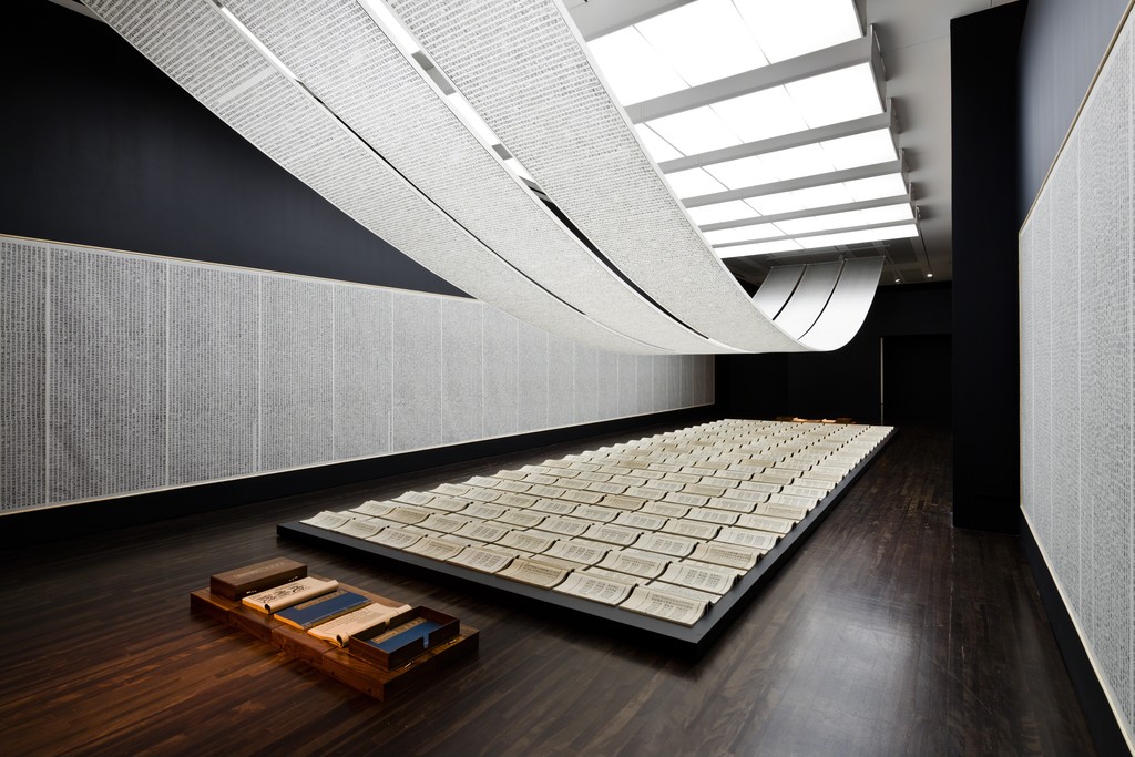
— Book from the Sky by Xu Bing
I learned about this installation by Xu Bing this week, and it’s insane. He made up 4000 fake Chinese characters and hand carved all of them and hand printed all of them. Calligraphy is the oldest art form of China, and studiers of it could not believe that none of the characters that Xu made up were real. Some visitors would come back to the installation and spend days there to try to find a real character even though they were told that all of them were made up. Some were able to identify ancient ones, but their translated meaning doesn’t mean anything to the piece since the replication of characters occurred out of coincidence and because those characters don’t have any meaning now. People were incredibly frustrated that they couldn’t find anything they understood despite everything looking so familiar. Some of the characters were close to real ones, but a missing stroke for example makes it not the same.
Type design for Chinese characters is incredibly time consuming since there is not just 26 letters but over 3000 characters, so its even crazier that Xu was able to invent 4000 of them and carve all of them. This contrasts to how reduced the Latin alphabet is. Of all the possible permutations of strokes and glyphs, only a relatively small set is actual language.
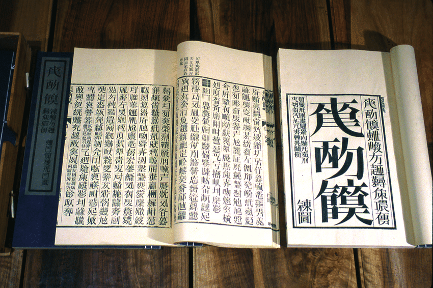
— a shot of one of the codexes
The assignment of meaning to shape is fairly arbitrary and has evolved to become more and more abstract and detached from physical origins. Sans serifs didn’t crop up in printing until the 19th century. New form is slowly adopted and popularized, because accessible type (readable, legible) is important for the dissemination of ideas. When typeform is made for an abstract concept, it becomes a less broadly applicable typeface, and therefore a less useful one. It becomes more about the idea of the typeface and less so the words that it may be applied to…
The National performed their song Sorrow for 6 hours straight. The idea was made in conjunction with conceptual artist Ragnar Kjartansson who does some work involving endurance and repetition.
“Thanks to The National for A Lot of Sorrow!”
— the alphabet
– “art for the people”
Xu Bing created a writing system called “square word calligraphy” that formally looks Chinese but is actually legible (for the most part) to English readers. The more legible calligraphy pieces in this system are the ones that contain familiar content, so the context of the words helps those familiar with the texts read it. The bigger pieces are still read vertically, column by column.
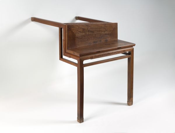
— Table with Two Legs by Ai Weiwei
Weiwei renders a traditional Chinese styled table unusable and exposes its ornament.
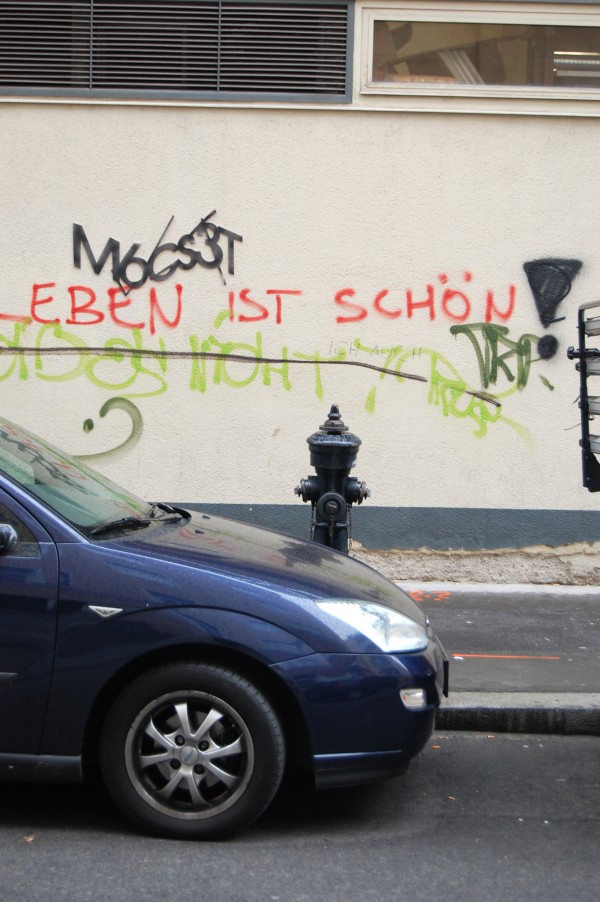
— Are you human? by Aram Bartholl
Captcha words (M6Cs3T) made out of mat board and adhered near graffiti.
— Map by Aram Bartholl
— OI by Aram Bartholl
Nina Katchadourian on improving upon self and the world, observing what exists and how interference is received.
— “GIFT/GIFT” by Nina Katchadourian
Nina did a piece in 1998 in which she attempted to mend a spider’s web with pieces of thread spelling “gift.” The spider rejected the gesture, batting at the letters.
— Venus, Material Speculation series
Moreshin Allahyari came to WashU to give a talk. I still haven’t fully processed her additivist purpose and use of 3D printing; it’s interesting but doesn’t completely resonate to me right now, but I can see myself better understanding it eventually. Currently I struggle with being ok that I’m not really good at making art for social and political good. But in any case, I found the implant of SD cards into the 3D prints quite nice, and her idea of archiving as an art practice and making technological objects a visible part of the art. A tool becomes the art. The act of preservation reminds me of scholarship in type design, how type designers revive type that has fallen into disuse or that has been forgotten and how many document their source material. The things we make are prone to being forgotten, and it seems important to preserve cultural objects of today. Without them, a part of history is lost and so evidence of truth is lost.
She also mentioned the poetics of technology, which I am also interested in.
She also touched on this sort of fetishization or sort of high regard for studying cultures outside of the one we live in, when the one we grew up in has value too. Her work is a form of resistance as she says, and preservation is a form of persistence in such a volatile world.
— The Architecture of the Book by Irma Boom
I kept seeing this peculiar box in the art library so I decided to finally look into it. It’s a book by Irma Book: 800 pages, 5x3.8cm. Irma is known for being uncompromising.
“If it’s good … the audience will appear.”
— Irma Boom in Publisher’s Weekly
She’s prolific, but not every book is a success. She also cites historical examples. It’s about innovating on the past for new concepts and ideas. It’s all about poetically marrying form and content, not making novel inventions.
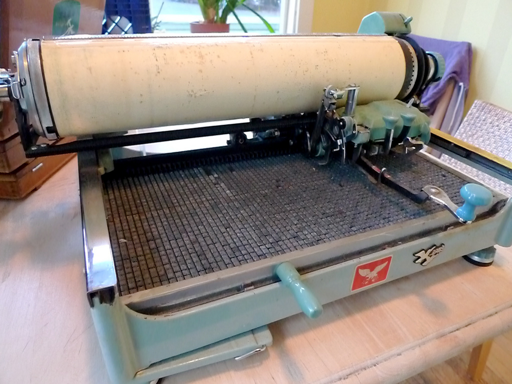
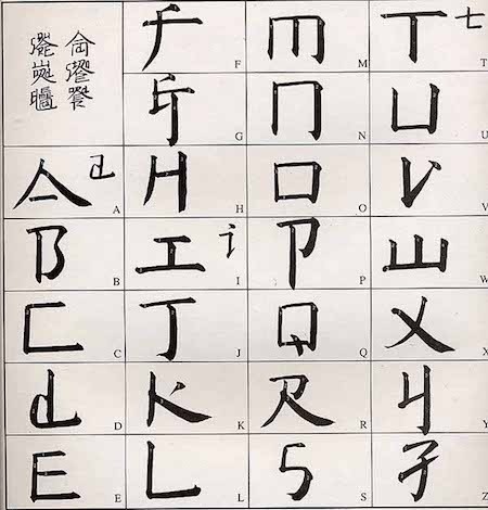
— Mullaney’s Chinese typewriter
Thomas Mullaney is a Chinese History professor at Stanford who wrote the first extensive book about Chinese typewriters. It’s fascinating! He’s also studying type design at TypeWest (the San Francisco counterpart of Type@Cooper).
So far I’ve read through his blog journeying the research for his book The Chinese Typewriter: A History, and I’ve read the intro to the book. Mullaney seeks to address misconceptions about the typewriter and how those viewpoints reflect a Western sense of modern superiority. He gets at how the invention of the Chinese typewriter, a great feat because of the Chinese character system, is a form of resistance against the alphabetization of the Chinese language. He brings up how the Communist attempt to simplify the language didn’t really simplify much at all in terms of information technology. The Chinese typewriter is part of China’s attempt to modernize. The character system is fundamental to Chinese culture; China cannot escape its language without making its history inaccessible. Language historically changes gradually because convention is a form of accessibility. It is another form of evolution and adaption overtime.
This book very much falls in line with the idea behind the cultural biography project, which apparently is a trendy history project that, as Mullaney points out, may be inflating the value of objects. But in any case, Mullaney is not attempting to render the Chinese typewriter as a groundbreaking, impactful object on China. It is rather a lens, the pivot point for telling stories. Looking forward to reading more of the book and learning more about the relationship between written language and information technology. For example, the Chinese typewriter implemented a mechanical form of what we know as predictive text today.
I’ve been drawn to monospace fonts and typewriter forms for a while, but I’m not 100% sure why. Mullaney also mentioned in a video interview that he can’t fully articulate why he is so compelled by the Chinese typewriter and that he’s still trying to figure that out (this was before the book was released). He was able to articulate why it was important, but on a deeper level, it’s just not speakable why it’s personally significant. And that kind of doesn’t matter.