texts
“If a new type doesn’t show your own convictions, what is the point of doing all that work?”
— Gunnlaugur SE Briem
“It is now easier for us to imagine the end of the world than an alternative to capitalism.”
— Dunne & Raby, Speculative Everything
Do You Want Typography or Do You Want The Truth? — Erik Carter:
How can we increase knowledge consumption without conflating material consumption? Can you be effective while ignoring “the market”?
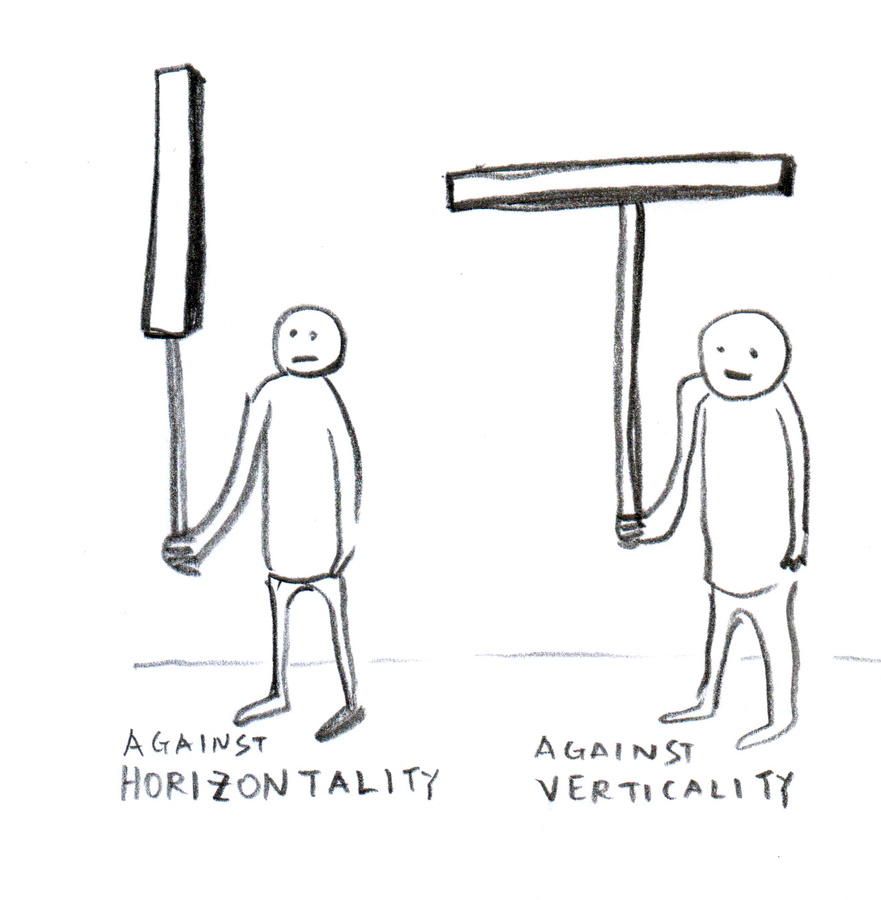
Working within the system vs. working in direct opposition to the system vs. creating a new system :: following the rules vs. breaking the rules vs. making the rules.
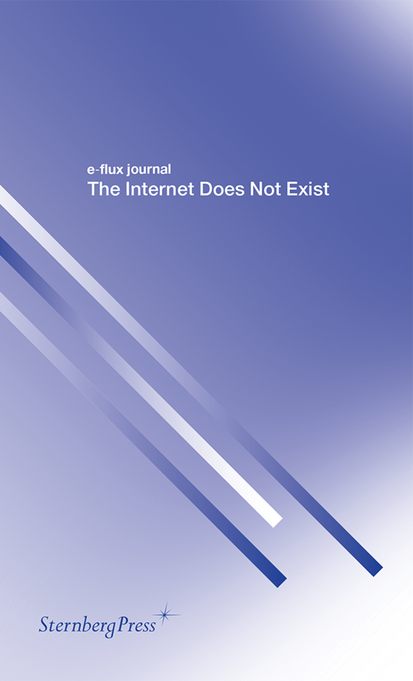
The Internet Does Not Exist (a collection of e-flux essays): The internet is 100% man-made. There is no nature. What are we constructing in this “endless” space? How much more trash are we creating? What’s being destroyed or abandoned? Do these vacancies matter? Is constantly moving to new locations disruptive? Are text-based communities real?
The internet does not exist separately. It is part of life; it cannot be ignored. It is an extension of man. The Internet with capital I does not exist. Only things exist on the thing we refer to as the internet: the seemingly boundless world inside boxed machines. But the internet is still bounded by country, language, culture, government—the same things that bound the physical world.
The world and “internet” are the same entity. The world has just expanded into another dimension.
“the internet is a tool, a tactic, and a territory”
— Media Manipulation Initiative (MMI)
The internet enables alternate realities that make their way into the whole reality.
“Disturbingly commonplace”
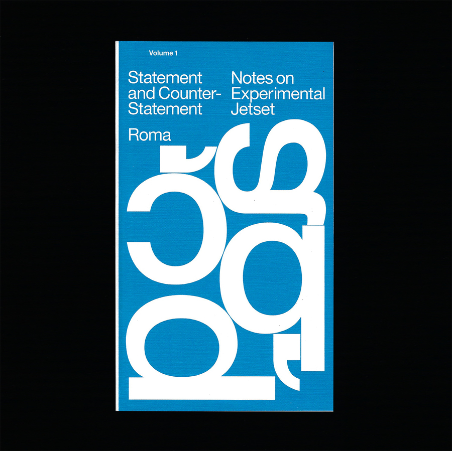
Statement & Counter-Statement: Notes on Experimental Jetset: A lot of quotes and questions pulled from this… Experimental Jetset represents what it means to speak a language and adhere to an ideology. They also consider all work personal; the dichotomy of client work and personal work does not exist for them. They’re also willing to try writing and expressing opinion, even if it doesn’t come out quite right.
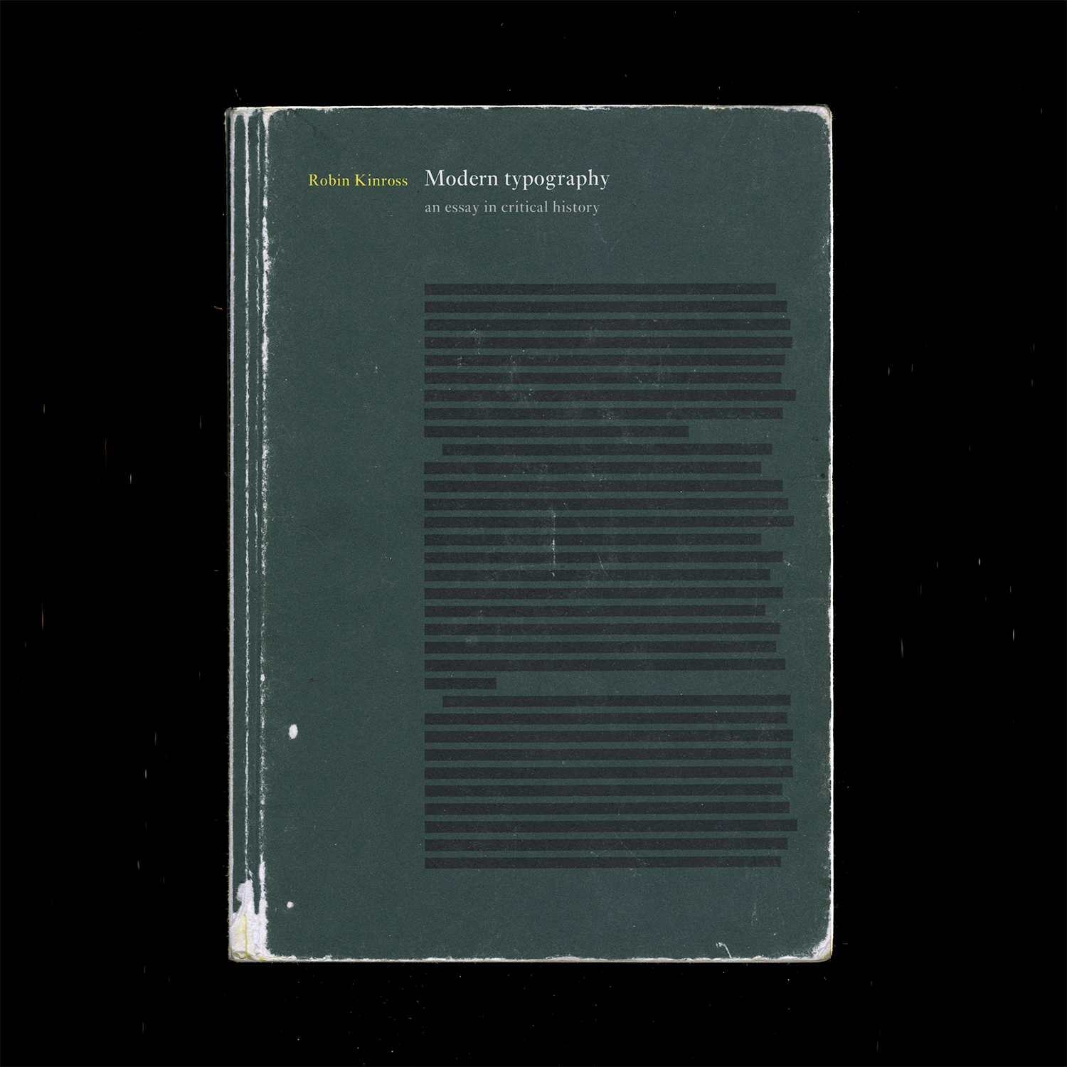
Modern Typography — Robin Kinross: Thoughts prompted by pages 10–11: Typographic scholarship is largely motivated by the intent to reproduce and sell typefaces modeled on old ones. Do type designers dig deeper than aesthetics?
What ideologies are we reintroducing, repackaging, reiterating… There’s fun facts, but what about context? Why was the original created in the first place? Does it matter since the connotations of a typeface change based on how they’re used? Do the ideologies of the original designer matter to the contemporary designer? Are contemporary process writings another form of marketing and persuasion?
But does scholarship need to be heightened to make typefaces successful in the market? Nope. And to some, selling is the priority… Can you blame them, considering the speed of society and the long-term process of type design? Are the stakes that high? What are the effects of type on culture, content reception, etc.?
It’s not only about legibility but also about communication and tone. Are the visual qualities of a typeface an argument on their own? An additional voice? Or a characteristic of the whole?
The tricky thing is, the use of a type is not controlled by its designer. Its context is variable. So is an ideology in a face even possible if its use is so varied? What does “authorship” mean in type design?
Modern Typography — Robin Kinross: Thoughts prompted by Chapter 2: Enlightenment Origins
“Modern typography exhibits a rational impulse, both internally in ordering its own working, and externally in the face it presents to the world.”
— pg. 16
“By a typographer, I do not mean a printer, as he is vulgarly accounted, any more than Dr Dee means a carpenter or mason to be an architect: but by a typographer, I mean such a one, who by his own judgement, from solid reasoning within himself, can either perform, or direct others to perform from the beginning to the end, all the handy-works and physical operations relating to typographie.” (Joseph Moxon, Mechanik exercises: or the doctrine of handy-works applied to the art of printing, quoted by Kinross pg. 15).
A typographer is as much as a practitioner as a reasoner, and these things can be taught. Typography is based in reason and rational thought, but it is not a science.
— romain du roi italic
Romain du roi introduced units for different body sizes and using the grid. It represents the move toward rationalization and order, and anticipates pixels and how fonts are constructed today (a fine grid of points).
A possibly incorrect assumption of mine: Italics are rooted in handwriting, so what happens when you try to apply that to a grid? An effect of rectilinear units and coordinates is that it leads to sloped romans instead of true italics, which precedes the oblique styles of sans serifs.
Chapter 3: The Nineteenth-Century Complex: Printing was full of working-class labor, roots of underserved, arduous workers:
“They quit, they cheated on their ‘voyage’; they collected small advances on the next week’s work (‘salé’) and then disappeared; and sometimes they spied for rival publishers or the police.” (p.27, Kinross quoting historian of book production in 18th century France). A reminder that things were way more intense back then.
Hard labor motivated workers to take shortcuts to make the work easier, not dissimilar to type designers today using programming and scripting to automate tedious and repetitive processes. Some say it allows more time to be allotted toward designing instead of pixel pushing.
Chapter 4: Reaction and Rebellion:
“The idea of freedom (‘as having skilled and unaffected boldness’) was essential to [Edward Johnston], as was that of constraint: ‘True spontaneity, however, seems to come from working by rule, but not being bound by it’…‘Set no limit to your hopes (which may contemplate Eternity) but every limit of the moment to your work’”
— pg. 39
Finished reading Modern Typography but it’s gonna need a second read eventually.
Chapter 6: New traditionalism:
Revivals were a thing because of consumer demand. What do people want now?
Rudolf von Larisch emphasized the importance of spacing over “the subordination of detail to the total effect” (p.76). I can get too finicky with type (as it’s easy to do) too early on. Just like graphic design, you need to start with the lower-fidelity, overall impression of a design before ironing out all the details. Otherwise it gets overwhelming and limiting. It’s also easy to fall into making showy glyphs that don’t quite work with the whole system.
A prevailing philosophy in type design: “writing or (more generally) hand-produced forms should be at the root of all letters for printing. To ignore written forms, as the ‘elemental’ or new typographers tried to do, was thus to discard the very foundations of civilized practice” (F.H. Ehmcke, pg. 77). What’s the relationship of the hand to how letters are made today? It’s at least half-digitally native now for typefaces, so… As long as it is identifiable as an alphabet, it is ‘legible’, as least legible in context. Individual letters may be hard to read, but you can tell when something is a letter, or when something looks like a letter. It’s so odd — letters are completely abstract things but are material representations of phonemes. Oof. Yeah it all started with the pen, but it doesn’t end that way. And it doesn’t have to start with the pen. What really defines an alphabet is the modular system. Repetition and permutation. Letters can be reduced to binary systems, like my CSS typefaces. It stops looking like an alphabet when none of the forms relate to each other. And form in stroke is not the only way to reference the roots of letterform. The alphabet is the alphabet, connecting points and lines. That’s what a stroke is now; not a gesture but a plotting of points.
Chapter 8: New typography:
Those who reject technological advancement are just denying the inevitable. Technology will make its way into everything and affect it; may as well attempt to steer the wheel.
El Lissitzky: “The printed surface transcends space and time. The printed surface, the infinity of books, must be transcended. The electro-library.” (pg.87, originally from “Topografphie der Typographie”). Still not sure what the electro-library is, but maybe it alludes to how text is read has changed. I am also keen on the idea of how type, the material, allows ideas to exist, to be transferred, to be heard, and to persist after its author has passed.
Jan Tschichold: “An extraordinary economy could be achieved through the exclusive use of small letters — the elimination of all capital letters… our script loses nothing through writing in small letters only — but becomes, rather, more legible, easier to learn, essentially more economical. for one sound, for example ‘a’, why two signs: A and a? one sound, one sign. why two alfabets for one word, why double the quantity of signs when half achieves the same?” (pg.88, originally from Elemental Typography). Another reason why the universal alphabet was attempted. Not sure how I feel about the simplification of alphabets either, but Tschichold has a point. I think it all just falls back on applying such an idea to an appropriate context.
Herbert Bayer: “to print a hand-produced letterform with a machine is false romanticism” (p.93, originally from his presentation Versuch einer neuen Schrift). Maybe this is why script typefaces kind of generally irk me.
Chapter 9: Emigration of the modern
H.N. Werkman was a typographer who did “experiments of configuration and of technique, in alliance with subversive content, suggested ‘an aesthetics of resistance’ [(pg.103)] … was shot by German military authorities who, it has been suggested, were provoked by his unorthodox typography” (pg.104). This was during Nazism. Again, stakes were high back then. Jeez.
Tschichold’s criticism of Germany’s new typography: “It seems to me no accident that this typography was practised almost exclusively in Germany and hardly found acceptance in other countries. In particular, its intolerant attitude corresponds to the German inclination to the absolute, its military will to order and claim to sole domination correspond to those terrible components of the German character that unleashed the rule of Hitler and the Second World War.” (said right after the war). “…aesthetic fetish out of efficiency and machine-production … For the worker, machine production has thus meant a heavy, almost deadly loss in the value of experience, and it is entirely wrong to put it on a pedestal… since we are unable to manage without machine production, we must accept its products simply as facts, without worshipping them on account of their origins” (p.108, originally from ‘Glaube und Wirklichkeit’, p.235). Considering the politics of aesthetics and the implications of imitating the form of an era while ignoring its social/political/etc. context.
10,000 Original Copies: Kris Sowersby argues that every interpretation of a preceding typeface is an iteration upon an idea that moves it forward and situates it in today’s world. Type design is a gradual improvement, moving at the pace of culture and the market. Originality is a false goal. New technologies expand the possible uses of a typeface, but the forms themselves are simply shapes. How is authorship present in type design? What makes a typeface more than a forgery? How is it different from Mona Lisa duplicates?
Typefaces aren’t merely facsimiles: well-done ones reflect the designer’s ideologies, their knowledge of history, and their craftsmanship.
“Remember. Growth is only possible as a product of history. Without memory, innovation is merely novelty. History gives growth a direction. But a memory is never perfect. Every memory is a degraded or composite image of a previous moment or event. That’s what makes us aware of its quality as a past and not a present. It means that every memory is new, a partial construct different from its source, and, as such, a potential for growth itself.”
— Bruce Mau, An Incomplete Manifesto for Growth
Microinteractions as frictionless experiences designed around practicality but also emotion: the infinite scroll, the pop of a red heart, the chime of a notification, the unintimidating 280 characters. These microinteractions are designed at the line between tolerable and pleasurable, a seemingly neutral experience with the minimal amount of enjoyment. Blunted.
Microinteractions triggering other microinteractions like a tweet
Invisible and seamless microinteractions possibly means gradual erosion of choice and assimilation to screen-based norms. But the repeating friction from new interactions incites online rage. A happy reaction to a microinteraction is a “neutral” one. Passive?
The Gutenberg Galaxy: The Making of Typographic Man — Marshall McCluhan
“By the same process whereby he spins language out of his own being, he ensnares himself in it; and each language draws a magic circle round the people to which it belongs, a circle from which there is no escape save by stepping out of it into another.”
— Wilhelm von Humboldt
Learning different languages—linguistic, visual, etc.—enables comparison to one’s defaults (more perspective).
“By the meaningless sign linked to the meaningless sound we have built the shape and meaning of Western man.”
— Marshall McCluhan
The alphabet is completely abstract, yet it’s the reason why anything is possible at all.
How to Say “Crunch” in Portuguese — Rob Stenson : OH no Type Co. interviews an audio software developer and programmer.
The e in Eames Century Modern by Erik van Blokland: no definitive right and wrong, just convention and context.
PEOPLE music gathering and website: “Music is for everyone.” A non-hierarchical, non-commercial digital space for artists (mostly musicians) to upload and update unfinished work. Includes some background information on when and where the pieces started.
Note the language: people instead of solo artists, projects instead of bands—reflects the in-progress work (or past sketches) but also the ideology of PEOPLE.
Also note the typography: monospace and all caps of PEOPLE representing equality.
The gathering itself is unscheduled and spontaneous “performances” consist of in-progress work developed during the gathering.
More insight in TCI interviews:
“You look at our capitalist society and people who are so enthralled with themselves and their own stories because they’re afraid to die. They’re afraid to stop expanding … You don’t need to expand, you don’t need to become Walmart.”
— Bon Iver
St. Vincent Is the 21st Century’s Guitar Vanguard — Sasha Geffen (NPR):
“Thinking of [the] guitar as a peer and not a tool.”
Coincides with the thought of using code as a language, a form of thinking and communicating and not just a tool rather for efficiency. Not only using the computer, but collaborating with it. Specifying code even more, what can you do in browser that you can’t do in Python? Or, how can browser restrictions influence a design?
“Forget the glass ceiling. Inside a St. Vincent song, you don’t even know where the floor is.” Unexpected, poetic moments vs. novel animations.
“We had been standardized. We were all speaking a different language now. It was the language of Facebook—of computers.”
“How Facebook Has Flattened Human Communication” — David Auerbach: In environments where the visual representation of our words is homogeneously predetermined, how powerful is it to spend time crafting individual letters that work together for legible harmony (or deliberately illegible disharmony) but that also reflect the content in a different voice? How powerful is it to slow down and think about what we’re writing but also think about what the letters mean formally? 140 sans-serif characters? Reactions reduced to a set of 5 emojis? The first impression is how the letters appear, conscious or not.
Letters are beautiful. Abstract shapes that become even more meaningful when someone uses them.
But if everyone is using the same shapes, what values are we reinforcing?
Homogeneity is not necessarily unity. It can mean competition.
“24x24 pixels worth of hearts and thumbs-ups are at the tips of our trigger fingers, and traded on a marketplace like commodities with decreasing value. Sending vectorized (infinitely scalable and replicable) abstractions of our feelings is now a tic — when we press the button we are acting on a neurological impulse to make known our identity, affiliations, and aspirations.”
— from “A drop of love in the cloud” by Fei Liu
“Perhaps we reveal ourselves too much in small things because we have so little of the great to conceal. The tiny incidents of daily routine are as much a commentary of racial ideals as the highest flight of philosophy or poetry.”
— pg. 44, The Book of Tea by Kakuzo Okakura
“A special contribution of Zen to Eastern thought was its recognition of the mundane as of equal importance with the spiritual. It held that in the great relation of things there was no distinction of small and great, an atom possessing equal possibilities with the universe.” (p.70)
Slow Reader: A Resource for Design Thinking and Practice — Ana Paula Pais & Carolyn F. Strauss (eds.)
Part of the “Long List of Rational Reasons of Why I Like Type Design” is that making a typeface takes a long time. It’s a nice contrast to the rush and immediacy of everything else. The speed of graphic design can sometimes make it feel quite meaningless.
Something that has been stuck in my head is:
ephemeral design, ephemeral emotion
You know when you hold something and it’s just full of emotion? That’s usually because someone put a lot of time and care into it.
The speed in which we design and produce work is tied to life’s timeline and capitalist demands. But not everything is precious and needs years to be made. The alternative of a gradual work is just nice. It’s somewhat of a protest.
With that said, the essays in this book so far touch on systems and language (or at least that’s what I’m choosing to pull out):
“We must learn about how the place where we are is forced upon us in its being, how the powers that be determine our lives, and how we can keep agency in that, and bring our own idea of a relationship.” (pg. 47, “Preparing for the Not-Yet” by Jeanne Van Heeswijk)
“We see words from the economic sphere being applied in the artistic and cultural spheres. A few examples in which I think language really betrays us: to capitalize (ideas), to produce (art), ‘work’ (instead of oeuvre), strategy and ‘projects’ when we refer to the process of creation, while at the same time we let creativity be co-opted by corporate language.
…The lack of criticality and self-reflection in the educational system, the lack of freedom, is intentionally designed as a political instrument. We witness a deliberate imposition on the child of a model of life based on the logic of automatism and the idea of professionalism, which does not allow the child to develop a certain sensitivity.” (pg. 76–77, “The Art of Conversation and the Aesthetic of Process” by Emilio Fantin)
“Often we feel trapped in one system, and we feel the system is so much larger than we are; but we are the ones who are keeping that system going. So once you recognize the inequity, and trace how your own body is being disciplined and kept in a certain place, you can begin to think through how you might design intervention, as a creator of cultural material.” (pg. 90, “Decolonization As Care” by Uzma Z. Rizvi)
“In all of my experience, however, the mode of resistance has only ever worked through collaboration, finding allies and solidarity with others.”
— pg. 94, “Decolonization As Care” by Uzma Z. Rizvi
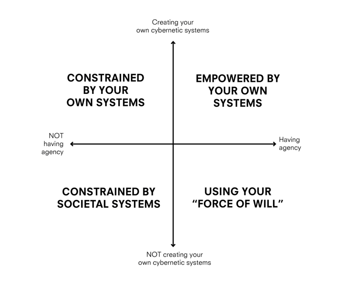
systems 2x2 by Max Fowler
I’m still skeptical about design research methodologies and representations but this graph thing makes sense.
In my Modern and Contemporary Chinese Art History class, we learned about the Modern Woodcut Movement, in which woodblock artists now designed, carved, and printed their art. Before, the steps were divided: an artist would send their drawing to be carved and printed by other people.
The claim of whole artistic control is similar to how graphic design has panned out. Graphic designers do their own typography, and there is also a move toward making one’s own type as well. Being in control is probably why I’m annoyed with predetermined templates and structures. I like building things from scratch. So maybe that is why I don’t want to enforce a closed environment on other people.
—“but still… stuff… dies?”
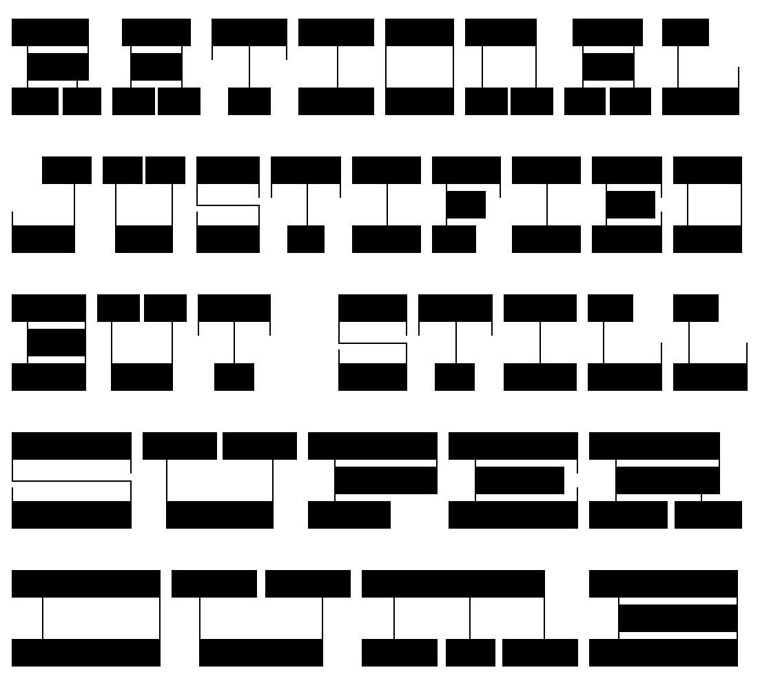
I showed my non-designer/artist roommate my CSS typeface and it took her quite a while to be able to read it. It was hilarious. But also great.
Of course it’s easy for me to read since I made it, and my peers and designers have been exposed to a greater range of typefaces, making it not too illegible. But for my roommate, it completely blew her mind. The typeface was intentionally unconventional with the horizontal stress and hairline verticals. No curves, no diagonals. And that rendered it largely illegible to her. Seeing her try to decipher letters reminded me of when I did a psychology experiment where I had to try to guess what letter these kindergartners were trying to write. Goes to show how distant designers can get from the average visual perspective. It also has me wondering how much of design is pretentious and really only understandable by designers. It’s kind of problematic in the type design world, too, it seems. You really do have to learn about type. It’s so niche though that most people outside of it don’t care about all the features and technicalities of it. They just want to right-looking thing. Designers are just stylists to a lot of people.
To the general population, does what we do really matter? Do those formal details really add that much more? Or are all these arguments just to bolster our careers and help us continue making a living?
The details cascade into bigger things. It does make an impact. Especially if the decisions we make are rooted in a consistent ideology.
Space for People, Not Cars — Viveka van de Vliet (Works That Work): Removal of explicit rules to raise awareness of surroundings.
— via David Byrne
Thinking of public space on the internet: what’s being built, how it’s being built, and what’s being abandoned.
— Seven Futures by Taeyoon Choi and Christine Sun Kim
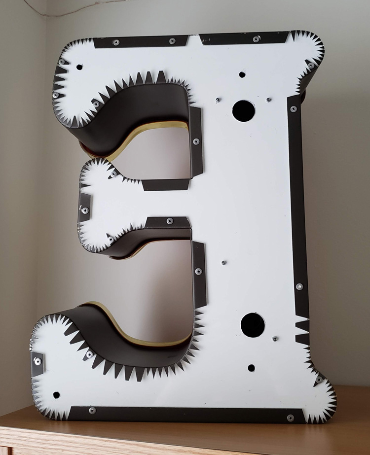
— the back of sign E is more interesting than its display side
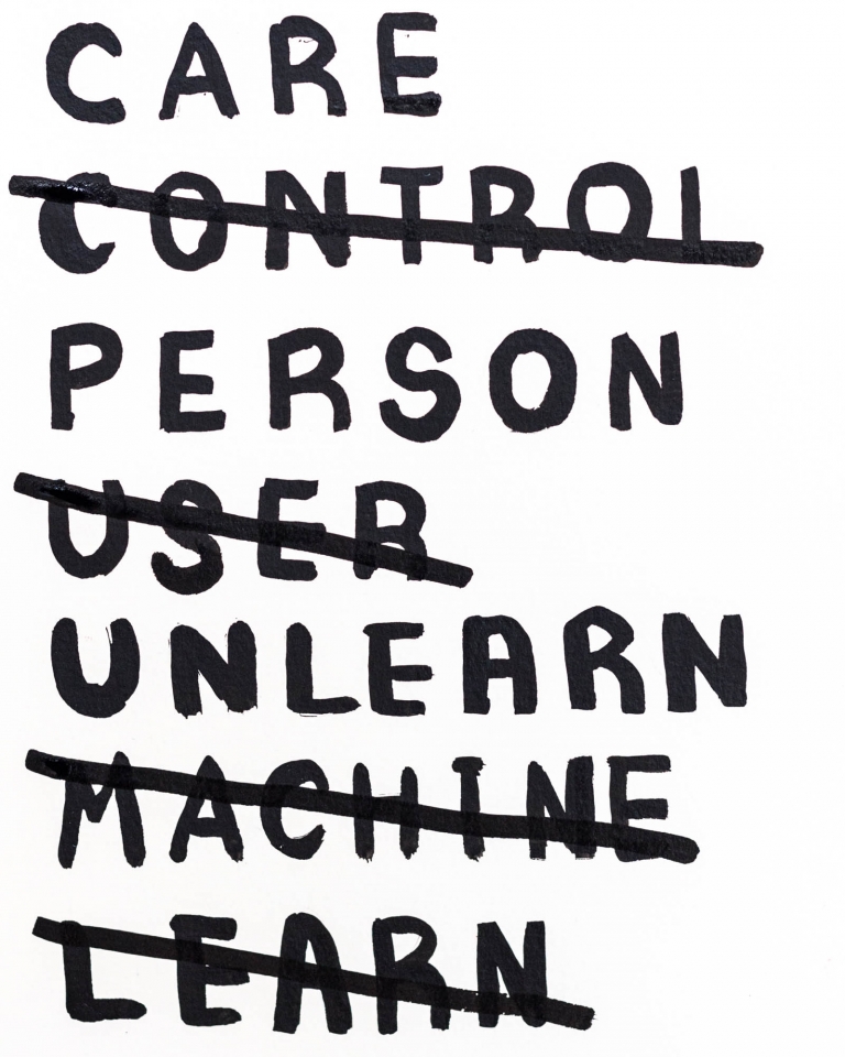
Earlier in the year I inadvertently wrote a whole essay about why I like to make things from scratch and why I was experiencing quite a bit of friction with the dominant Adobe Suite in how it may perpetuate conventions and defaults if used as one’s main creative tool. Wanting to make my own type and build my own tools and digital, creative environments kind of made me just feel like I was being a huge control freak. But really those feelings reflect something larger: the lack of agency and control.
On Wednesday I found out about one of the School for Poetic Computation (SFPC) founders, Taeyoon Choi via TCI. And he said exactly what I’ve been thinking:
“I find commercial software kills my creativity. It’s designed to do something very professional, like a production tool. In the beginning, I felt like I couldn’t really go underneath and truly understand its interface … I’m sculpting with signals. I understand what’s happening, and I can control the behavior of my robots or sound installation. It’s very immediate. Unlike commercial software, like Photoshop, nobody has decided things for me. It’s an open plane to be creative. I can understand every single step.”
I’ve been wrestling with systems (following existing ones, going against existing ones, creating new ones), and what appeals to me most is creating my own systems and rules because I can understand how the whole thing works. Everything can be shaped for my individual intent rather than for a larger system or agenda, because as designers, form-givers, we must use tools to create. So how much truer can our idea be if we design our own tools? Look at what we’re making in the browser compared to what we make in Illustrator or InDesign. I am taking all these rules of microinteractions and Laws of UX that we’re reading about with a grain of salt. It’s hard to unlearn.
But the issue I have with creating my own systems is that I can tend to rationalize on idealistic, idiosyncratic terms instead of realistic, more general terms. That can make it hard for people to understand what’s going on, and it’s not considered “practical.” But what’s nice is that in today’s society of systems, creating a new one is a way of exposing a new perspective. Idealism is possibility not yet realized. It’s different than utopianism.
“Poems are not meant to be functional. Poems are more exploratory, and poems are expressive and very human. We looked at code that way.”
— Taeyoon Choi
Taeyoon also specifies my (and the general) idea of code as language by considering it as figurative language. The way I see it and have been approaching design is a visualization of language. It’s all metaphor. That’s why coding is nice. It feels like writing. It’s a different, more direct translation of written word to form.
How can the process of design also be the metaphor?
— Taeyoon Choi
“How can we resist the capitalist means of control and instead care for each other through the network?”
— “Ethics and Archiving the Web”, Taeyoon Choi
Another significant idea of Taeyoon’s is “care as an alternative to control”. Taeyoon has been focusing on how disability on the internet is handled, but the idea extends to the whole system the designed internet.
“The free-floating traffic of information travels in what appears to be open space, but in reality it is highly regulated because of the infrastructure on which it is built … the society of control does not provide space for the us to take agency and take care.”
— “Ethics and Archiving the Web”
Right now in the capstone course we are oriented toward calculated, controlled experiences, some involving designed “randomness”. It’s all really nuanced, which is actually kind of scary. Manipulation is everywhere. There’s a lot of responsibility in designing these things. Is the illusion of agency dishonest and unethical?
“What are the discrete points of the worldview that are compartmentalized into zeroes and ones, and what are the spaces between?”
— Atom ≠ pixel: What gets lost in the translation and compression of ideas into the pixelized space?
— A sketch from Taeyoon from a post about protest
Poetic Computation: Reader: Taeyoon Choi wrote a book about poetic computation that was supposed to fully released by now but unfortunately only 3 chapters are available as of now. He elaborates on the role that poetics of code can play on aesthetics and how understanding the mechanisms can unlock the language of these programmed processes.
“Repetition is a powerful way to perform complex tasks by breaking them down into a series of a simple operations, enabling a basic pattern to scale to larger, more abstract and complex structures. We might note that repetition is also an essential technique of poetry. The images, in their abstraction, also hold a sense of the sublime for me. The sublime is the experience of something that is beyond judgment, such as having a transcendent encounter with nature. This sublime elegance in computation propelled me to ask if we could use these aesthetics to envision a different narrative of technology.”
— from Chapter 01 of Poetic Computation
Describing the computational poetics as a form of the sublime is just right. I’ve been trying to articulate it, but it is not completely able to be articulated, only observed and experienced.
He also describes immaterial drawing, seemingly boundless, as “free drawing in the air.”
We’re pressured to commercialize what we learn. I mean, one kind of has to to make money? Not really sure how I’m going to harmonize with capitalism as someone who is uncompetitive with hardly any entrepreneurial spirit, who also has trouble with hierarchy and authority.
— from Emigre 51 (I think that’s the issue)
“Louis was suspicious of architects and planners… he was critical of how they feel compelled to control every square meter of the country, which he saw as almost pathological. Louis used to say ‘You must leave a gap.’ … The metaphor of the gap was a place that was out of society’s control, outside the labor cycle, valueless, simply ecological.”
— Building a Wilderness with Louis le Roy by Julian Raxworthy, pg. 102–103
Closed, fully controlled systems vs. mostly controlled but open-ended systems.
“By placing ‘just one brick, then another,’ something emerges that is in synchronicity with the world, rather than a representation of it.”
— Building a Wilderness with Louis le Roy, pg. 104
Incremental change that affects current reality vs. whole constructions of idealized futures.
Alexander Tochilovsky, head curator of the Herb Lubalin Study Center, on Lubalin’s convictions and skill, the inaccuracy of Google, and Karl Gerstner’s systems.
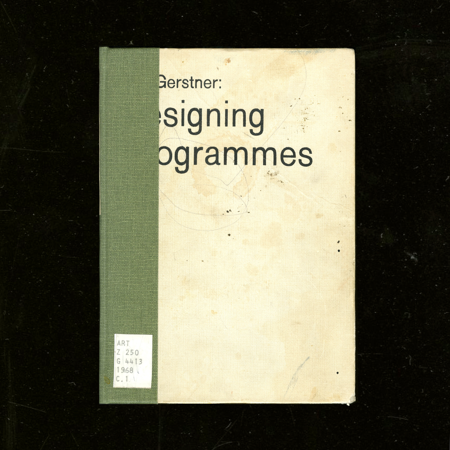
WashU’s art library also has a copy of Gerstner’s Designing Programmes. Not sure how I feel about such a rationalized approach quite yet, but this quote,
“The rules of the game is permutation”
— Paul Gredinger, Pro-Programmitic, introduction to Designing Programmes (pg.3)
defines design for me, in regard to how each individual design is made but also how design as a collection evolves. Another interesting perspective is:
“Instead of solutions for problems, programmes for solutions … The creative process is to be reduced to an act of selection. Designing means: to pick out determining elements and combine them.”
— Karl Gerstner
This is how I’ve felt about design. It feels like a big game of collage and synthesis. I’m more interested in working at the more micro/fundamental levels of its existence, like type design (can’t have a lot of design without typography, and can’t have typography without type). Type is just abstract yet just material enough. It sits at such a nice intersection. It really is its own thing.
I’ve been looking more into the contemporary composer Nico Muhly’s work more after hearing a piece of his premiered at a yMusic concert (in which some Sufjan Stevens songs from Enjoy Your Rabbit were also performed). The song above (Mothertongue: I. Archive) begins with the singer spelling out all of the addresses she has lived at. I didn’t know this before listening the first time, so it sounded like she was singing in code, in recognizable sounds but not recognizable words. Muhly also made an opera about how a boy planned his own murder using internet chat rooms (true story).
Muhly works with my favorite artists (Sufjan Stevens, The National, etc.), is a prolific and diverse composer, and is joyfully and charismatically eccentric. He was even on the podcast Design Matters and has written about fonts on his blog (???). Anyway, the parallels between music composition and type design interest me. Both make material or instruction that is to be interpreted through their use and performance. Muhly is prolific in his work because he is voracious in collaborating and making sure that his work is interpreted and performed in many different contexts, because the music doesn’t mean much if it isn’t performed and heard — this aspect is especially pertinent to music because of how it is materialized: ephemeral sound, a live performance. With type you can look at it with specimen and gather something. Looking at a score is more difficult.
Muhly has an understanding of musicians and their instruments, so he is able to write for them better. Type designers also need to understand how their type is used but also who they are making type for.
Muhly wrote an article on his process, and he touched on an issue he had during his days at Julliard:
“I constantly had hundreds of tiny, brilliant ideas, each lasting about five seconds, and instead of learning to use them, I’d just throw them at the wall in some order and the result would be a sparkling and disorganised mess, a free-form string of disjointed but attractive thoughts. My teacher set out to fix this problem, and taught me a method of planning I still use to this day.”
I am having the same problem with type design (and other design too). The ideas are endless but I am having trouble sticking to one and executing it thoroughly. It’s because I don’t really know what I’m doing, but I really want to make the thing. I need more structure and guidance but not too much — I need room to make mistakes, to learn the hard way, because there seems to be something about failing and learning that is more truthful than following advice that may just be convention. Muhly elaborates on how he became more structured in writing:
“With every piece, no matter its forces or length, the first thing I do is to map out its itinerary, from the simplest, bird’s-eye view to more detailed questions: what are the textures and lines that form the piece’s musical economy? Does it develop linearly, or vertically? Are there moments of dense saturation – the whole orchestra playing at once – and are those offset by moments of zoomed-in simplicity: a single flute, or a single viola pitted against the timpani, yards and yards away?”
He talks about the itinerary in another interview: “It’s less a question of having a story and more having an itinerary.” What he means is that thinking of a concept is half the problem; it’s the process of making it that is just as crucial. Methodology. The narrative can only guide so much.
In another interview, Muhly talks about focusing on the day-to-day act of creating and the process of creation as home, which is how I felt making type this summer:
“By not worrying about what anything means (as about [musicals versus operas], above), I find that a day can be spent just in the joy and rigour of work. The process — the journey, as it were — is itself home!”
In the same interview he also just talks about how creation itself is the driving motivator, not its philosophical meanings or whatever else:
“I fear that the minute I figure it out, I’ll forget how to do it, so I always just try to keep my eye on the task at hand. One thing is that I am fiercely unambitious. I have never made a plan that has anything to do with my career, or my ‘trajectory’ or whatever euphemistic phrase I’m meant to use. Instead, I work — not to repeat the word — vigorously on everything, so that the work itself is the ambition. It’s never, ‘in ten years I wish to have accomplished these things and will tick off the boxes as I go.’”
Things started going a bit hairy last year when Pro Practices started and questions of “Where do you want to go? What do you want to do?” and models of success were presented. Before I was just doing the best to my ability and following intuition without letting consciousness block creation. And then when the time would come on where to go, I’d be prepared simply because of my work. I came into the program just wanting to make meaningful things. Simple. Even if I tripped up design wise I was still able to keep going without hesitation. Once these future pressures and templates for behavior were presented, I just got lost. The work stopped being the guiding factor. All of it seemed to be made for a purpose that was not mine.
Really I entered in because my interest in type was overwhelming and unignorable — I honestly didn’t really know what graphic design meant. I’ve clarified that it’s not necessarily graphic design that I want to make. It’s about materializing ideas. And it seems that my way of doing that is through language and words, less so image. And this is where the artist vs. designer debate starts.
One more thing: the idea of “musical citizen” over “solitary genius writing in a hut somewhere”.
“In the workshop it is the moment that speaks and not the artisan.”
For bookbinding we went to Special Collections. I encountered Botnick’s Diderot for the third time in person, but this time I had the opportunity to actually read some of it more closely.
Every time I thumb through that thing I always leave with a dose of vigor. It’s like all the time and energy that Botnick and others put into the book is being transferred to whomever touches it. The act of making such a book is in itself beautiful. The devotion and conviction to a crafted object and to language is the purest goal.
“How often I found where I should be going only by setting out for somewhere else.”
— Buckminster Fuller, via Botnick’s Diderot colophon
Why Do All Websites Look the Same? — Boris Müller:
“Templates are content agnostic”
An unanswered question I’ve been having is if type revival is a form of appropriation, and if it matters if type designers that heavily reference historical form also consider the social, political, etc. context of that type’s time. I don’t want to assume that designers just pull type they formally like and that’s that, but sometimes it kind of comes off that way, or they try to frame it as a historical ode. For what? Credibility in validating their own type? There’s a lot of rhetoric to unpack. But I guess the truth is in the type designs themselves. Are serifs merely attachments, or do they hold some connotation? Does their origin from handwriting really matter anymore?
“Sometimes, if you want to design the future, you have to rediscover the past.”
Back to thinking in terms of websites, not type: Naïve but well-meaning form that was created because no conventional model existed at the time is priceless. Unlearning is hard.
“Designing Between Points” — Aetherpoint (Andrew Johnson): Johnson writes about how tools and GUIs affect our ability to visualize possibilities. Expanding on responsive design, he pushes for options presented on axes instead of discrete points determined by the software designers. More open spaces, larger rooms, rather than many small rooms.
“Letters are sheer form and writing is rhythm”
— Gerrit Noordzij, The stroke of the pen, via Fred Smeijer’s Type now
It’s not so much the letter as much as it is the word. And it’s not so much the word as it is written language. Materializing ideas in a shareable way is the point.
![]()
— Deconstruction, no. 1 by Kyuha Shim
Depth to pixels.
Vocabularies of Computation: An Interview with Kyuha (Q) Shim:
“After all, there are many ways to draw an outlined circle.”
“Computation is, first and foremost, my primary medium. It is a lens with which and through which I take an analytical perspective to see things as generative pattern, a combination of parameters and algorithms. Not everything is made out of rules, but I love to decode logic encrypted in artifacts. At the same time, computation is a material with which I build systems that can automatically repeat tasks, which yields continuity and actually feels like real-time. It enables me to play with contingent, complex, data-driven, and improvisational aspects of formation.”
The interviewer also asks,
“Can an algorithm have style?”
Shim responds by saying that depending on the rules, yes, an algorithm can have style due to the visual patterns that it creates.
— Letter & Spirit by Dexter Sinister
The font Meta-the-Difference-Between-the-Two-Font-4-D intends to bridge historical precedents with parametric design. Sinister asks “How to keep things moving? … what if we make one of those parameters time itself?”
I had the quote “I follow the spirit of the law not the letter” saved before watching this video but did not know that it comes from judicial practices and precedents. I was considering trying to define letters in terms of language in order to abstract letters using letters… but after trying to think about how to define each letter, it was basically impossible since the image, perception, and understanding of a letter also depends on its context. An E can be described as 3 horizontal lines parallel to each other and connected by a vertical line. But without the vertical line, the E could still be read as an E. Additionally, the definition doesn’t describe how far apart the 3 horizontal lines are. Letters are weird! Though they are pure shape, they can’t be mathematically defined like a circle or square. It’s quite simple: an E is an E if it looks and reads like an E. Though letters are visual, they are at the core immaterial and completely abstract.
I have also been reading about Ludwig Wittgenstein, a philosopher who focused on language’s limits and function. A frequently cited quote of his is “What we cannot speak about we must pass over in silence.” Since letters are the basic unit to written language, it’s quite difficult to break them down any farther. They are not merely line compositions. So I have just come to accept a letter for a letter and to keep moving on. It is what it is. What I have come to observe is the changing meaning of “movable type.” For Latin characters, it began with Gutenberg, moved into wood type, hot-metal typesetting, phototypesetting, typewriters, (what else?), and now digital typesetting. Movable type now can involve fluid time and movement, live transformations. Can type ever become unstuck from rectangles?
After hearing about Metafont again, I decided to actually look into what it is and what it makes. It doesn’t aesthetically work too well but it’s undeniably impressive: “The Concept of a Meta-Font” by Donald Knuth. I though about making a parametric typeface, which I kind of did for the CSS typeface project, but after seeing Metafont and Spectral, I’m not actually into it that much, weirdly. It’s not really type design, and too many broad parameters means the typeface loses its identity.
— Kaba Ornament by Bram de Does
Capstone title: Bram “Bro” de Does: My Long Lost Father.
Found out about Kaba Ornament after mining through all of Alphabettes’ posts, but man, online pics do not do this justice. I got a hold of the book thanks to the interlibrary loan system. G’ bless ILL. Kaba is only cut in metal; it is not a digital font.
Kaba Ornament is a two piece modular system; the pieces are mirror images of each other and individually asymmetric. Combining asymmetric forms but mirroring them allows for building symmetric compositions. The shape of Kaba is Gestalten: The negative space is essentially the same shape as the positive space. This is largely why Kaba works as a simple yet dynamic module for pattern.
In the book, Bram explains his thinking behind ornaments, including some entertaining biographical snippets, and shows the process and eventual system that emerges for Kaba. He sketched configurations of Kaba over a long period of time using a felt pen, saying that he was more interested in the possibilities of combinations of a module than in the actual ornament itself.
“Nearly every morning I scrawled for half an hour with a thin felt-tip pen on a sheet of 5mm squared A4 paper. Working single-mindedly, shifting to automatic pilot, this was a fine transition from sleeping to waking; a therapeutic activity and advantageous to bowel movement, I can assure you… But I often forgot what I had sketched earlier and I did not want to think about it too much, as this only makes one feel tensed up.” (pg. 8).
Bram also does not own a computer, so his form of working was pure human automation and repetition. In doing so many iterations, Bram drew many of the mathematical possibilities of certain types of symmetries, which he found out about after reading some math books. Yo!
He also explains why the shape of his ornament works well for pattern making: the line adds a variation in texture, the edges are designed to connect well, and the 65° angle and curvature of the shape lends itself to dynamic compositions rather than just a series of perpendicular crossings. Looking at my current modular type, I have come across similar principles! Bram also acknowledges Islamic patterns and the tilemakers who have known this long before (ka’ba means cube in Arabic).
Reading about Bram’s process was enlightening for figuring out why certain letters in my currently small system work better than others for pattern. Currently I have a loose system (which is fine for the beginning stages) and some sense of rules, but that may make it too easy to derail and it’s not a good foundation for establishing consistency, emergence, and coherent differentiation. Examining how some letters work better than others is key. But most important is to keep trying variations until finding the one that just clicks while fitting in with the rest of the system.
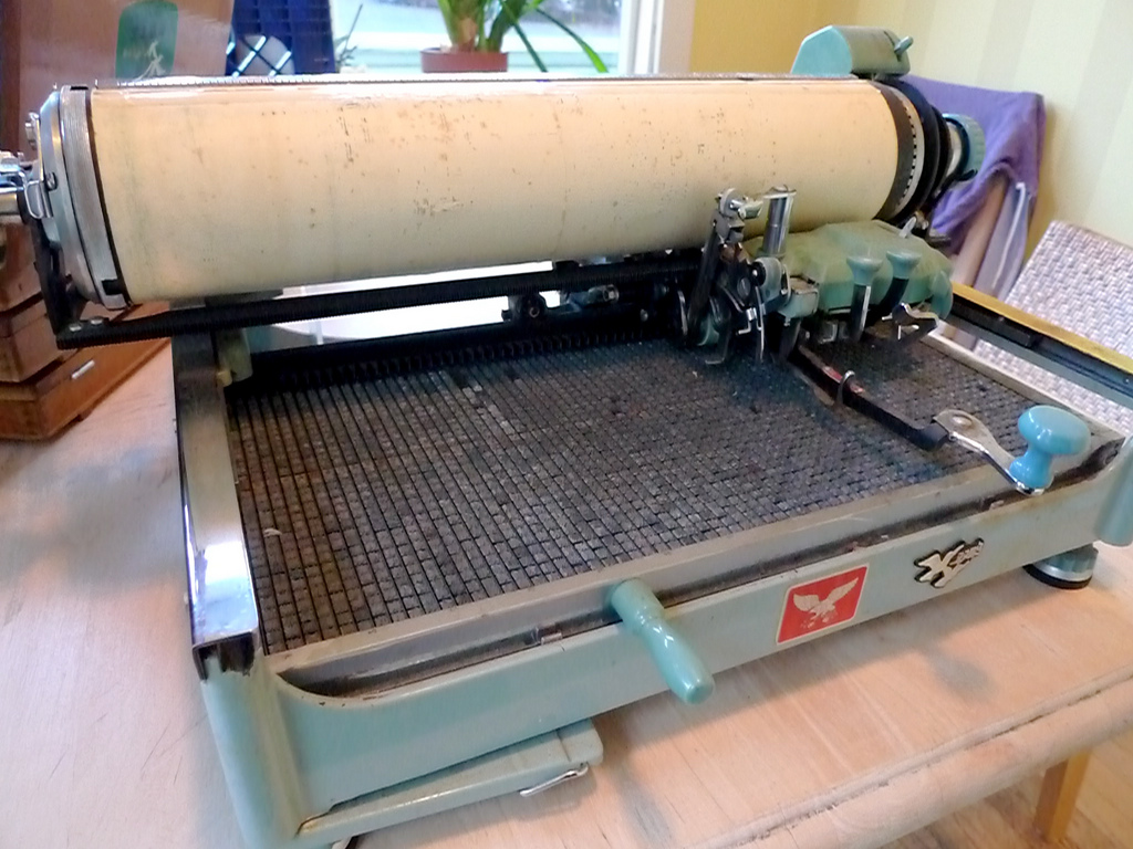
— Mullaney’s Chinese typewriter
Thomas Mullaney is a Chinese History professor at Stanford who wrote the first extensive book about Chinese typewriters. It’s fascinating! He’s also studying type design at TypeWest (the San Francisco counterpart of Type@Cooper).
So far I’ve read through his blog journeying the research for his book The Chinese Typewriter: A History, and I’ve read the intro to the book. Mullaney seeks to address misconceptions about the typewriter and how those viewpoints reflect a Western sense of modern superiority. He gets at how the invention of the Chinese typewriter, a great feat because of the Chinese character system, is a form of resistance against the alphabetization of the Chinese language. He brings up how the Communist attempt to simplify the language didn’t really simplify much at all in terms of information technology. The Chinese typewriter is part of China’s attempt to modernize. The character system is fundamental to Chinese culture; China cannot escape its language without making its history inaccessible. Language historically changes gradually because convention is a form of accessibility. It is another form of evolution and adaption overtime.
This book very much falls in line with the idea behind the cultural biography project, which apparently is a trendy history project that, as Mullaney points out, may be inflating the value of objects. But in any case, Mullaney is not attempting to render the Chinese typewriter as a groundbreaking, impactful object on China. It is rather a lens, the pivot point for telling stories. Looking forward to reading more of the book and learning more about the relationship between written language and information technology. For example, the Chinese typewriter implemented a mechanical form of what we know as predictive text today.
I’ve been drawn to monospace fonts and typewriter forms for a while, but I’m not 100% sure why. Mullaney also mentioned in a video interview that he can’t fully articulate why he is so compelled by the Chinese typewriter and that he’s still trying to figure that out (this was before the book was released). He was able to articulate why it was important, but on a deeper level, it’s just not speakable why it’s personally significant. And that kind of doesn’t matter.