week 2August 31–September 6
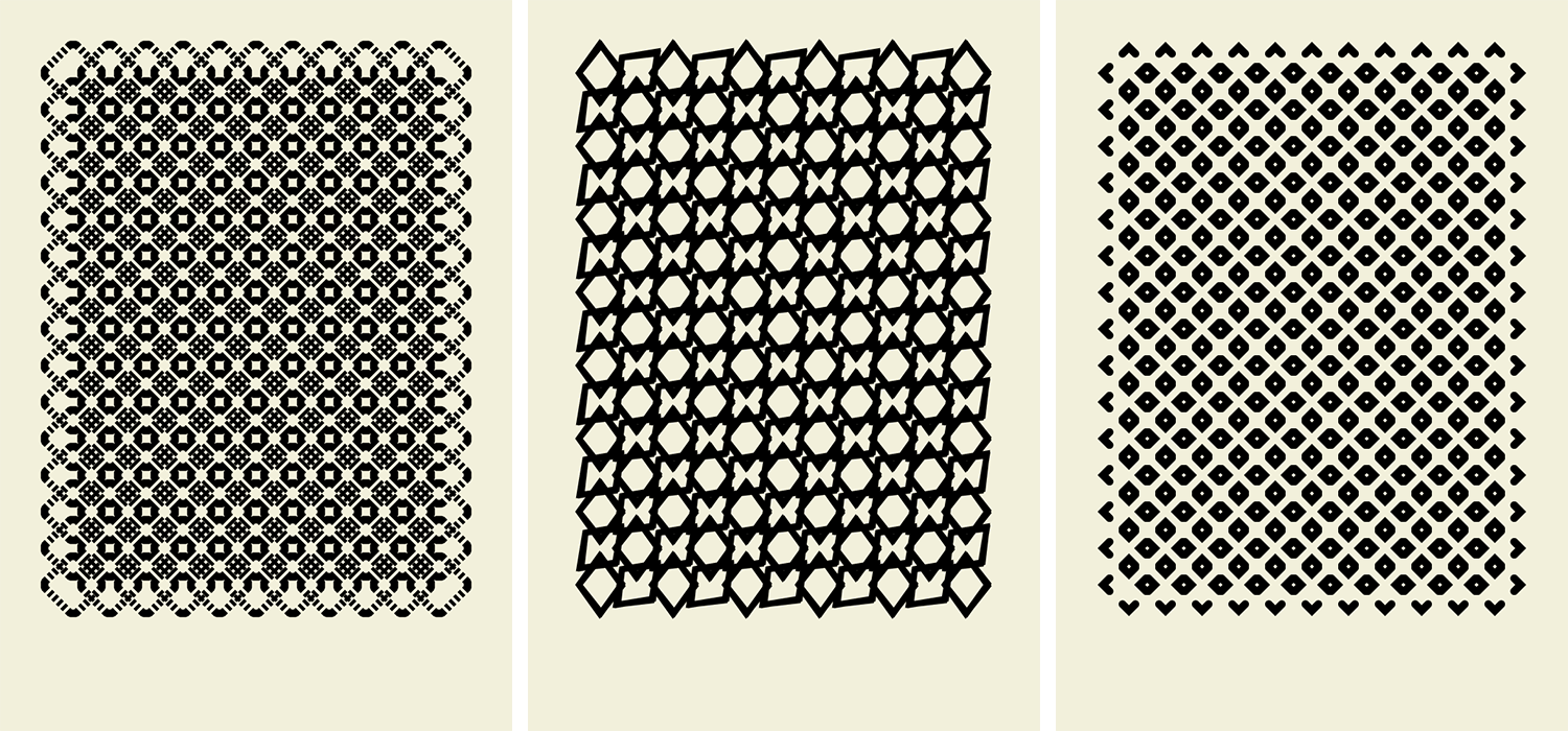
— 101 Patterns by NCLZ via But Does It Float
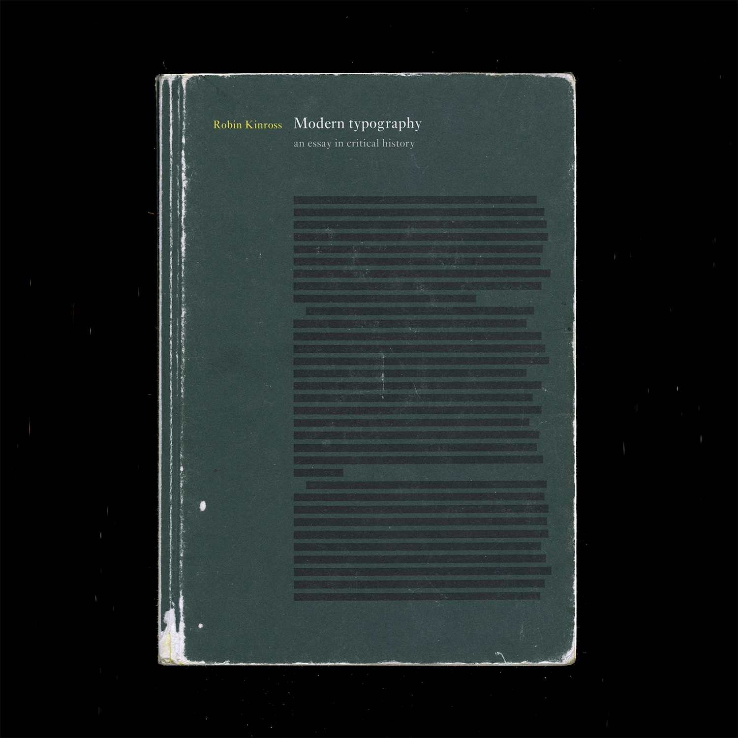
Modern Typography — Robin Kinross: Thoughts prompted by pages 10–11: Typographic scholarship is largely motivated by the intent to reproduce and sell typefaces modeled on old ones. Do type designers dig deeper than aesthetics?
What ideologies are we reintroducing, repackaging, reiterating… There’s fun facts, but what about context? Why was the original created in the first place? Does it matter since the connotations of a typeface change based on how they’re used? Do the ideologies of the original designer matter to the contemporary designer? Are contemporary process writings another form of marketing and persuasion?
But does scholarship need to be heightened to make typefaces successful in the market? Nope. And to some, selling is the priority… Can you blame them, considering the speed of society and the long-term process of type design? Are the stakes that high? What are the effects of type on culture, content reception, etc.?
It’s not only about legibility but also about communication and tone. Are the visual qualities of a typeface an argument on their own? An additional voice? Or a characteristic of the whole?
The tricky thing is, the use of a type is not controlled by its designer. Its context is variable. So is an ideology in a face even possible if its use is so varied? What does “authorship” mean in type design?
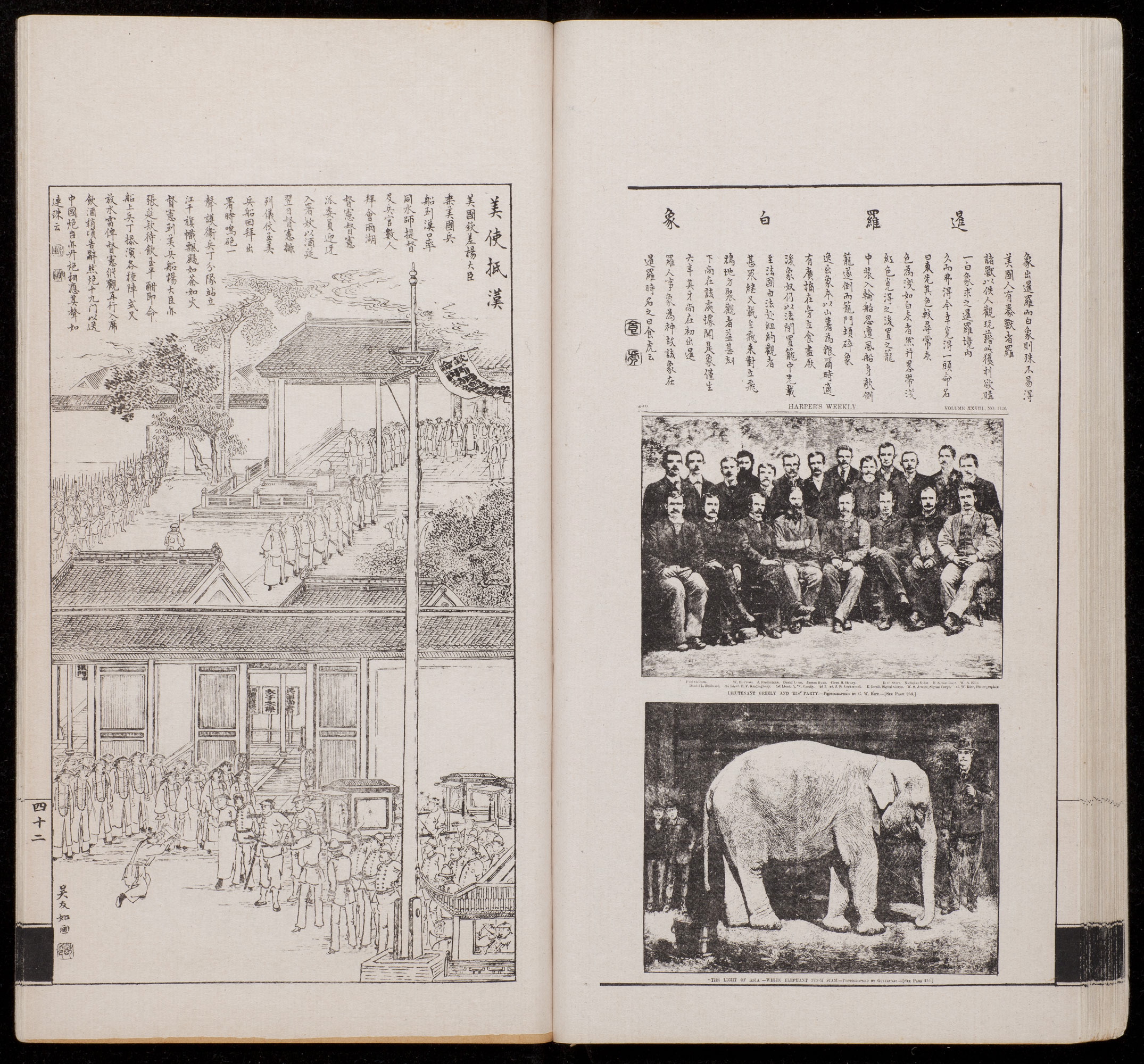
— Vol. 1 of Dianshizhai Pictorial, 1884. Left: “American Consul Arrives at Hankou” by Wu Youru. Right: “A White Elephant from Siam,” a photo taken from Harper’s Weekly, an American publication.
Dianshizhai Pictorial: This was a Shanghai-based magazine that was published after the establishment of Shenbao, a newspaper founded by the Englishman Ernest Major. The spread above is from the first volume and represents the different image-making methods and dominant technologies of the Chinese (woodblock prints) and Westerners (photography).
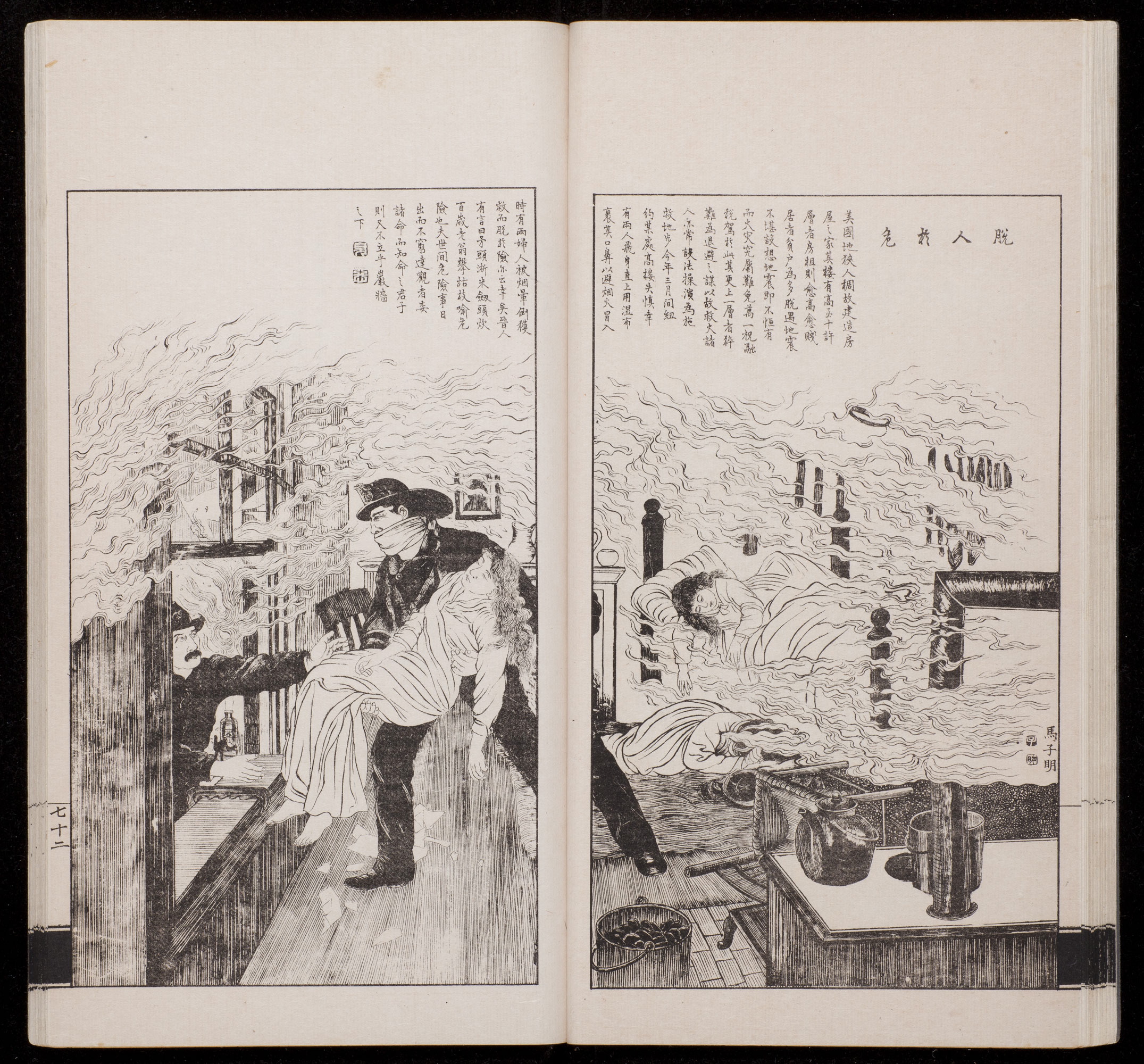
— “Escape from Danger” by Ma Ziming, vol. 2, 1884.
Synthesis, not assimilation
This second spread shows the synthesis of East and West and reflects Shanghai’s culture and population as a trading port. Western technologies were introduced to the Chinese, and lithography pushed past the limitations of woodblock printing, allowing for greater volumes in mass-production along with more detailed prints. Here technology influences form and content, but does not completely override tradition.
— Well-designed bingo boards
Sliders vs. scroll bars.
— 2014
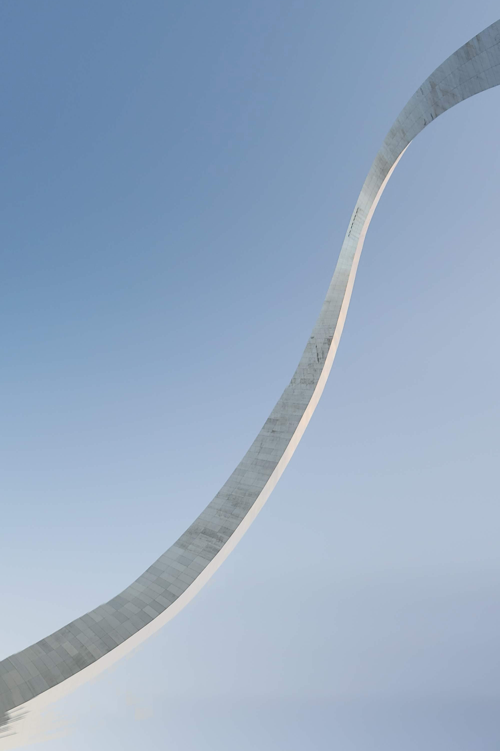
I took an accidental glitch-panorama of the Arch the summer before senior year of high school. It reflected the state of St. Louis.
The summer of 2017 I studied abroad in Florence. Our final project was about collection and curation. One of my classmates/friends Laurie did hers on glitch panoramas. It resulted in many silly pictures, but in the end considered the possibilities of interaction for divided panels of panoramas.
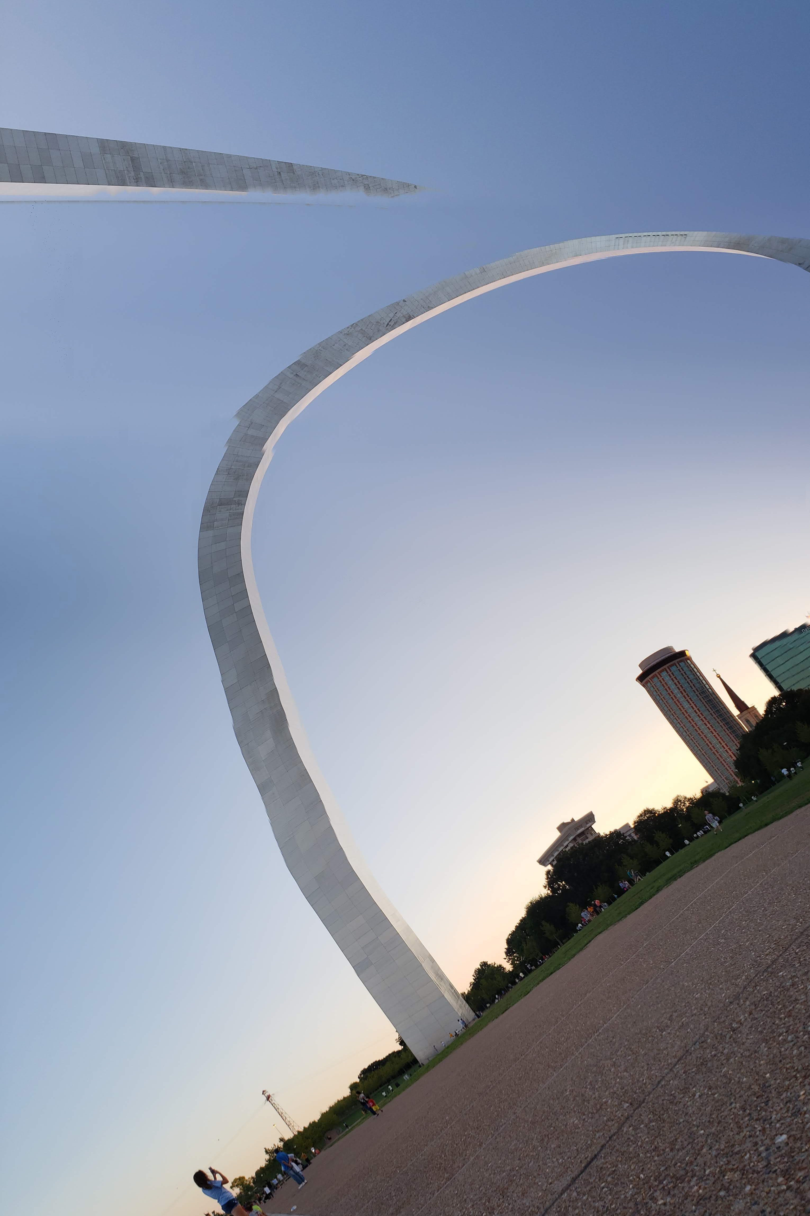
— 2018
The Sunday of Labor Day weekend, I went to the newly renovated Arch and took some more panoramas, this time deliberately contorting the Arch. The glitch panorama has a new meaning and association and is inseparable from Laurie’s project now, for me and for the people I studied abroad with. Community impacts the work, and connotations can’t be forgotten. But what do these photos mean to others?
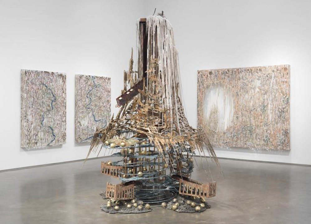
— The Candle Clock in the Citadel by Diana Al-Hadid, 2017. In which Al-Hadid attempts to reconstruct a complicated machine like a badass.
Diana Al-Hadid’s talk on Wednesday was about historical synthesis and new form. It was new to witness an artist give a less prepared/scripted talk, as she seemed to intend. She was using the public space as a means of reflecting on work in a new setting, which probably put some people off as she searched for words. But to me it made her more empathetic. She’s still figuring things out like everyone else. And the work as a collection speaks.
Her experiences show that the work is not coincidental, that it does not come from some mysterious, unknown source. Experimental Jetset calls on the same theme of origins in Statement and Counter-Statement. It’s getting at the question:
“What were my atoms before they were me?”
I’ve been thinking about the why’s of what I do a lot; the roots are traceable, and influences are everywhere. My parents own a nail salon, and doing nails is not dissimilar to the practice of graphic design. Creative labor. A service. … That’s just one part of the big Why.
Microinteractions as frictionless experiences designed around practicality but also emotion: the infinite scroll, the pop of a red heart, the chime of a notification, the unintimidating 280 characters. These microinteractions are designed at the line between tolerable and pleasurable, a seemingly neutral experience with the minimal amount of enjoyment. Blunted.
Microinteractions triggering other microinteractions like a tweet
Invisible and seamless microinteractions possibly means gradual erosion of choice and assimilation to screen-based norms. But the repeating friction from new interactions incites online rage. A happy reaction to a microinteraction is a “neutral” one. Passive?
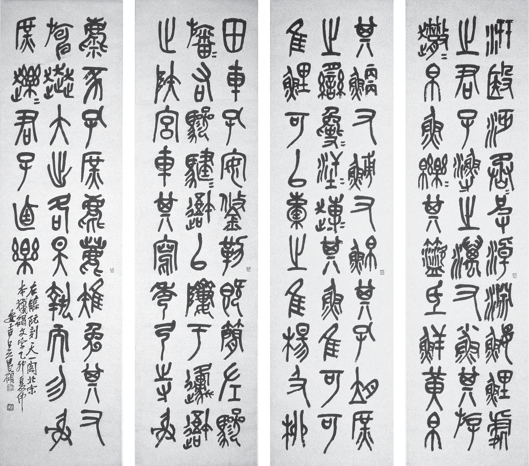
— Stone Drum Script by Wu Changshi, 1915
Wu Changshi was an epigrapher (a scholar of ancient scripts) who considered the seal script (as he replicated above) to be modern. The seal script was one of the earliest Chinese writing systems, and required lengthy study to understand and replicate. Traditional Chinese calligraphy showed the stroke of the brush and had varied stroke weight. The seal script is comparably monolinear, rectilinearly grid-based, and conceals the stroke of the brush tip, as seen in the rounded edges.
These characteristics run parallel to the transition from broad-nib/pointed nib writing to designed serifs then to sans serifs. The study of epigraphy is also similar to the practice and scholarship of reviving old type, wherein studying historical models seems to elevate the credibility of a typeface, just as the study of epigraphy was seen as an elite interest in China…
In my bookbinding class we are making paper as well as getting a hang of the letterpress. This week has been about experimenting. My group made a mega-paper/community-quilt-type-thing, and it’s honestly kind of meaningful as cheesy and sort of cliché-y as it might me. We just pressed multiple sheets of paper together, and there ended up being a space in the middle from human error and imperfect alignment. The physical negative space also shows that the paper was made from multiple modules. The paper was pressed in a sort of American flag shape with the larger rectangle in the corner, but the whole sheet is one color, which happened to be a blueberry-smoothie color from mixing white pulp with red and blue dye. It was a whole lot of serendipity but also about enabling those moments by saying yes to trying simple but new things.
In any case it’s pretty nice learning more about paper production and taking the time to collaboratively make these things by hand. Getting back on the letterpress is also nice; cranking the rollers, setting the letters. Craft is a good way to slow down and digest and to get intimate with the materials we use to communicate ideas. Sometimes design feels too sterile and clean. Frictionless. The imitation of letterpress aesthetics on the screen also feels disingenuous. So what is native about digitally-based media?