Capstone ProcessSpring 2019
the outlet mall of graphic design
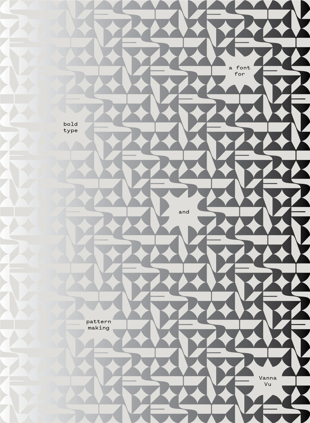
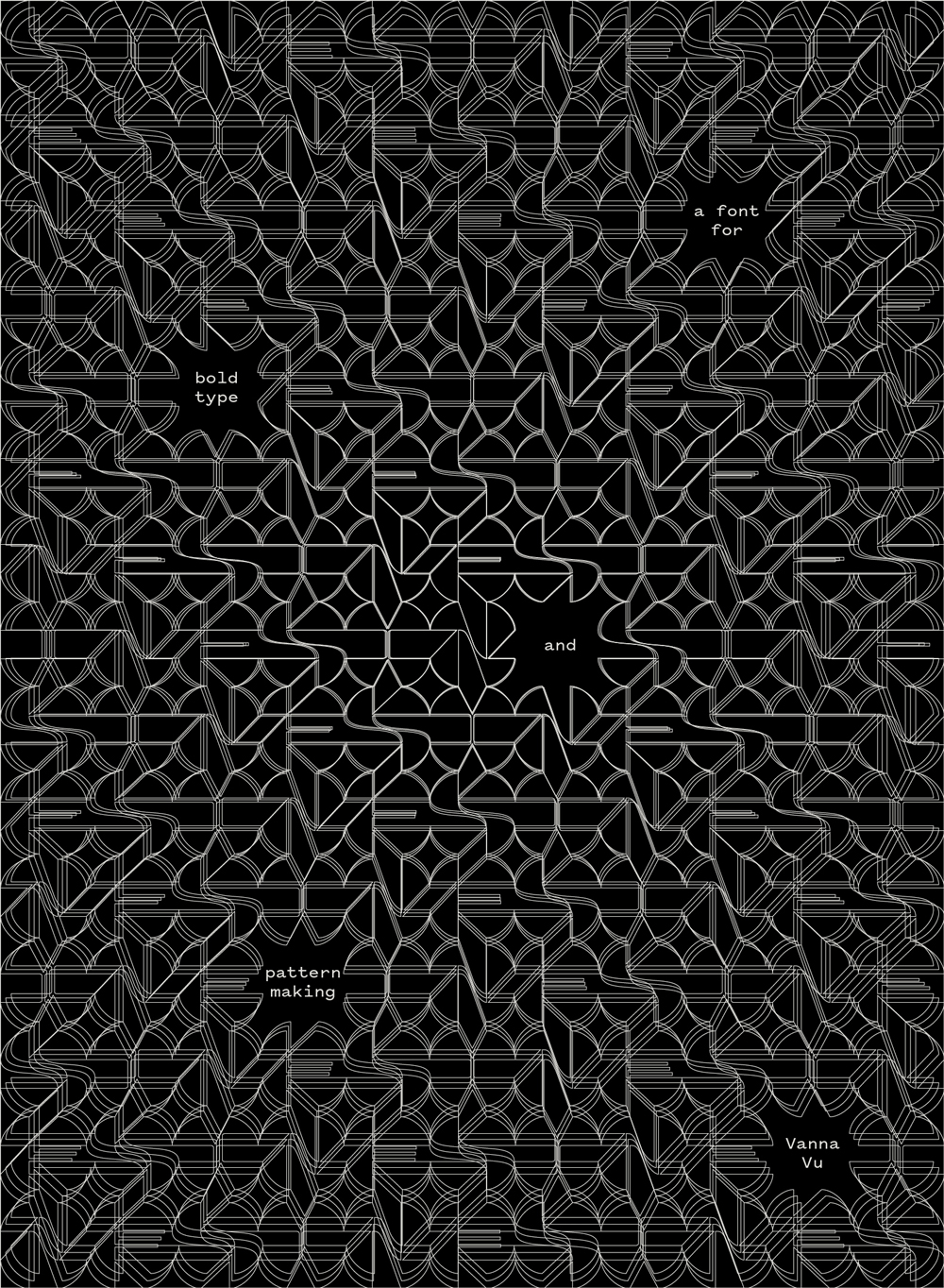
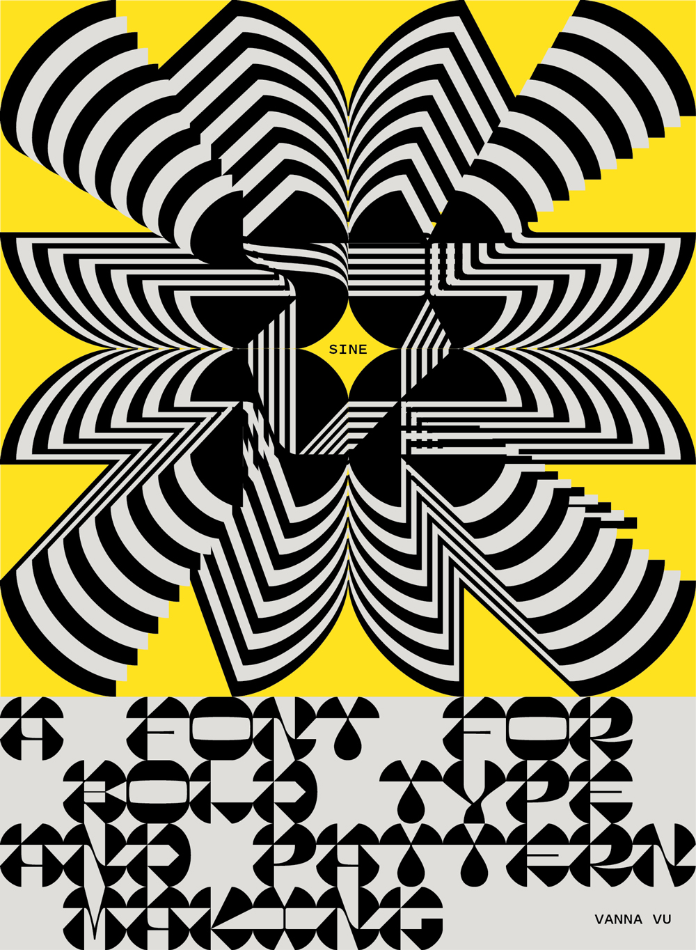
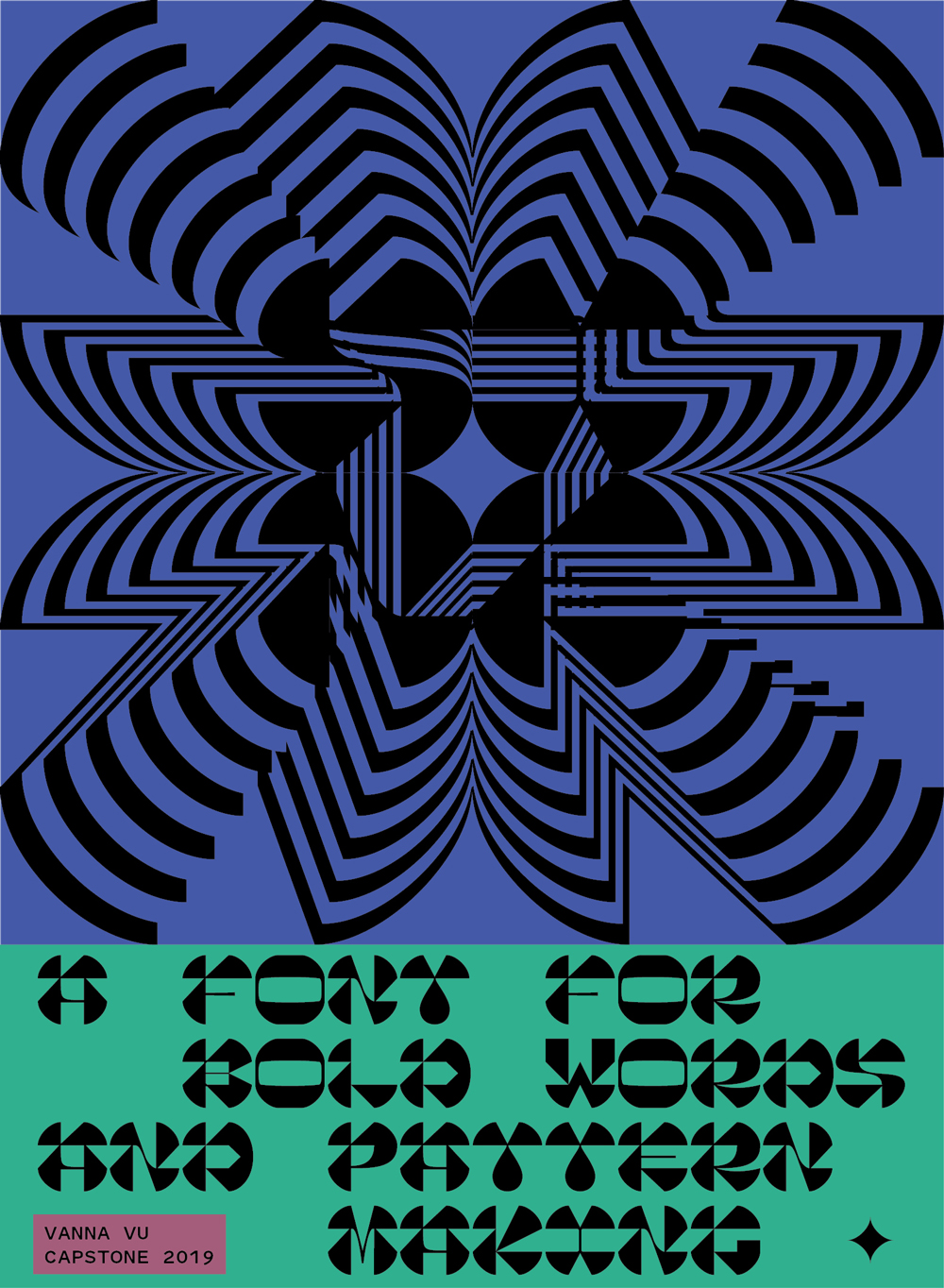
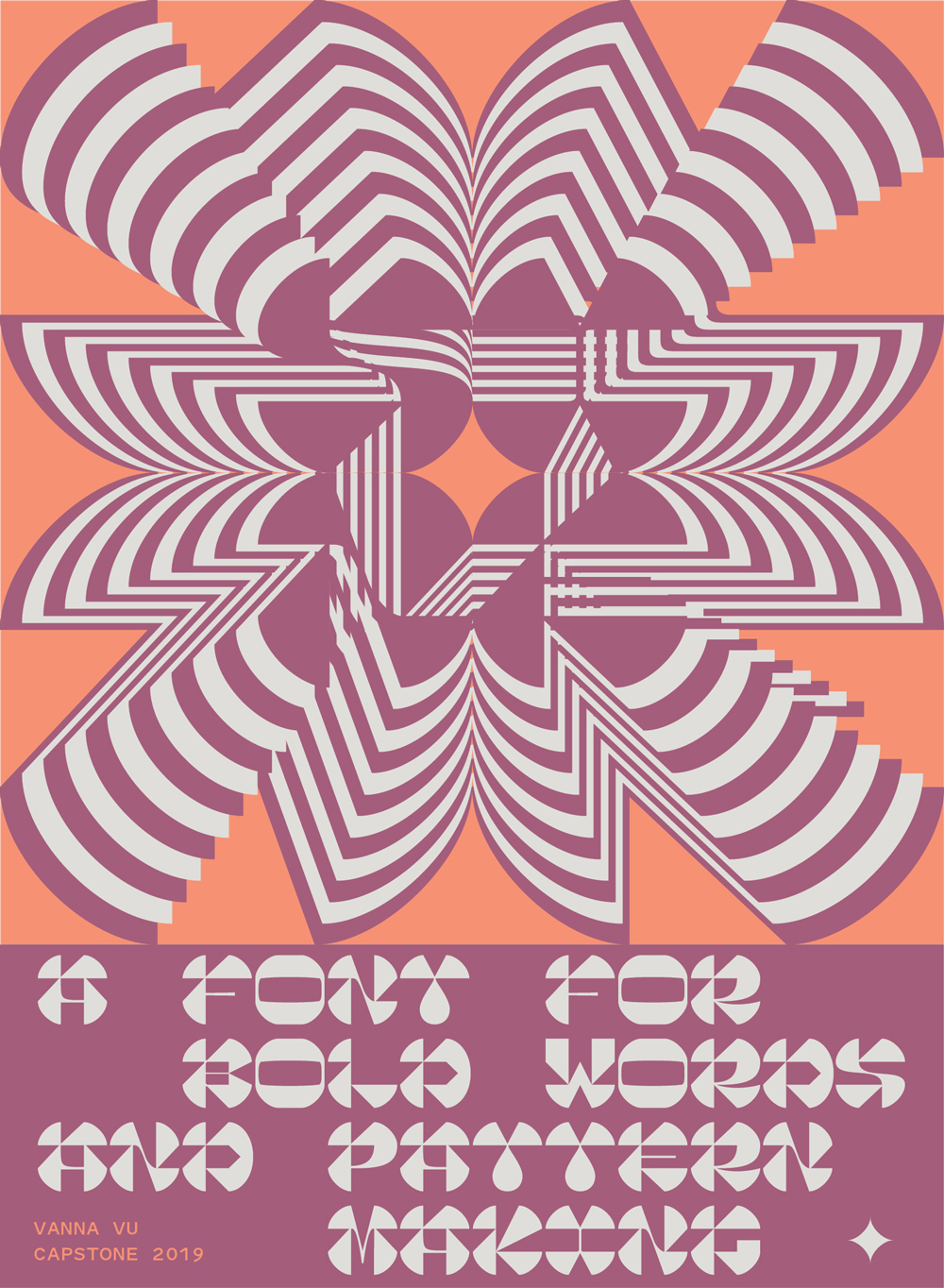
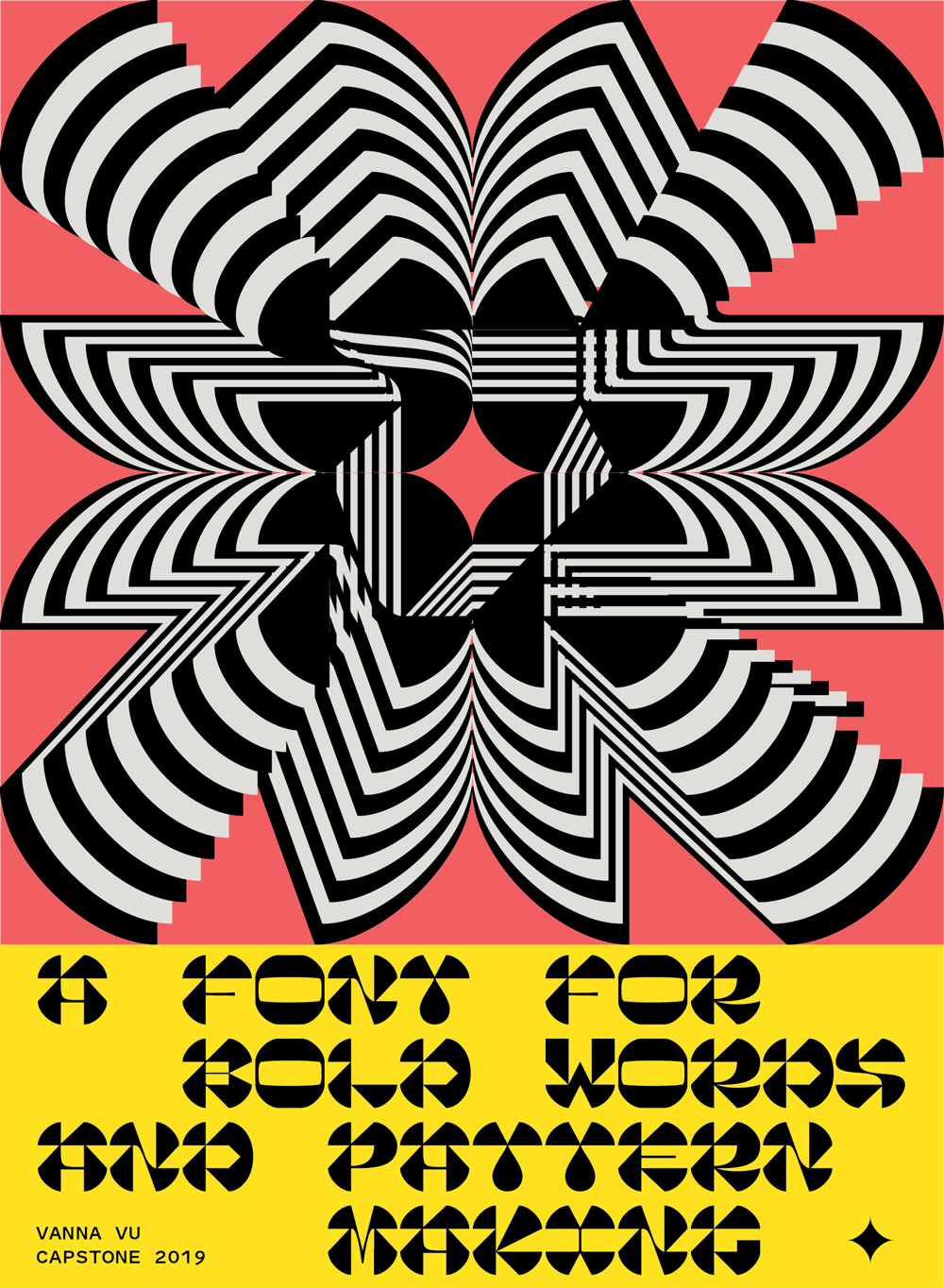
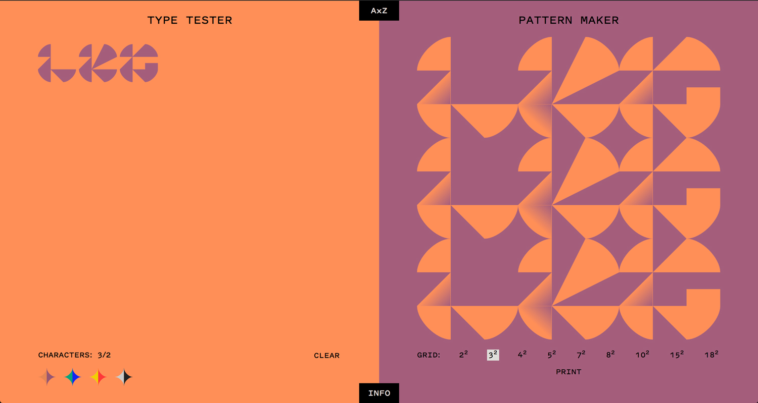
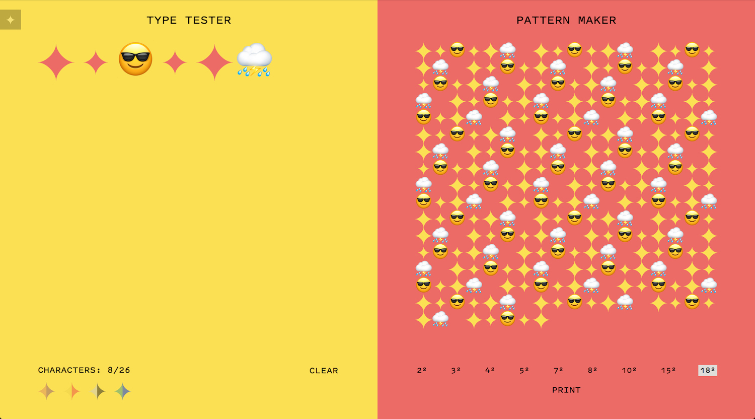
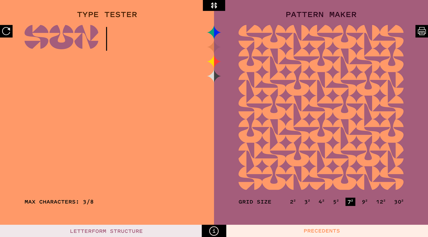
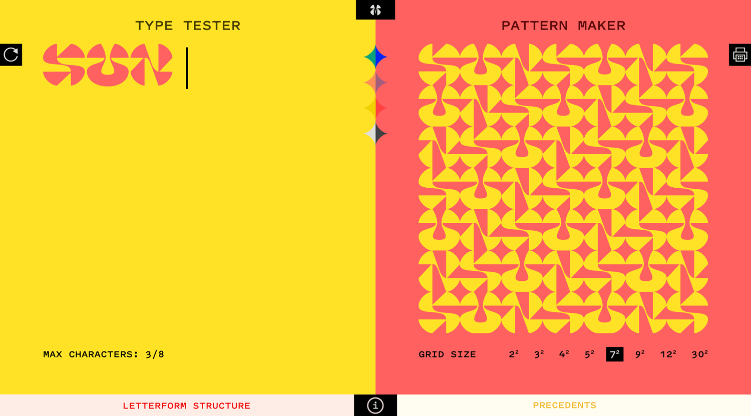
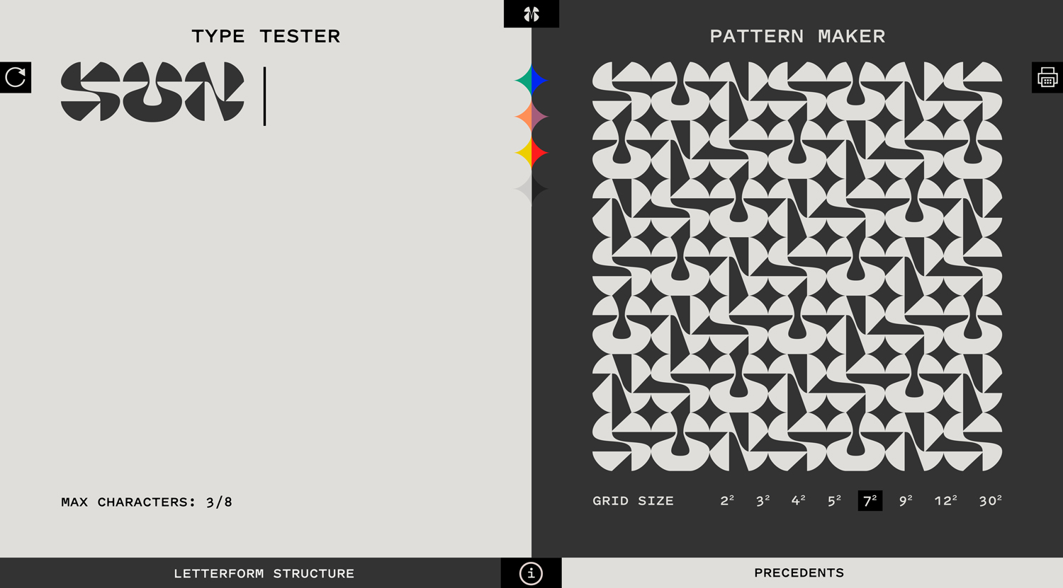
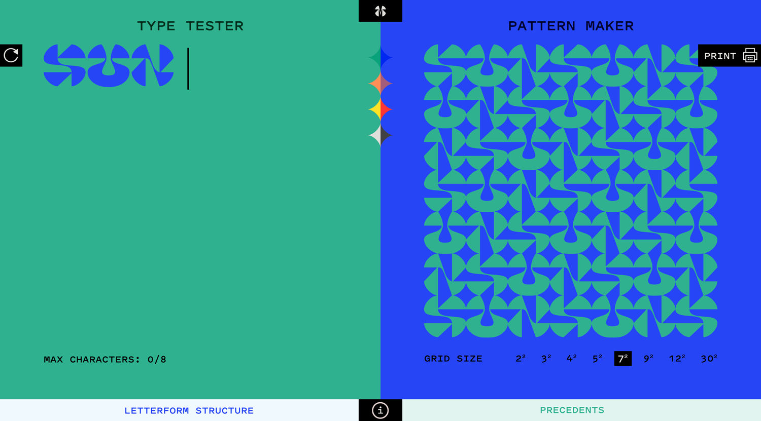
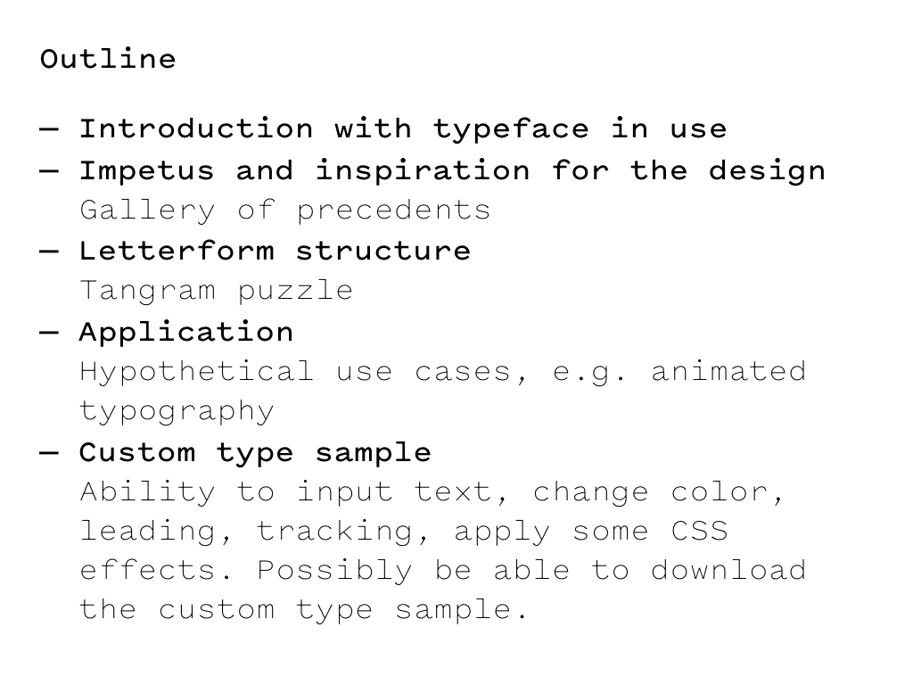
My capstone is two parts: a typeface for display text and pattern making & an interactive type specimen website
+ some context from the previous semester
4.04.19
Attempted to make some GIFs via After Effects for the letterform structure diagrams, but it’s not worth the time trying to plot the points in the right place. (Or at least that’s not the priority at the moment.)


funky accidents
I have also started listening to Sonic Youth while working. Quite a shift from Philip Glass and Steve Reich. (This project is due next Friday.)
4.03.19
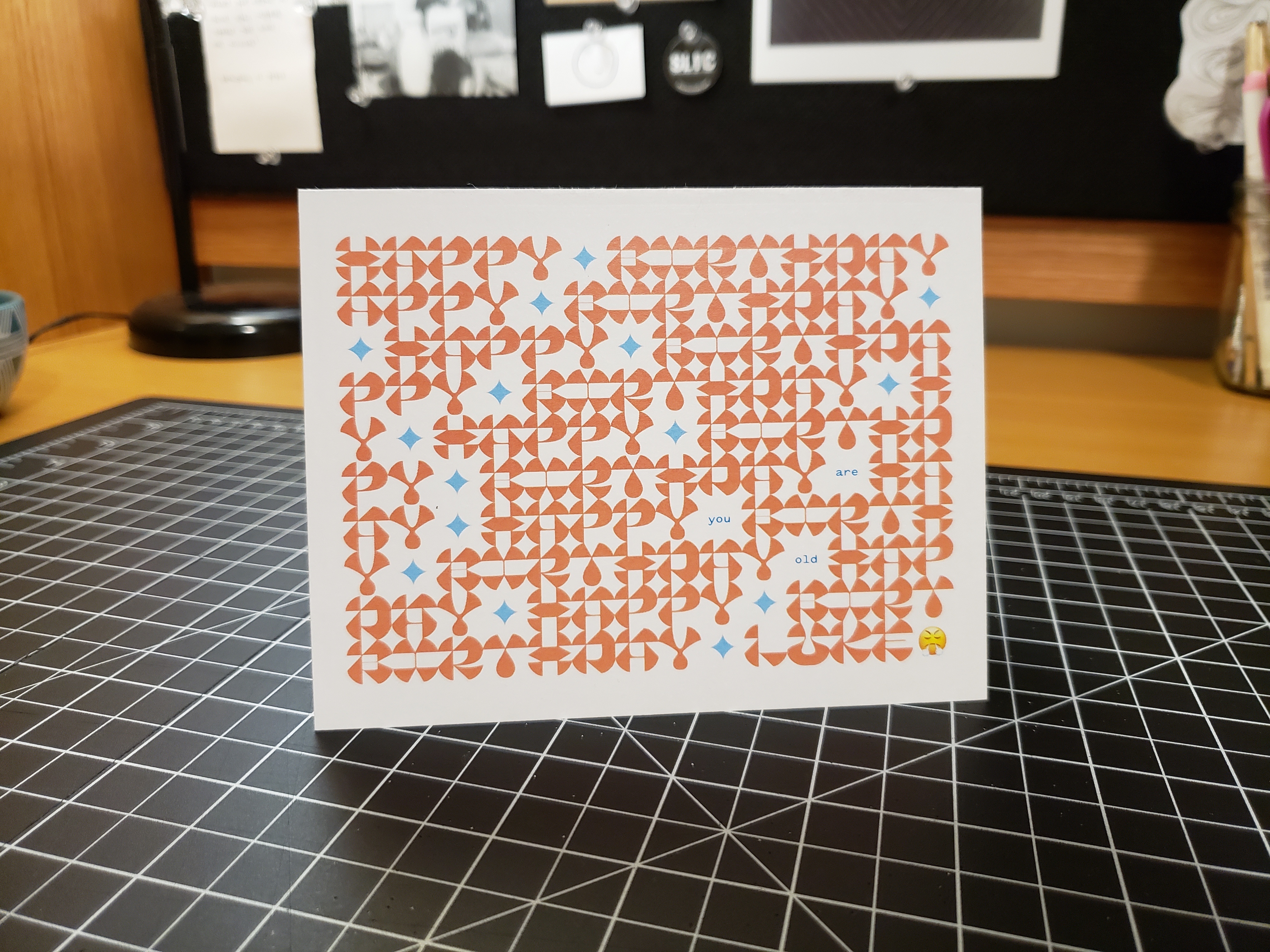
Wholesome procrastination: in use for my brother’s birthday card. Still need to fix the H and B.
4.02.19
I am kind of stuck on how to write the Letterform Structure copy because my font technically isn’t done. I am also wary of retroactively applying influences. And of accidentally writing an entire research essay instead of a digestible/accessible amount of content.
So I am using this blog to start writing, then I’ll sculpt it from here.
Last summer for my internship I worked on a geometric slab serif. Those forms are ingrained in my head. It was a good way of studying basic serif construction/placement. Toward the end of my internship I thought of drawing a dumb super slab, and its initial physical manifestation was a birthday card for my brother.

Then at the start of last semester, we had a CSS typeface project (making type only with HTML and CSS). In one of the 3 intial sketches I took the super slab, cut off its slabs, and geometrized it.
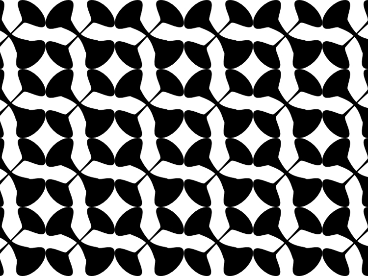
I went with another direction for the CSS typeface, but spun off these forms for a window resize project that involved creating patterns with these geometric letterforms and transparency.
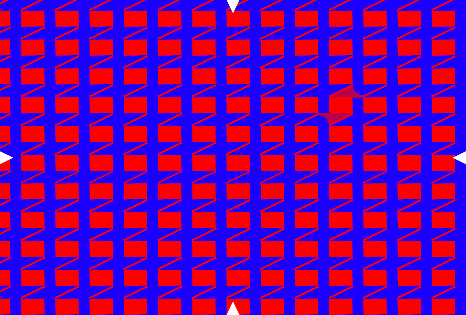
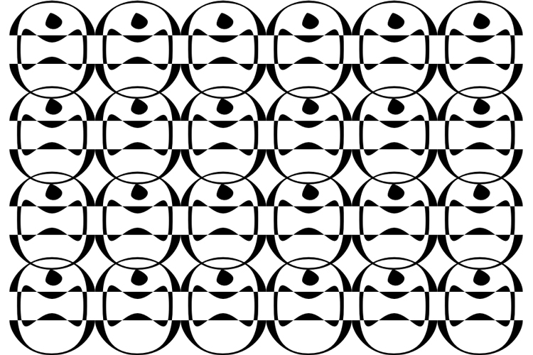
pattern made from overlapping o’s
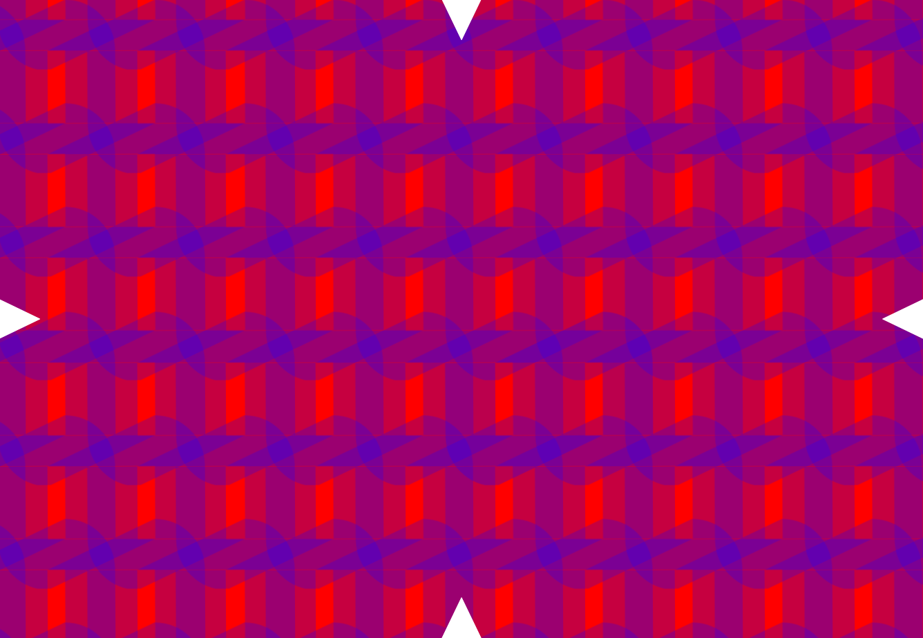
transparent o’s
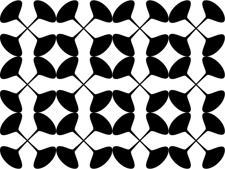
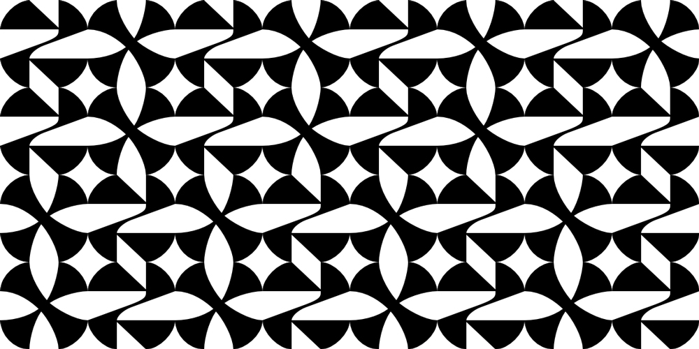
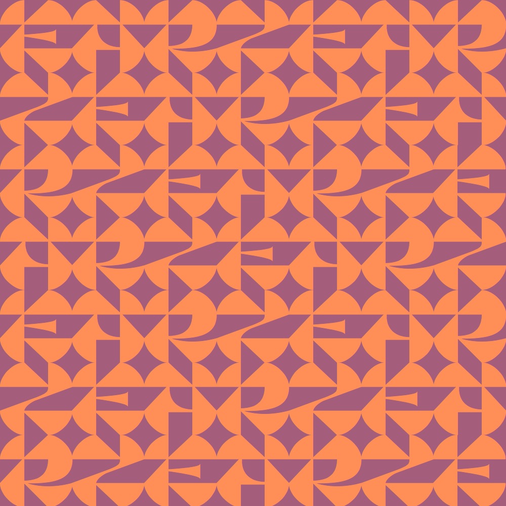
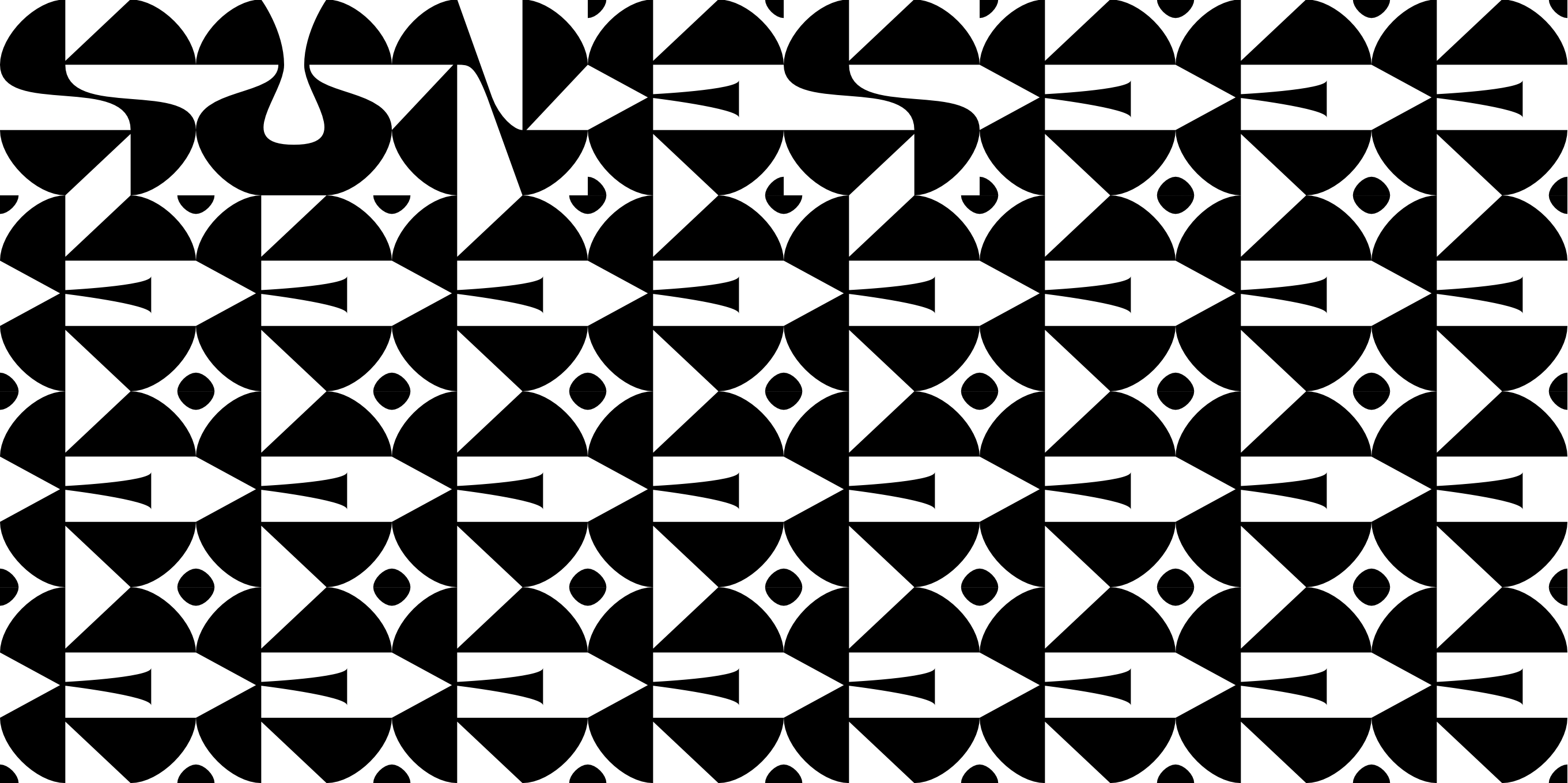
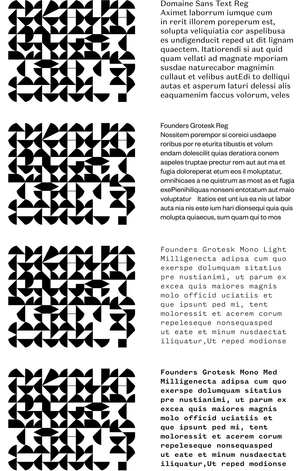
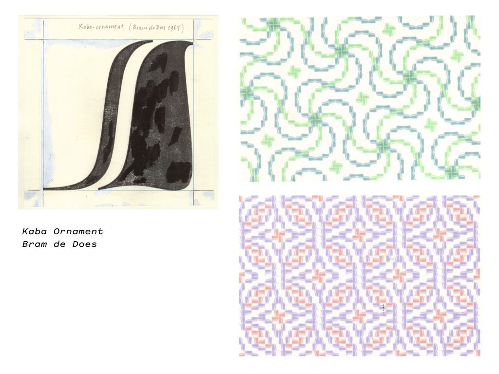
I made the grid into a 6x6 square since squares are more flexible for pattern making due to their greater range of symmetrical properties (rotational, symmetric, mirrored — both Zuzana Licko and Bram de Does talk about this in their patterns). Using proportions with rational numbers (e.g. 1:2, 3:4) also makes makes math and fitting easier.
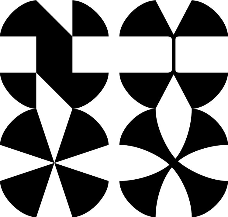
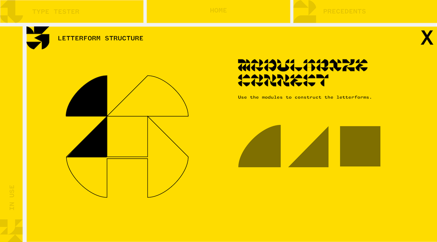
I abstracted the letterforms even further by using squares, right triangles, and quarter-circles. As mentioned earlier in the blog, these forms are more like tangrams than letters. The current step is massaging these shape configurations into whole letterforms that also work within a pattern. Letterforms are nuanced but not necessarily strict. It’s quite beautiful the way reading works. That is the human element to all typefaces: optics. It’s why captchas exist.
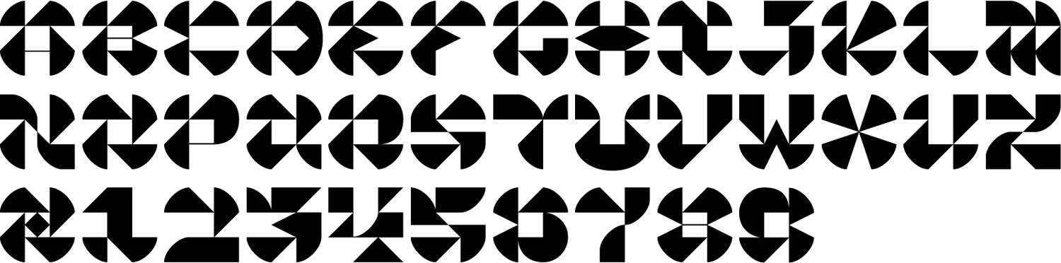
semi-updated/in-progress set (the C, J, & 2 look huge!) — got a lot of sketches to digitize
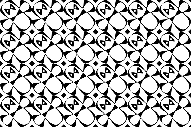
Adding curvature to the letterforms also changes the tone of the font. I haven’t thought of the right adjective for it, but the funk level is slightly increased. Monospaced and geometrically derived forms don’t have to be rigid or sterile.
—
Well, I basically just wrote the outline for my copy… Writing in a type editor is much less stressful than a Google Doc for some reason. Now I just need to add where the precedents fit in along with more images of how the font is structured to work as a pattern. (And to make the writing tone a bit more intelligible.)
3.31.19
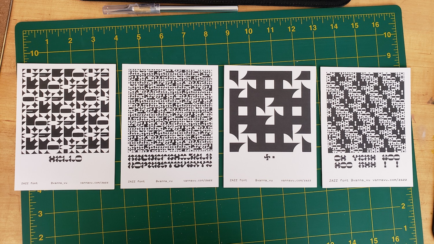
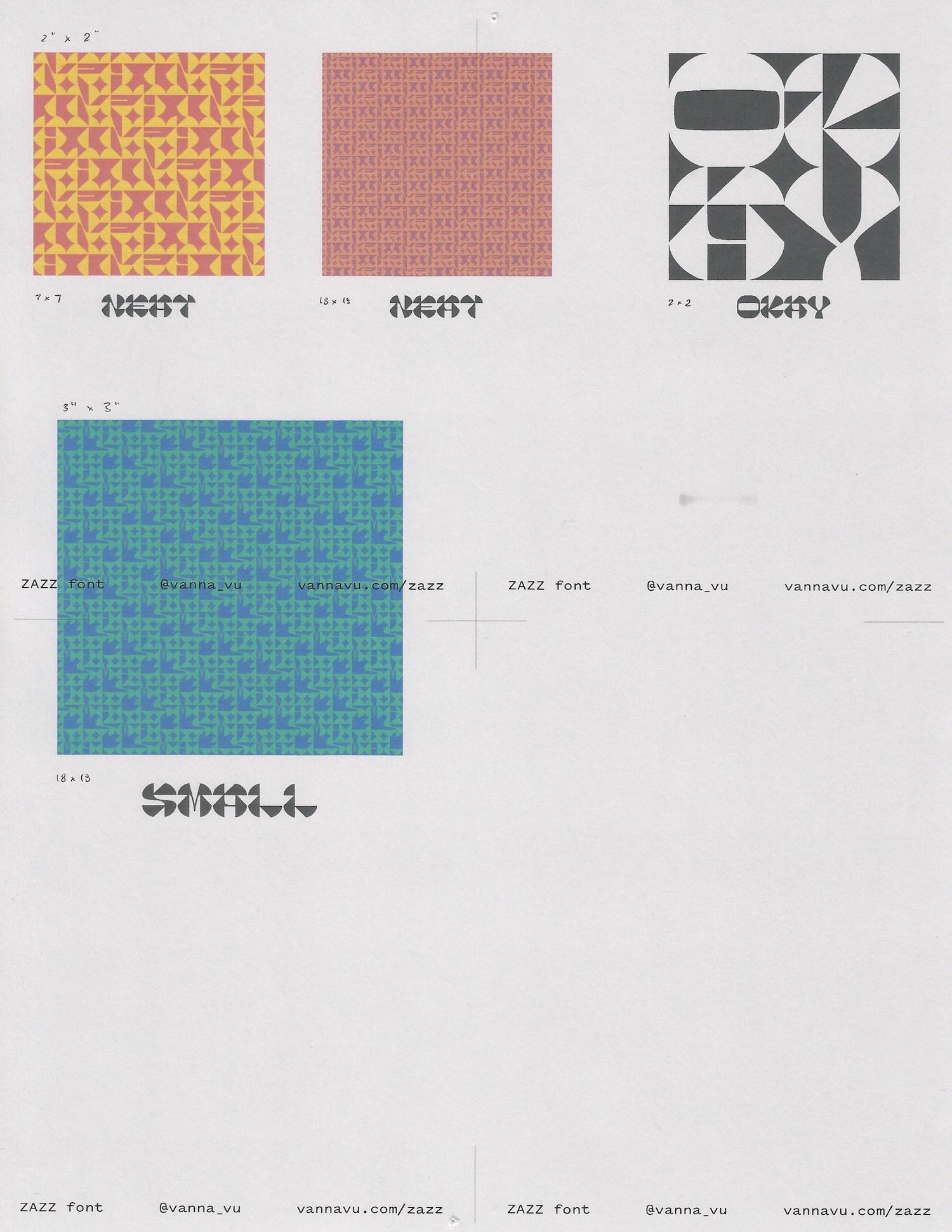
Worked on layouts for the print-outs. I made them smaller, quarter-letter instead of half-letter. They look even more like polaroids now, so I’m going to try flipping the layout upside down to dissociate that.
And these are scraps that I kind of like the composition of:
scan of print tests; darker black laser print over inkjet on gray cardstock
sketch of the book attempt
3.30.19
The mistake I made with this book is that I have been thinking about it for over a month, but have not been making it. Classic mistake. Oof. The issue is that I don’t clearly know what I want the book to say. I want it to be an expression of how my font can be used in a poetic way, but that’s a vague goal.
The first compelling idea I thought of was to make a cubular book and to print a pattern on the fore-edges, along the idea of these books:
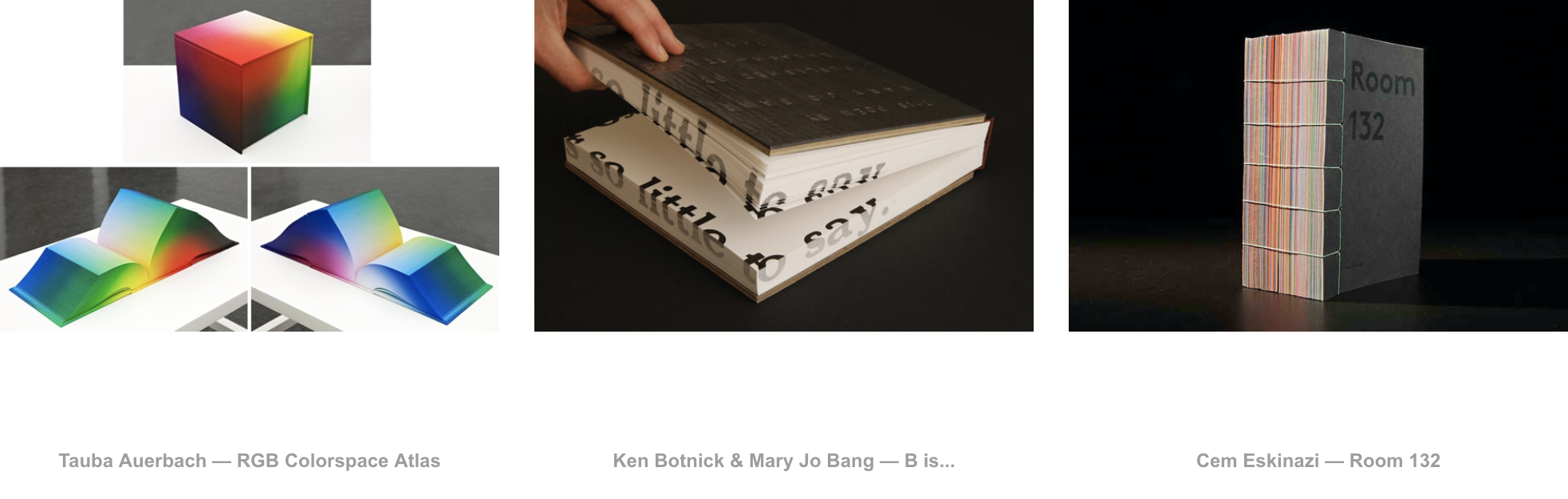
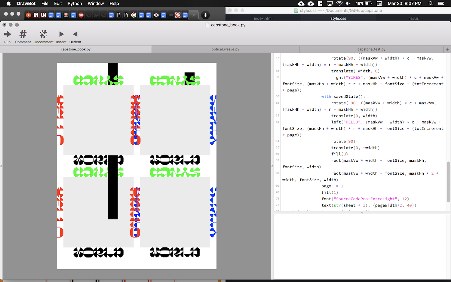
I forced myself to make some attempt at this book, so I wrote a DrawBot script for fore-edge printing:
book models, craft withheld
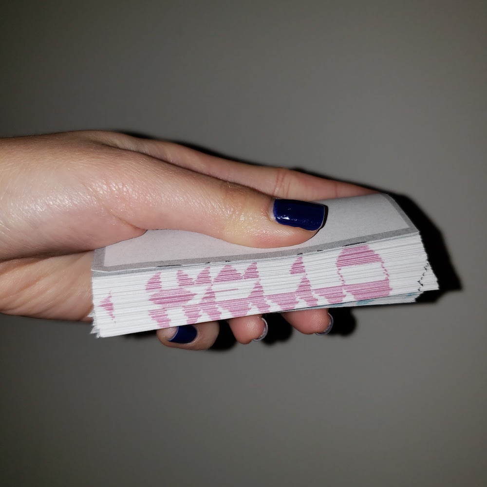
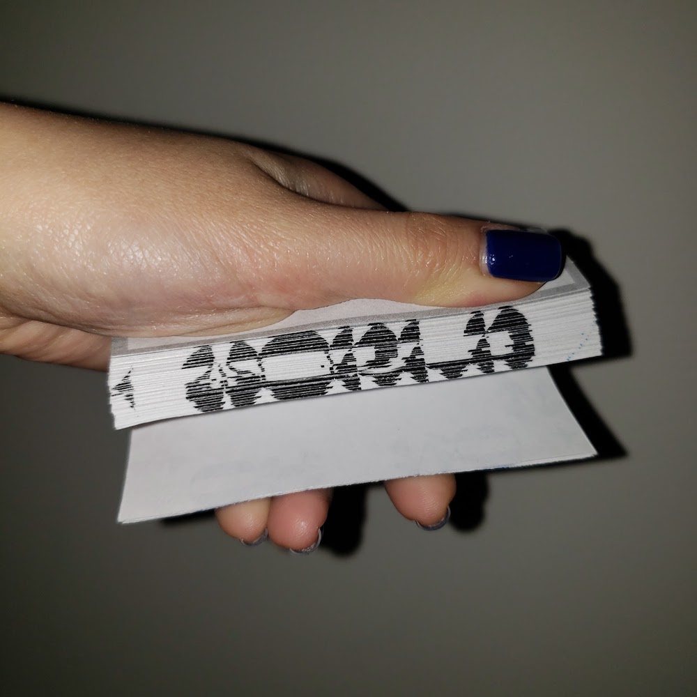
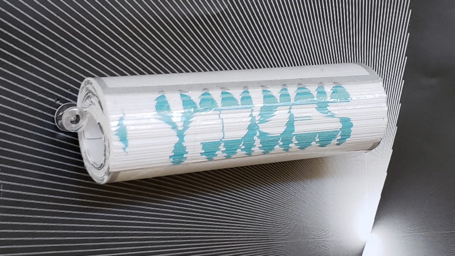
If the fore-edges were squares filled with text set in zero leading and letter spacing, the words would not be readable. Opening the book to a page would be an act of adding space to make the content legible. So it plays off that binary concept my website also has. But it feels like redundant idea. I want the book to say something else.
I was thinking of using Japanese stab binding since it shows off every fore-edge. My issue with that is that to me that binding is very tied to Japanese culture, so it always feels off to me when it’s not used for such content. I’ve thought of trying to find more industrial materials in place of linen thread, like a thick, clear, rubber string. All of my thoughts have been very much about form, but I can’t think of content. Last semester in bookbinding I got used to picking content for the binding type, which ended up working quite well. Usually one chooses a font to fit the content, so going the other way around is proving to be difficult, especially since I made the font.
I need to do more research on that to find what language will fill the pages. Writing my own content won’t be quite possible at this point with the due date looming ahead. I also don’t want to put out a book unless I believe in it, so this may be a summer project.
I rolled up the book model and taped it to make A Useless Object for a Useless Font. Then I made a bunch of dumb videos attempting to make the object useful, like calling it a 50-ply compostable straw. The form and language actually guided my decisions with those, but there’s a reason why those videos were ephemeral Instagram stories and not on this blog :)
3.22.19
The working name for the font is now Sine, but I’m still not feeling it because of the strong mathematical connotation. I may change it to Sein which means “to be” in German. I am just not looking forward to questions of “why did you name it that?” I have a feeling that “why not” will be an insufficient answer to most people. I could rebut with “what would you name it” but I am not really feeling like being that person either.
Too much talk about feeling — what works?
Obviously I am just frustrated that I can’t think of a good name. I am making excuses in case I end up with a mediocre one.
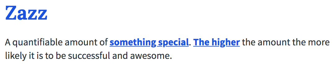
I have been thinking about nonsensical ones that sound the way the font looks. Like AZZA (huzzah?). Azzaazzaazzaazza. Which has led me to Zazz, as in pizzazz. Upon “research” of pizzazz and zazz, I am tentatively sold:
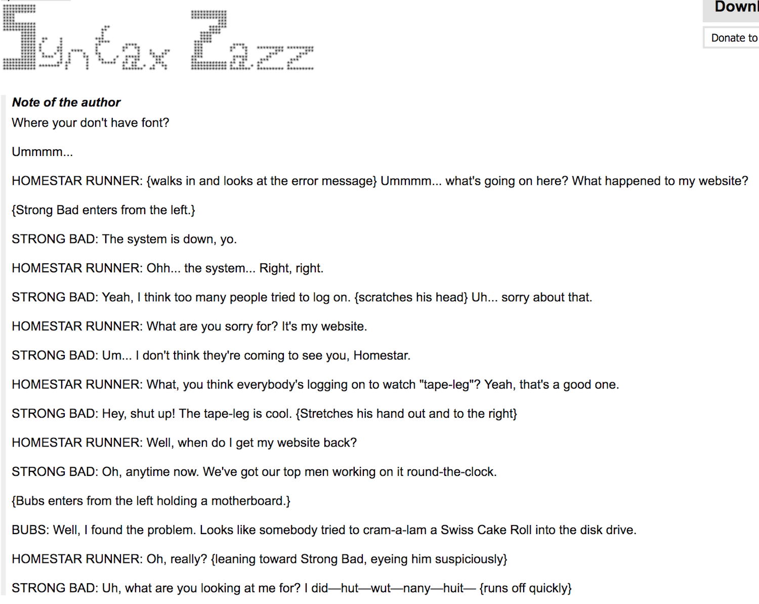
Homestar Runner was a little bit before my time so I have no idea what’s going on with this dialogue — dafont.com
I have never described a pixel font as gross, but Syntax Zazz is gross. The person who made it has named themselves Font Bureau on dafont.com. Good god. Main point is there is not a font out there on the internet that’s just called Zazz.
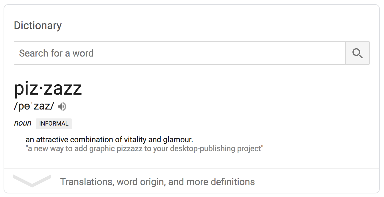
Google — very much wondering if the use example is algorithmically curated
I am vibing with these definitions:
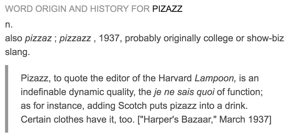
dictionary.com
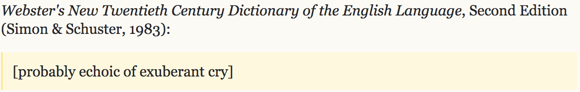
english.stackexchange.com
Echoic of exuberant cry. That is GREAT. ZAZZ IT UP. At one point I did want to name the font Echo but Typotheque beat me to it.
…And more:
urbandictionary.com
oh no :(
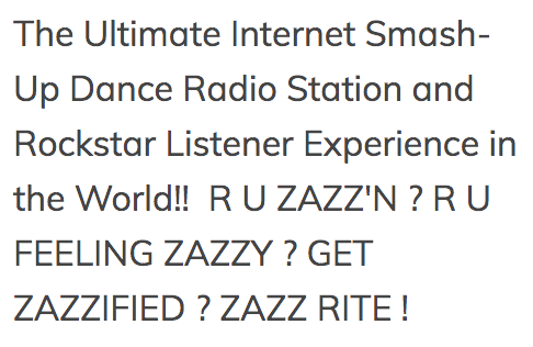
ZAZZ radio station: boy do I have the font for them
3.21.19
Came up with a new T. The bulb/tear drop fits the tone, but I think it may be too pure of a shape? I’m getting better at forgetting the rules of the original system and not overthinking letters.

top: new version, bottom: old version
I’m also getting used to the O. It’s not awful. Just need to smooth out the plateaus. People also keep saying they don’t see much wrong with the font and that I should focus on the website. What?
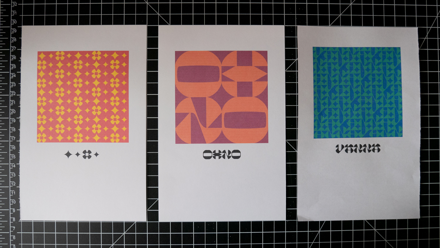
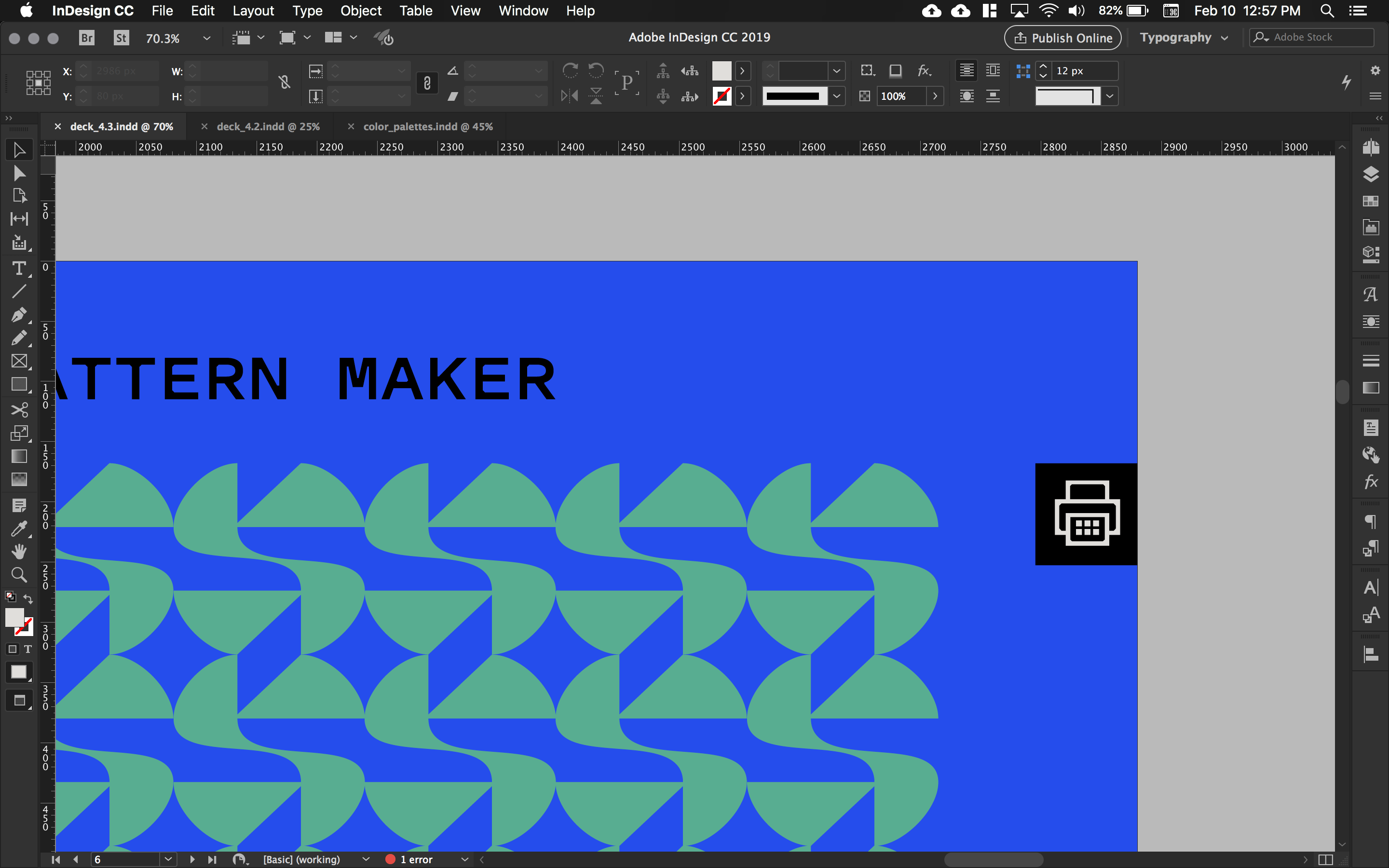
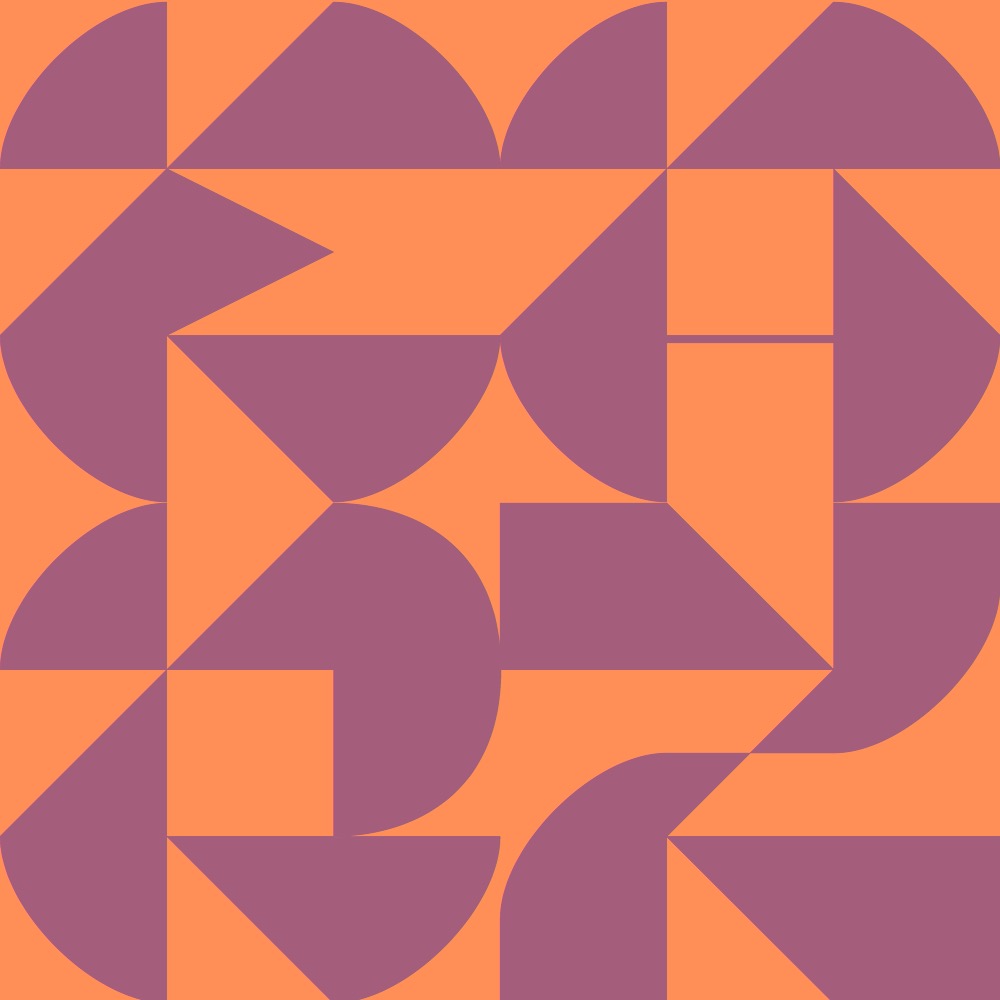
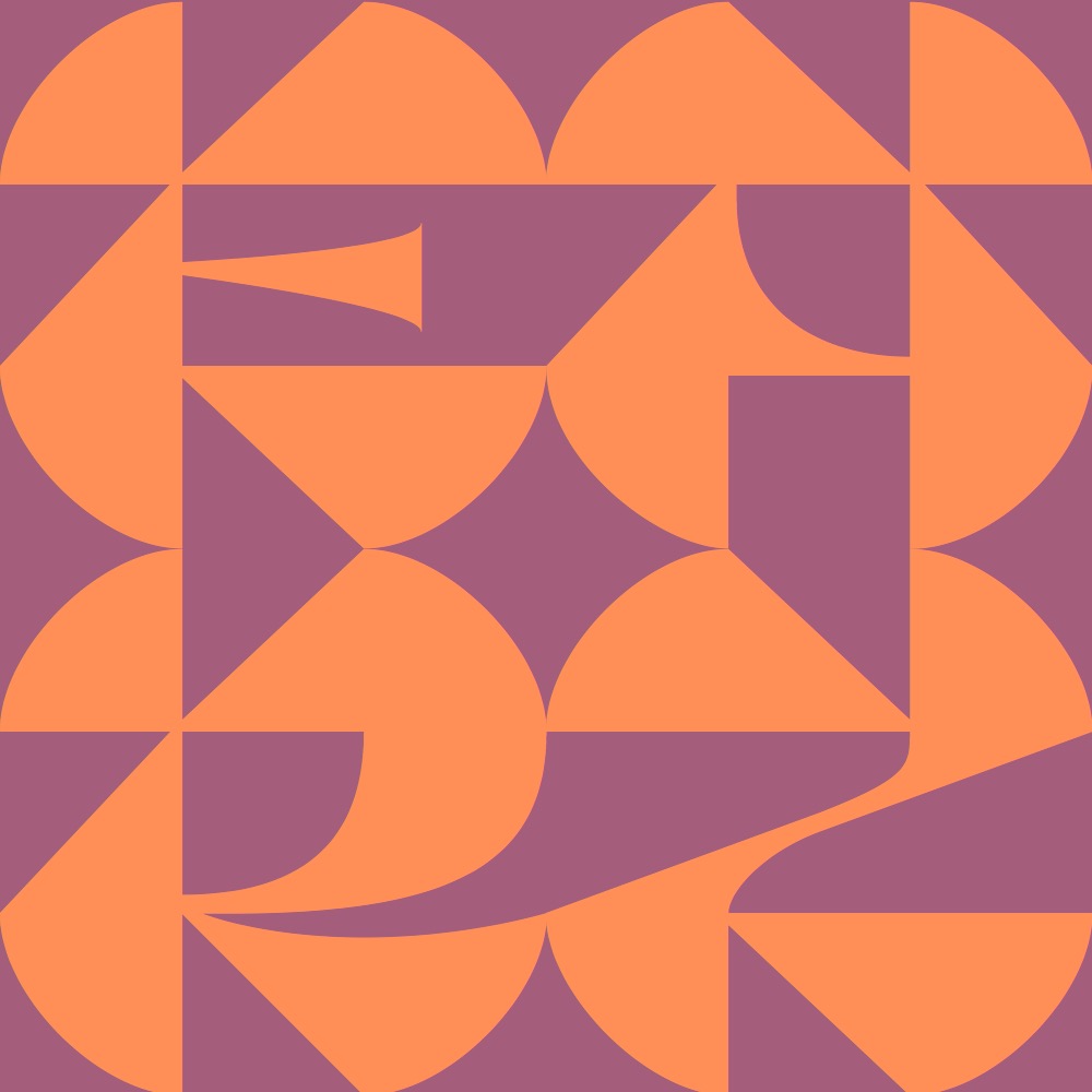
We also had an in-class poster session, and everyone spat out some quick drafts. For me it was an excuse to make more patterny goodness. I don’t want the poster to be a 1-to-1 of the website really. The poster is another opportunity to show the typographic potential of the font. I am having a lot of fun with these colors and letterforms!
Here are a handful:
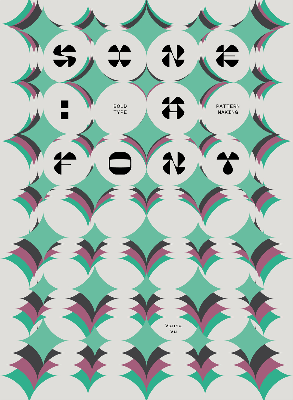
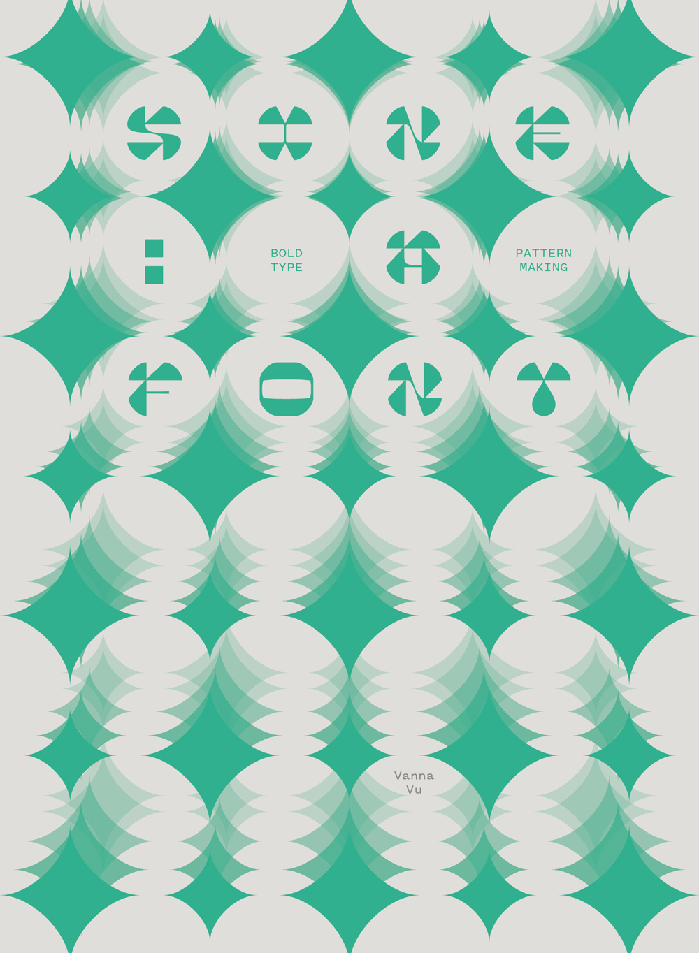
if I knew how to screen print…
3.10.19
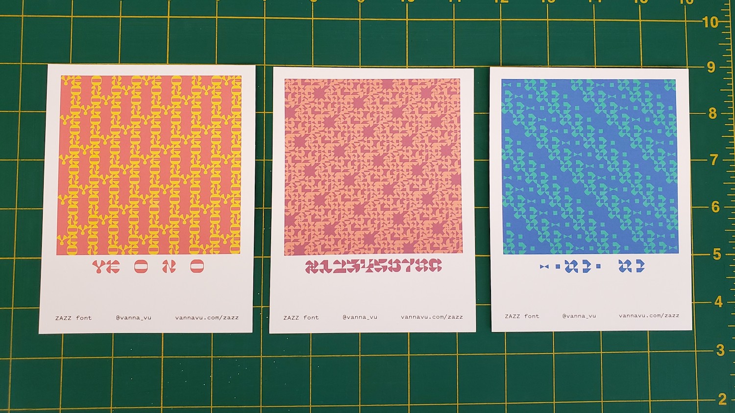
Layout is still in prog, but the colors actually printed closer to how they look on screen than the laser printers at school. From a reasonable distance, the print quality is acceptable. Looking at these makes me wonder if they should resemble polaroids. Conceptually there is no meaning, but formally and mechanically it makes sense.
the 6 year old $30 inkjet still kicks
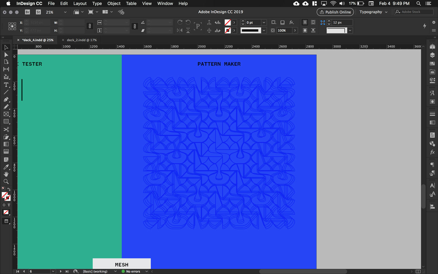
Everything is taking a chunk of time to get working, unsurprisingly, but it does make the payoff feel that much more satisfying. Formatting how a piece of the website prints is an opaque step above how HTML or CSS code will look. Also glad I don’t have to buy ink. But I gotta buy paper so that it all ties into the website.

L: French Paper Grout Gray, R: website gray
Been looking through French Paper’s catalog, and Grout Gray looks like a perfect match for the gray I’m using on my website! Just debating what paper to get for my book, which I have yet to make a model of. Since the current idea is a cubular book, that requires a good chunk of paper and thus not a small amount of money for one book. Maybe I should make two so that someone can buy the second one… I feel like if I’m going for this sculptural artist book, everything has to go all out too. It should be archival. Or maybe people will actually pay $5 for my font. If just 10 people did that, that’d be nice. That would cover the cost I paid for one weight of Pitch Sans.
Hm.
I added a section to the website saying that typeface is available for download by email request. Someone said to put “for sale,” not just download. I mean, why not make it a free/pay-what-you-want font? I’ve heard people say to hide your first fonts in the depths and never sell it. It’d be a cool to see what people decide to make with it though. The whole point of a font is for someone to interpret it and use it. I do still want it to be mindfully distributed, that way people know the context that this is not a retail font but a study in making type. There’s a lot to learn from seeing how people use your type, too.
3.09.19
Various intermissions from past weeks:
a wild glitch in Chrome due to overlapping points in the font files!
3.08.19
forgot a curly bracket
3.06.19
There hasn’t been much to update on since all I’ve been doing is debugging web code and just refining the physics of the website. I’ve been doing more reading, watching, and listening again about people’s typefaces, especially in preparation for writing the copy explaining my typeface structure.
Kris Sowersby of Klim updated his write-up of Maelstrom after releasing the sans version, and lo and behold he linked to DJR’s reverse contrast repository, Backasswards 🙏 Never have I been so happy over a slideshow.
Update: found a video of DJR talking through the slides:
2.27.19
The Unicode character database is a QUARRY OF POSSIBILITIES.

Since my website globally changes color, I have been trying to figure out ways of making it easier. Instead of using SVGs, I made some alphanumeric characters for part of my website. Fun stuff.
2.22.19
Today I had Ben Kiel critique some of the curved letters against the initial drafts. Got good advice on how to deal with round letters like U and O. I’m also overthinking some of the letters, like H, in pursuit of creating nice patterns. He said the typeface was a combination of James Edmondson of OH no and Zuzana Licko. It’s no coincidence; inspirations show. Edmondson is the dude. His writing and talks about type design have very much affected me. Fonts can be funky. But I also feel like my typeface is very much something I would make.
I also got some technical questions answered and learned about the massive Unicode Consortium character set PDF.
In the spirit of Bram de Does, Ben also said the letters should maintain some swing. The new curved versions are going in a good direction. He also suggested that once I get the character set fairly down, I can generate some proofs to evaluate how well characters pair together and consequently play out in the pattern. Then I can create alternate characters for better patterns using OpenType.
Later he suggested also making a book using DrawBot. Dude. Now I’ve got to make that book. It’s actually a solid idea for rounding out my capstone since the website only shows instantaneous configurations and scaling of the font. A book would broaden the typographic possibilities and be an opportunity to make meaningful and poetic content. I also made some code-based books in bookbinding last semester.
2.21.19
Font Friday for this week was a Type Thursday. A lot of messing around to loosen up but also get somewhere, but I made a better I and X. The process has been a back and forth of sketching and vectorizing, I think because I’m still getting comfortable with drawing straight on the computer. At the end I’m going to scan all my sketches.
weird X’s, nice patterns
I & X
L: old, R: new
ZX — pretty pumped about this X
nonsense with O: ghosts & helmets
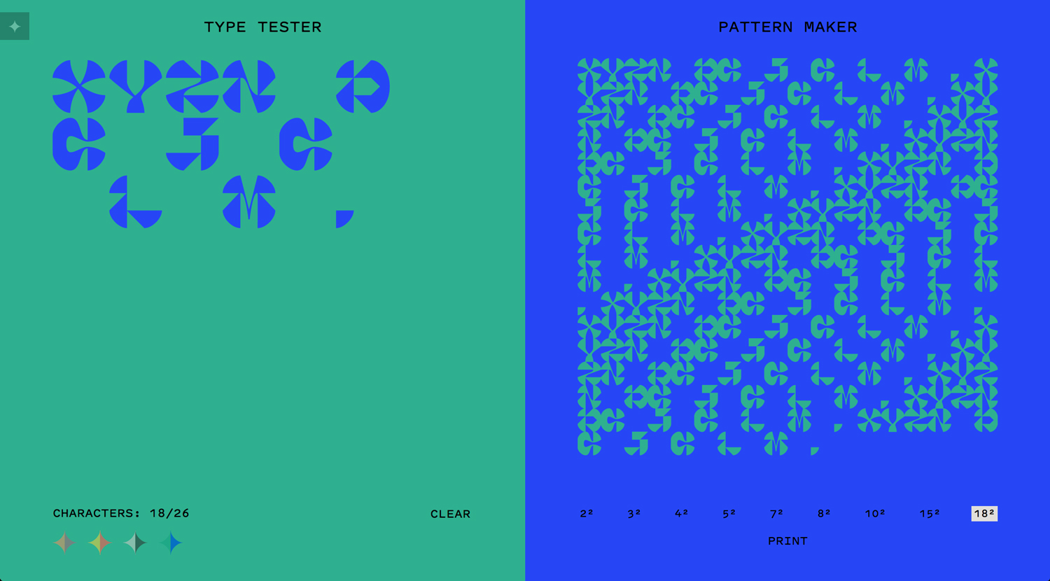
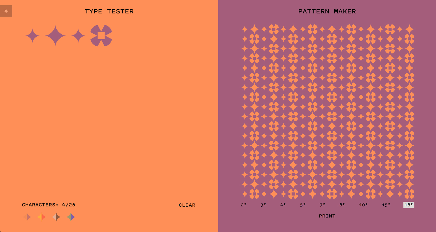
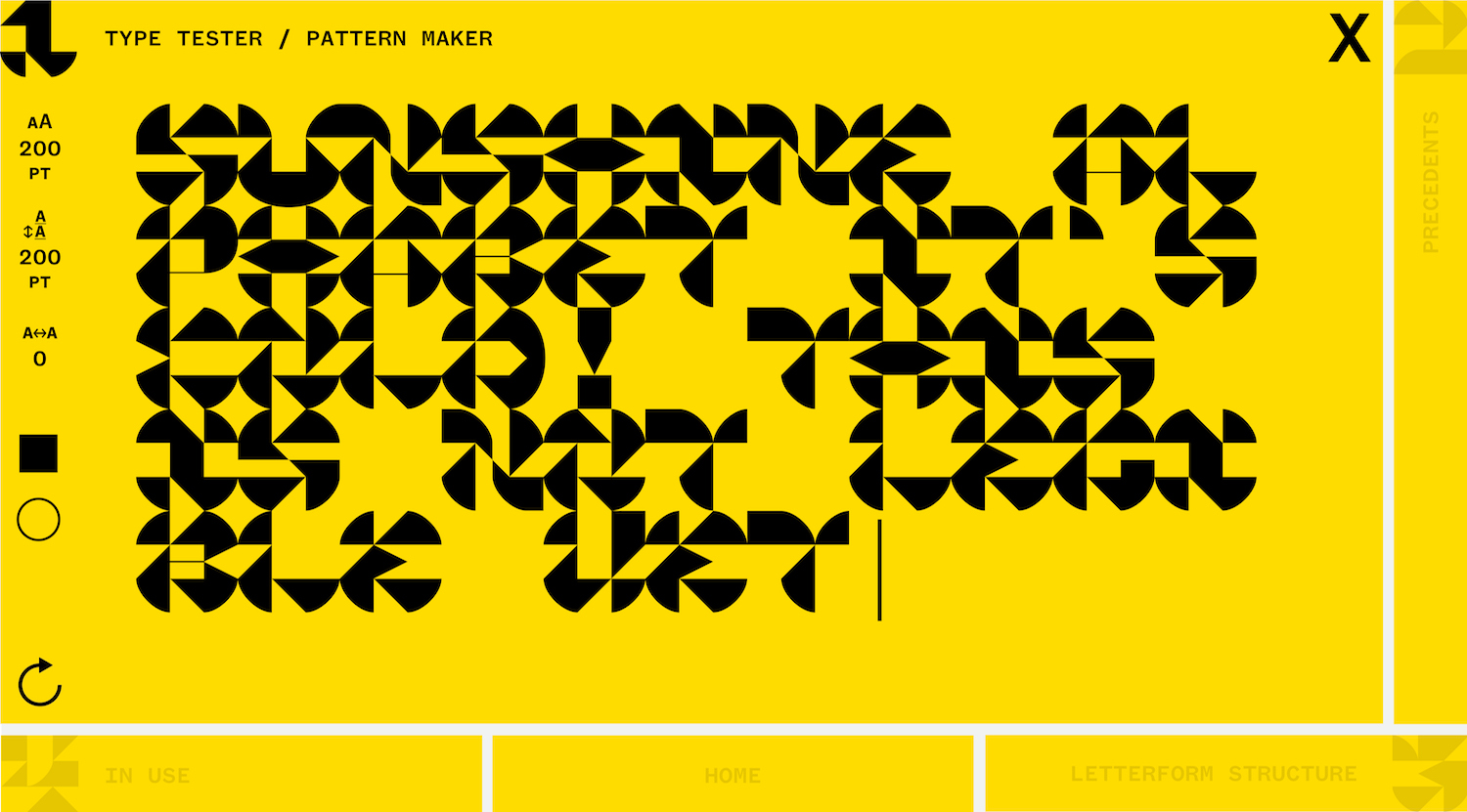
Some people also tried out the type tester. Naturally, the first thing they type is their name. Since the type tester is already so minimal and restricted, I’m not sure whether I should prompt people on what to type or just let them play around to figure out interesting combinations. The most interesting patterns I’ve made aren’t with real words.
2.12.19
Some updates to the deck:
hover flag-outs for buttons
The palettes are somewhat settled. The tricky things to work out are making yellow and light gray body text easy on the eyes, but I also don’t want to make the global color changes cumbersome with a bunch of variables.
The new navigation setup is also too distracting and the hierarchies aren’t quite right in differentiating between global and local. Thinking the icons are going to have to go too, though they were fun to make! Words are just more direct.
2.10.19
My self portrait, one of the first things I made after transferring into Sam Fox, still holds.
January 2017
2.09.19
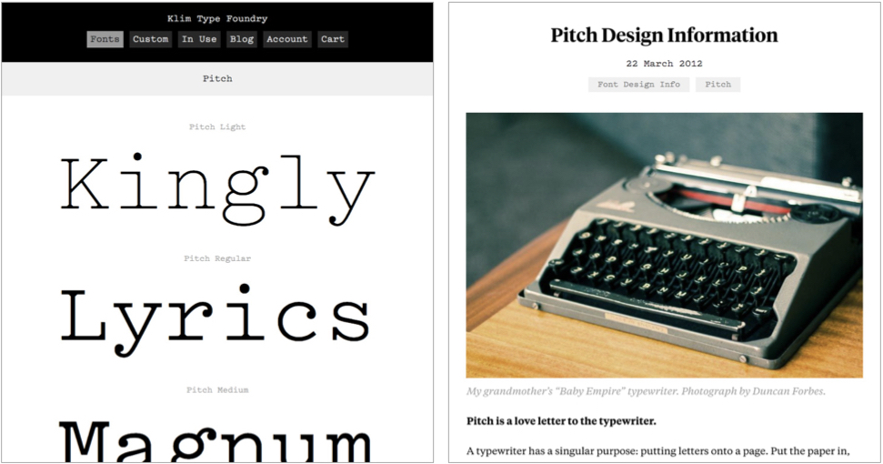
Made lil’ refresh and printer icons to match Klim’s Pitch Sans!
I tested several monospace fonts to find one that matched Pitch’s aesthetic and personality but that came with lining figures instead of oldstyle ones, but there really isn’t anything that pairs as well with my typeface that also comes with arrows (Founders Grotesk Mono: if only it had arrows.) The proportions of Pitch are squarer than a lot of monospace faces and it just pairs well with the slight funkiness of my typeface. Looks like Pitch Sans Bold will be the first font I officially buy!
Also working on names. Oof. The placeholder name is MESH but it’s not quite right. Perhaps AxZ?
2.08.19
Gradual letter updates from the latest two Font Fridays:
left: old version, right: updated
Not 100% sure about the new crossbar of the E, but it’s better than the initial one which looks like Demetri Martin’s nose. But really, the new crossbar is trying to match the new contrast system of thinned middles. It’s just awkward right now and looks like it’s about to snap off, and I’m not sure it quite works in the pattern.
EARZ
Also quickly tried some corner pieces (but it ain’t gonna happen):
2.07.19
Still got a lot more palettes to come up with to pick the top 4. Trying to test different forms of contrast (hue, value, saturation).
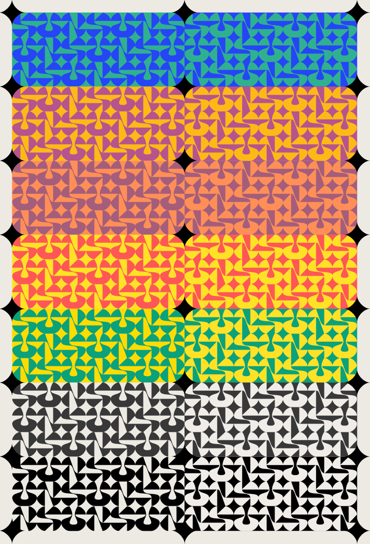
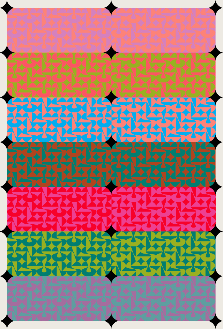
🌈 left: more legible, right: pushing vibrancy
2.05.19
…People like the deck! Main criticisms revolve around navigation and making things look like buttons. Excited to see everyone get to a point where we can all rally behind each other’s projects.
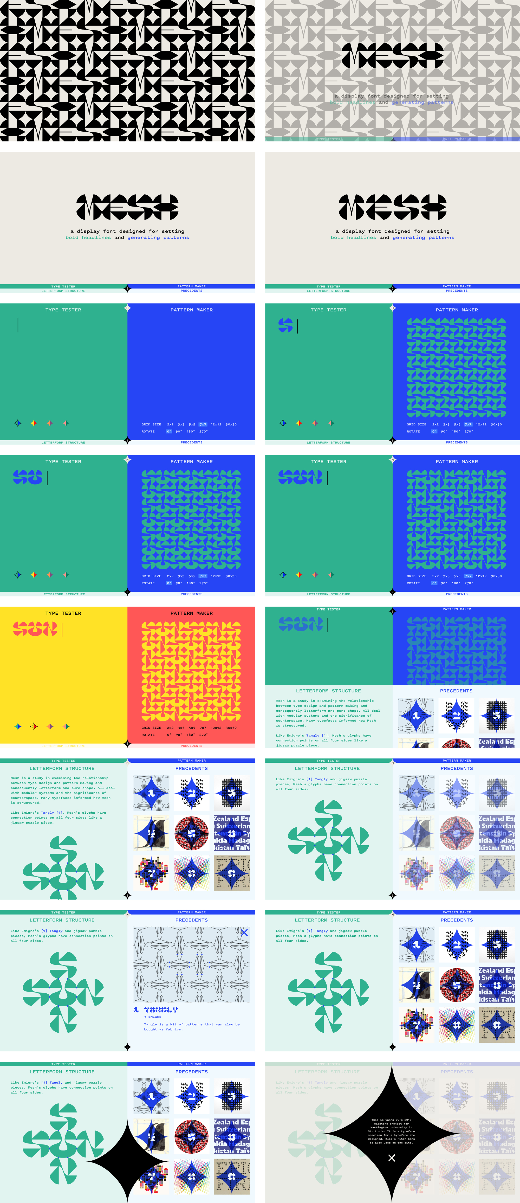
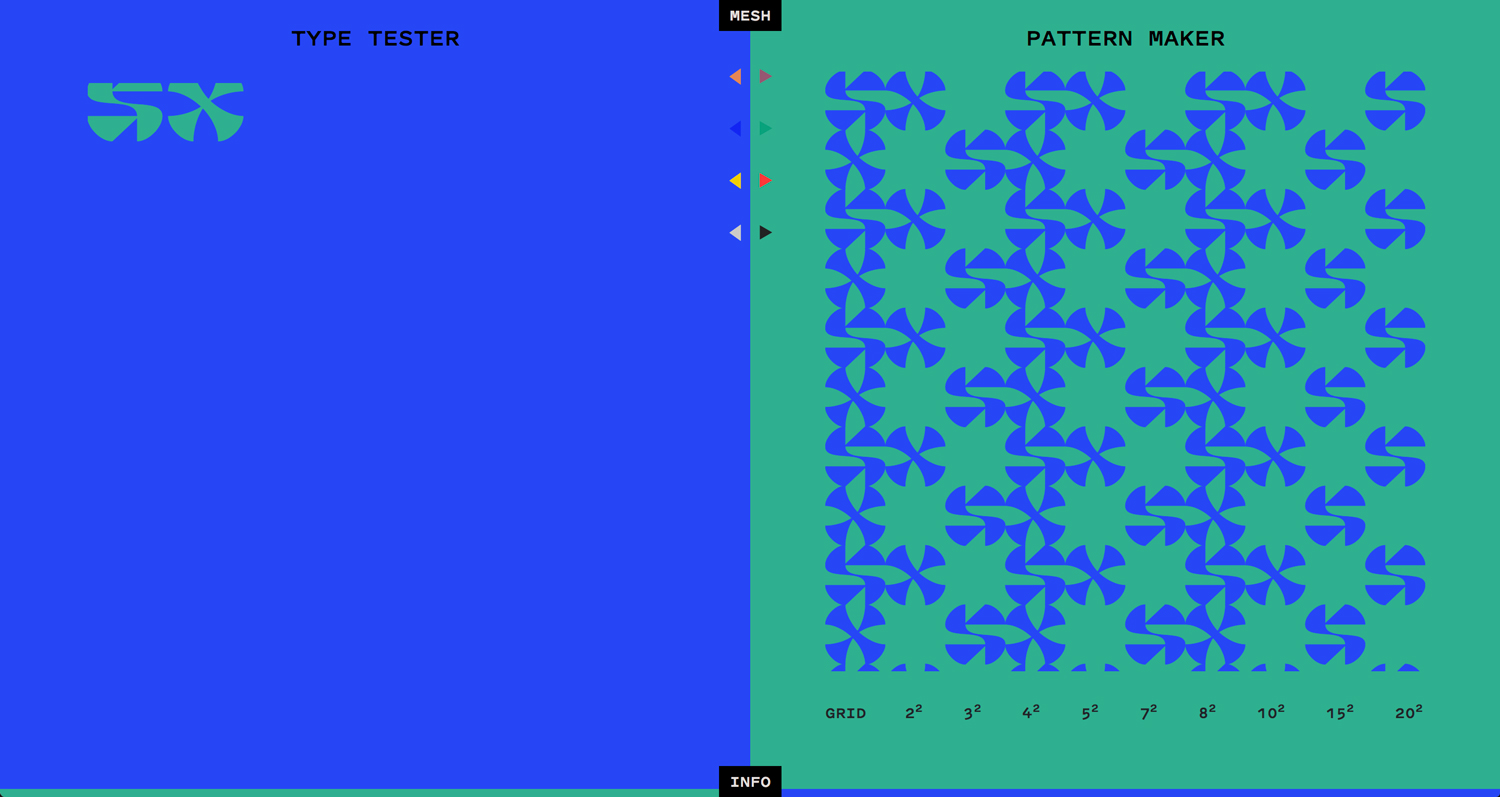
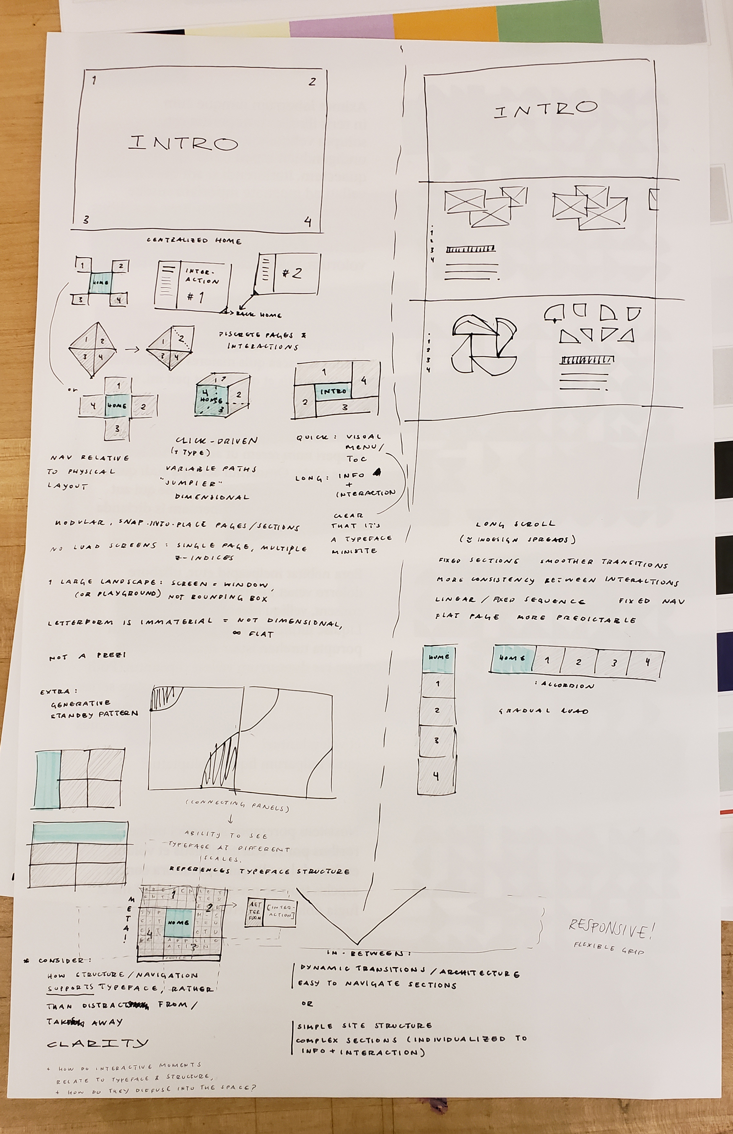
Jonathan’s critique on my first pass at the deck and small iteration after was to lean into a binary concept, as the typeface is for headline and pattern. After some sketching and looking back at website structure research, I got it. The split screen drives the concept and pushes me to think about how the two sides interact and how all the pieces are connected to each other.
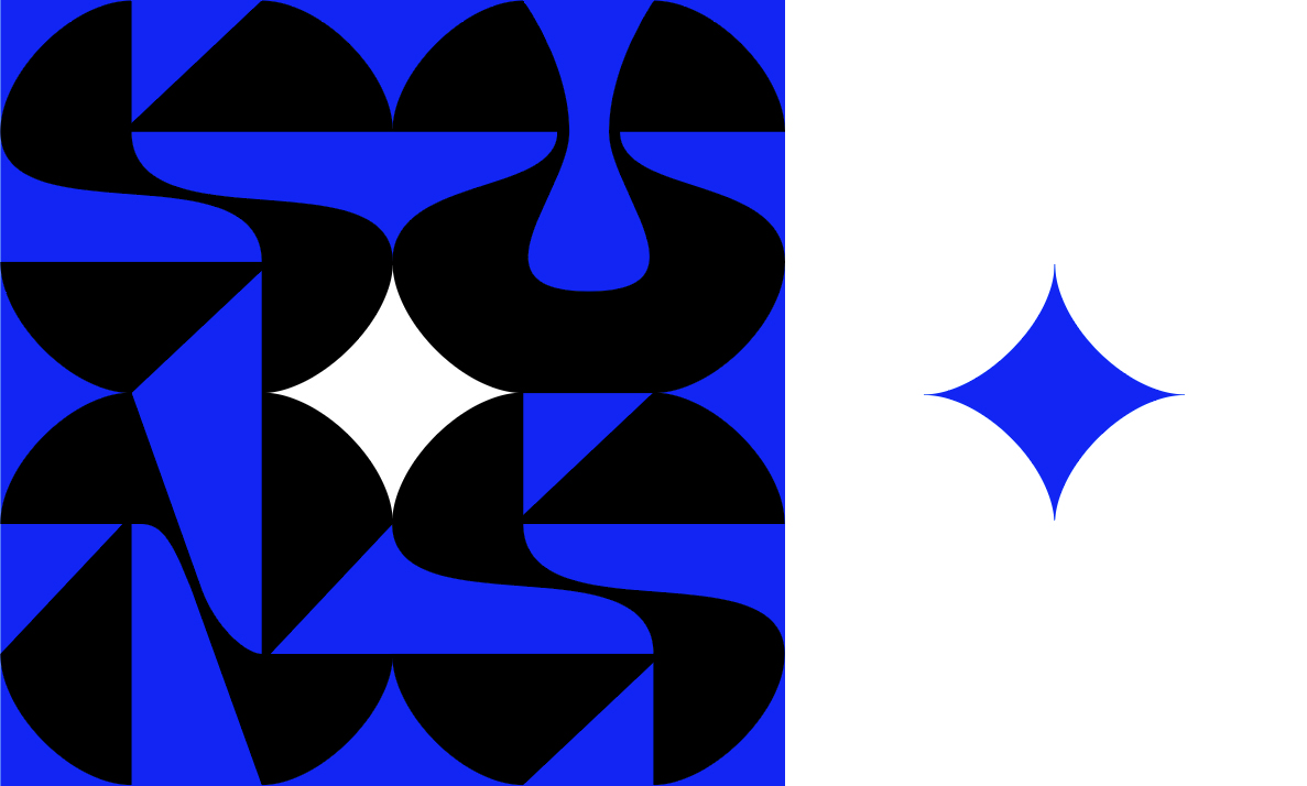
The type tester completely serves the typeface now and really fits the context of this minisite better than a generalized type tester. It still allows people to see the type at different scales, too. By reducing the number of buttons and explicit variables, the typeface concept is reinforced and clearly communicated.
In the beginning, I was thinking about making postcards/business cards like the illustrators do to hand out at the capstone exhibition, but the idea was brought up to connect a printer to my laptop so people can print their own patterns they’ve made. It fits the context of the exhibition well and people get a takeaway/exit from the experience.
oh hoo ha ho heee
2.04.19
WOO
1.31.19
Still trying to figure out colors.
1.29.19
First pass at the website deck: still thinking about what the discrete interactive elements will be and how they support the typeface. Right now they’re not that strong as interactions and still quite default. Still working out the aesthetic and the color scheme, as well as the navigation and page structure.
not quite the right tones: elementary, tribal, ornamental/jewel-like, New Mexican; by the end of this session it simplified, per usual
In this draft the structure was based on edges, the critical areas of the typeface. Since this is also a minisite with a relatively small amount of content, I tried to play with an alternative navigational structure with the edge-wide menu sections (it’d be hard to get completely lost in such a simple site). However the logistics of building it would be needlessly complicated and the logic of its movement is confusing without a diagram of the thinking behind it—it’s not clear enough or intriguing in the right way.
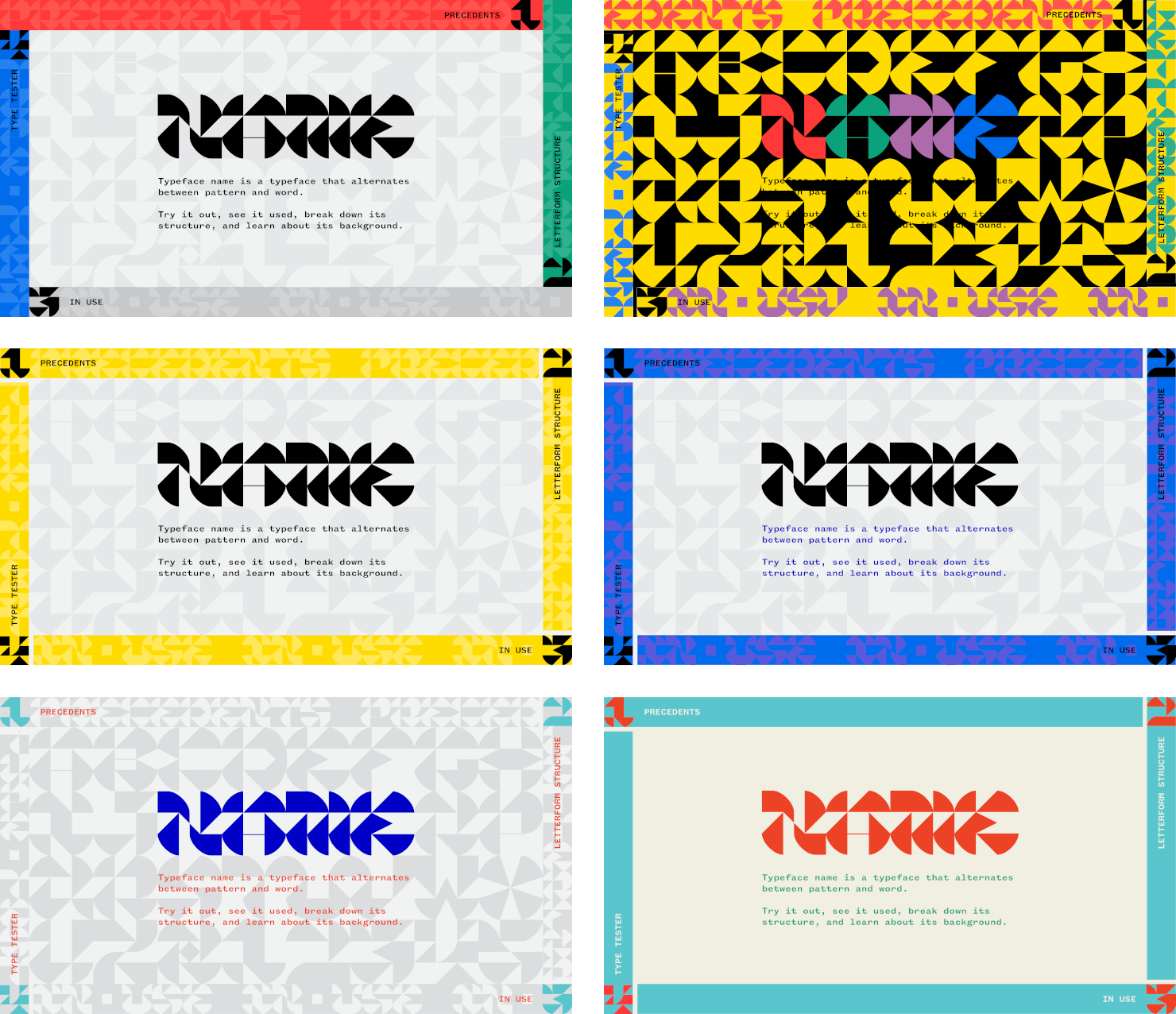
basic type specimen / precedent gallery
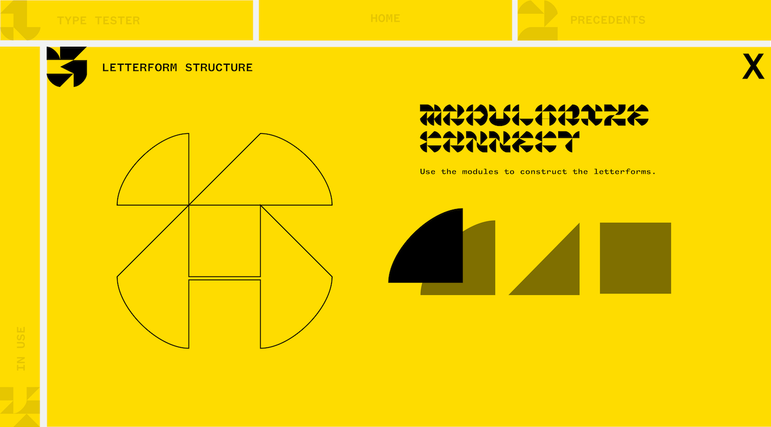
tangram puzzle to reveal structure rather than textually dictate it
Not really on board with these interactive elements since they don’t do much to convey the typeface’s concept—it’s still very much being interactive for the sake of being interactive. Also the color scheme points me to NYC taxi cabs, caution tape, and Buffalo Wild Wings.
Onward!
1.28.19
I hate the phrase “mood board.”
Here is visual research:
filed under “Capstone” on Are.na
The current idea is to use color to highlight/visually prioritize the interactive elements, with black and white supporting the foundation.
type pairing tests / website structure ideas
The two website structure ideas revolved around space and microinteraction. The first: click → large plane to move around (like Google Maps). Second: scroll → long scroll page. After talking to some people about it, the idea of a responsive/flexible grid came up, like this website, which was presented last semester.
1.27.19
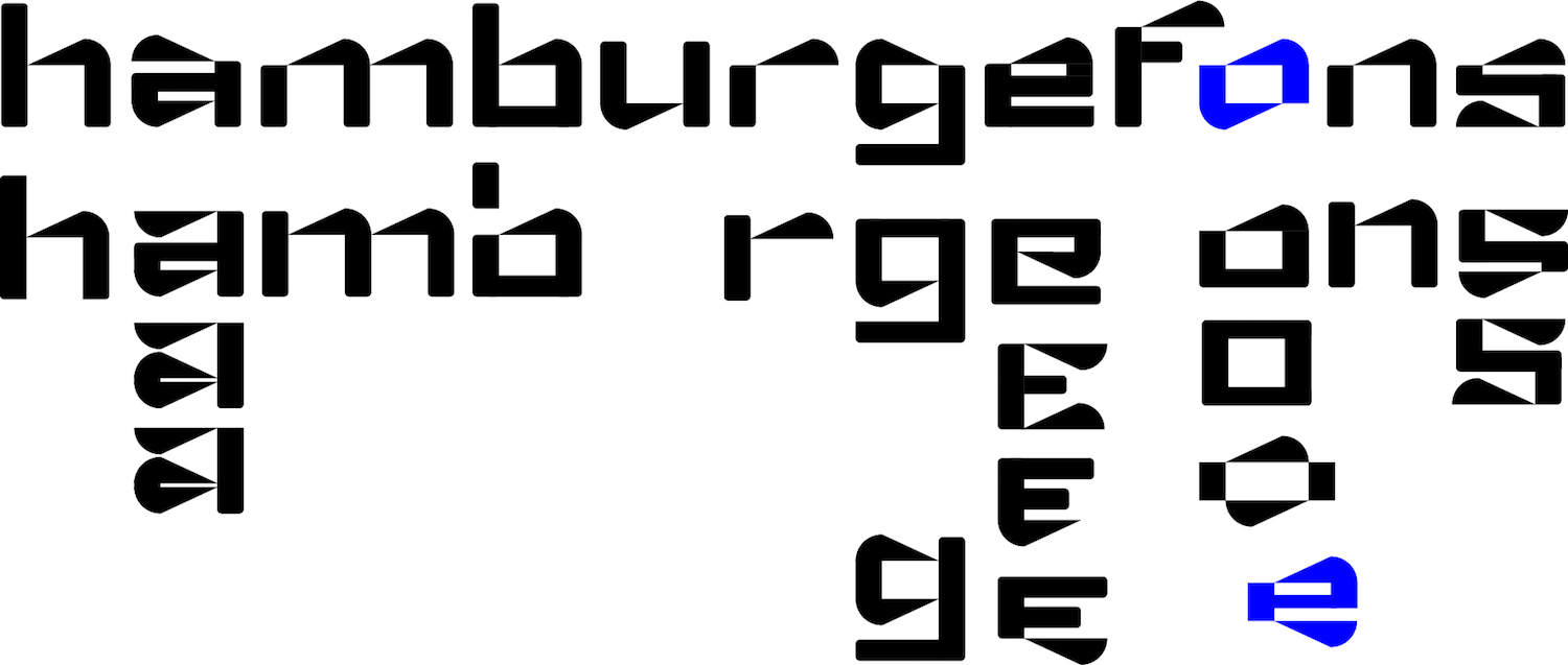
Started adding some curves and smoother connections between strokes and the rigor of some of the other letters is starting to change. The letters are more legible and the words are more readable. But the pattern also improved now that the letters are more consistent to each other.
left: old version, right: updated
I’m still a little skeptical about whether or not the pattern is quite visible, but I think since I know the letters intimately I see the words immediately. Scale is also a factor but there may be too much of a 50/50 balance of positive and negative space.
I’m also finding that the strength of the pattern depends on color choice to make foreground/background either ambiguous or distinct. Certain types of contrast can make shapes appear bigger (e.g. white against black vs black against white).

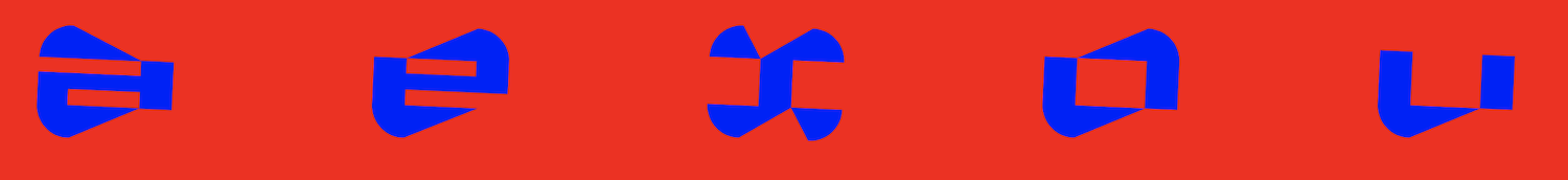
red: flattened U / blue: rounded U
I flattened the bottom of the U to create a consistent diamond shape in the pattern, but the round U may be an alternate for single-line typesetting.
1.21.19
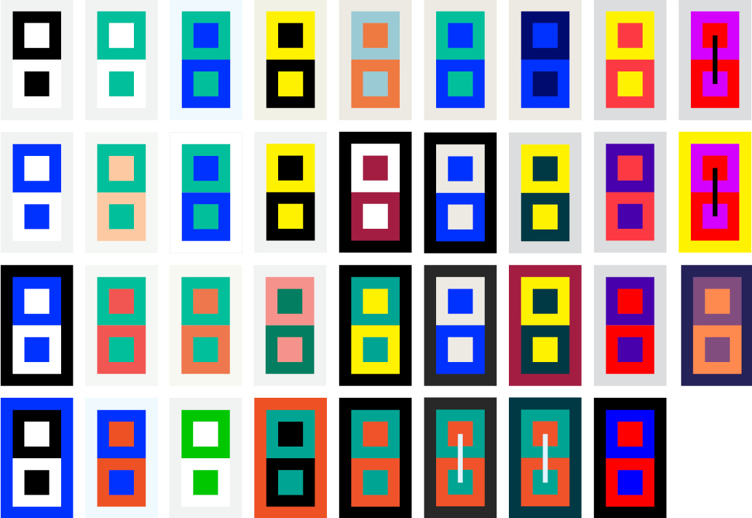
Made a bunch of palettes but none of them are quite working with the tone of my typeface. I’m really sensitive to palettes and a lot of them hold an association to something, so it’ll take me some time to find the right one. I’m looking for something abstract… not able to labeled as tropical or earthy or whatever. Black and white with a pop of color is nice, but I think it’d be good to branch out and at least try something else.
The default of this palette tool also led me to generate 6-color palettes, which is more colors than I really need for my text-based website. The palettes also don’t communicate what the primary and secondary tones are. But it’s a start!
1.17.19
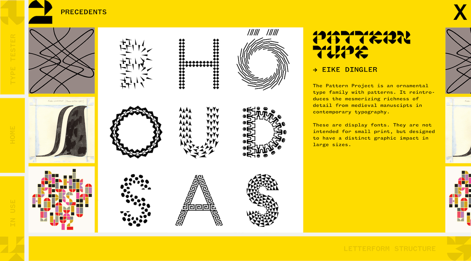
Today we presented our thinking so far on our capstones. I showed a lot of precedents to contextualize my project, explain why I’m doing it, and to give a sense of what the project is in the material sense.
The first question of my capstone is:
How can I design a typeface that functions as ornamental pattern and legible word?
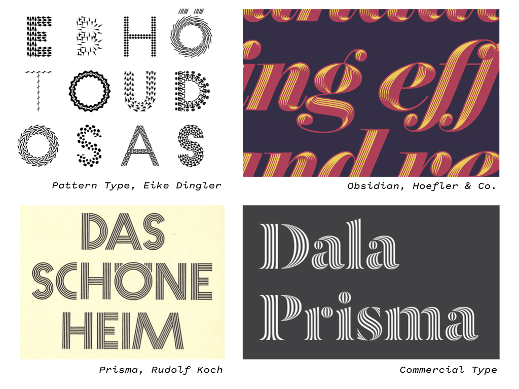
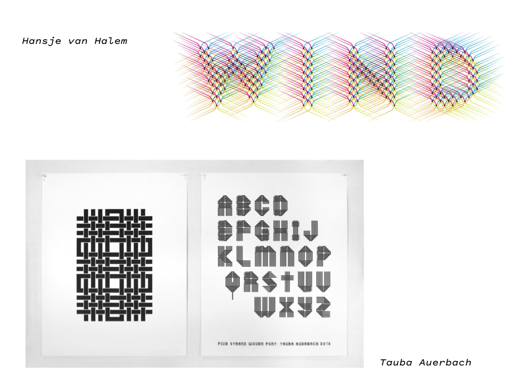
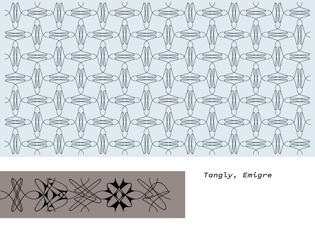
some of the precedents to show approaches to pattern in type design
some sketches
(Already shared the digitized drafts so I’ll omit those)
The second question of my capstone is:
How can I present a typeface’s digital specimen and background information in tandem rather than in separate environments?
Many foundries split the specimen and design information into separate web pages, which makes sense since. As commercial foundries, they are addressing two different audiences.
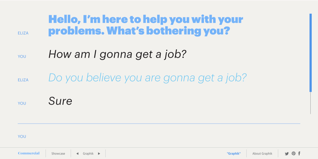
Commercial Type made a whole collection of interactive/responsive type specimen for each of their typefaces. It does the job of showing the typefaces various weights, etc., but content wise it is conceptually dissonant. At the core, this specimen follows traditional printed specimen in that the content doesn’t have much to do with the typeface. But I mean, it’s a fun playground, and it does push what a type specimen can be.
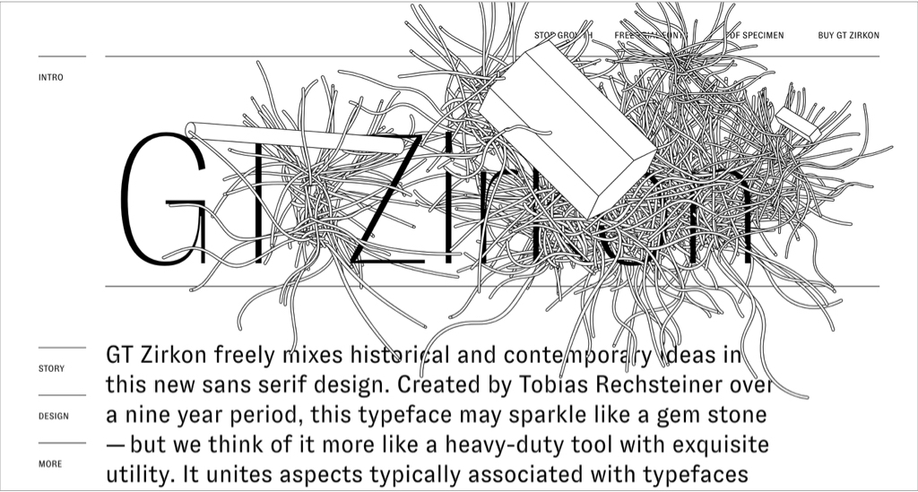
gt-zirkon.com
A very recent design is Grilli Type’s Zirkon. This minisite separate from their home site’s catalog. The minisite tells the story and process of the typeface and has animated diagrams. This is closest to what I have in mind for my website, though mine will have interactive elements that’s are a bit different from the default type tester found on every foundry’s site.
My initial proposal is:
An engaging, rather than dry, informational narrative that integrates the type specimen and explains a type design’s basis and structure.
Designed for type novices and people interested in type. Accessible — not overly scholarly, technical, or commercial.
tentative
—
A major question that comes is “what’s the use of this typeface?” Immediately people demand a defined function for it, whether it be for a magazine, scarf, etc. Of course type gets used in unexpected ways and isn’t married to the type designer’s initial intent. To legitimize it to people though, it seems that one needs a practical medium for it. I have friction with that in regards to my font, because that’s not how the idea for it came about. So retroactively applying an intended medium for it feels dishonest.
The whole point of my font is to explore the relationship between type design and pattern and to see what poetic and typographic possibilities arise from its formal qualities. I do not feel like I am designing a solution to a problem, but a program for solutions, as Karl Gerstner puts it. I am not making a tool, but a material for interpretation. In this project, I am not a marketing salesman.
As Kris Sowersby said about Maelstrom: “why does this perverse thing need to exist? … because it can.”
In this new year, I’ve started to carry the attitude of why not?
1.16.19
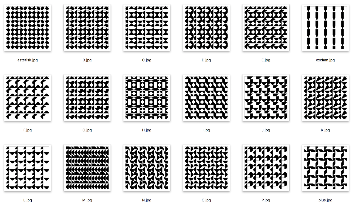
I wrote a simple Drawbot script to generate pattern specs for each character, but right now it involves manually entering each character. There’s a way to automate that. These are one way to judge the strength of each character’s color, texture, and composition in the part to whole relationship.
1.12.19
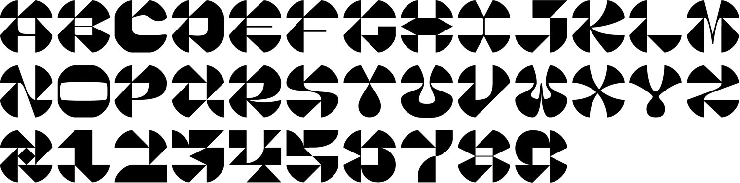
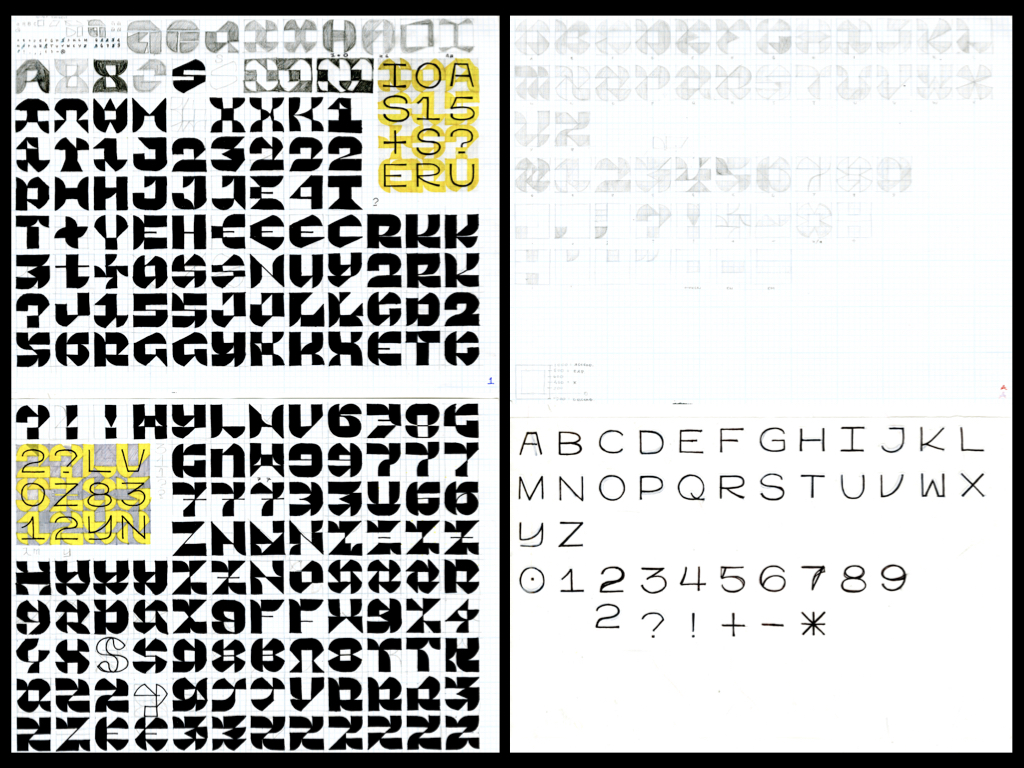
First digitized rought drafts of the typeface:
character set
how it connects / how it splits apart
Quite a ways to go! The zero tracking and leading version is meant to be the pattern configuration and the tracked out version is meant to be legible (to a degree — I’m not making an easy-on-the-eyes conventional body text). People are having trouble reading it though; it’s too sharp and some of the letters are just weird. It is kind of confusing to me when people think that the I is an O or the T is an R but I can’t argue with what they see.
The letters need to be massaged to be less rigorously geometric and a little more letter-like. I’m glad I worked on an extreme end though because it’s easier to pull back than tighten up.
The rigorous geometry also makes the face feel a little unsophisticated… I like the tone it carries but it’s not 100% likable yet. I also focused too much on the individual letters and lost a little bit of sight on the system. Sure they’re all composed of the same modules, but the flow is not there yet.
randomized words thanks to the word-o-mat Robofont extension
The tricky thing is that a satisfying pattern requires a sense of symmetry and consistency, but legible words carry asymmetry and subtle variation. One point that is often said though is that the negative space and letter spacing play a huge role in readability.
This is all a fun puzzle with an interpretable set of rules. In the end, it’s all up to the eye’s judgement.
1.30.19
I was reading through my journal and found this from November 23, 2018. Seems like an appropriate start to this process log (though a couple of the next entries will be material from previous weeks):
It’s all on the tip of my tongue.
Taeyoon Choi writes of repetition as a form of the sublime. It’s perfect. The sublime just is. It’s not able to be articulated enough. To transcend code & logical function is to create poetry.
So why a typeface? It captures all: repetition → evolution via permutation, individuality yet coherence, abstract image, fundamentally language. Logic & legibility is also not enough; craft, love, & beauty also transcend a typeface. Type is also potentially one of the most purely digital things. Using itself to create itself. Infinitely flat. Pure light & optics. The written word is how anything is. Shapes that when combined become interpretable & therefore meaningful. One can’t help but read.