LETTERFORM STRUCTURE
Zazz is a study in the relationship between type and patterns and the nuances of reading and seeing.
Two significant factors that affect whether we identify a series of shapes as letters, words, or pattern/image, are context and spacing. A period, for example, is often only identifiable when it comes after another character. On its own, it simply appears as a dot. When the rhythm of white space between letters is removed, they merge into each other and automatic reading is disrupted, forcing us to parse the visual mass.
XXXXX
XXXXX
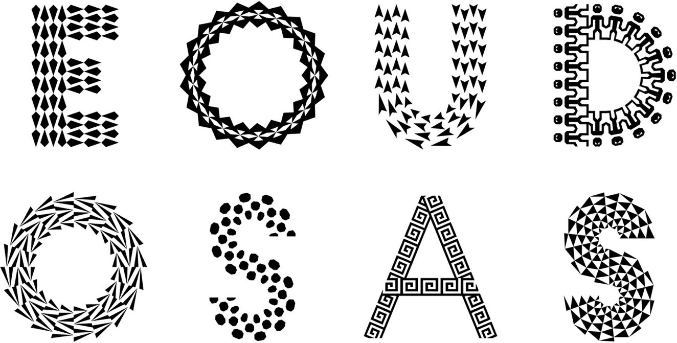
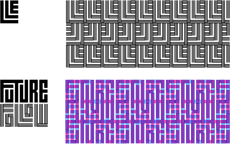
Some typefaces that employ pattern do so by conforming pattern to strokes of a letter 1 or by creating patterns through repeating a module on a grid 2. Unlike these, the patterns of Zazz are not completely apparent from viewing one letterform. Instead individual letterforms conform into a larger textural pattern. It was designed with the idea of removing the margin of whitespace between letters to create tiled patterns, taking advantage of the alphabet’s modularity.
The font originated by geometrizing the strokes of a slab serif that I had a drawn a couple characters for. Later I increased the geometric rigor by configuring the letters with basic modules on a grid 3. The letters were then massaged to become more coherent forms, as before they were a tangram of shapes.
Like a jigsaw puzzle, the letters have connection points on all four sides, allowing every character to work with each other in the pattern while remaining distinct in regular typesetting. This is a common technique in textiles, and also what Zuzana Licko did for her pattern kits 4.
The letters are bounded in a square, allowing for more easily transfigured symmetries, an important aspect to generating a variety of patterns. One can rotate a square letter 90 degrees and still have it fit within the pattern 5. This also allows for the counterforms of each letter to connect to each other on all sides, maintaining geometric rhythm horizontally and vertically.
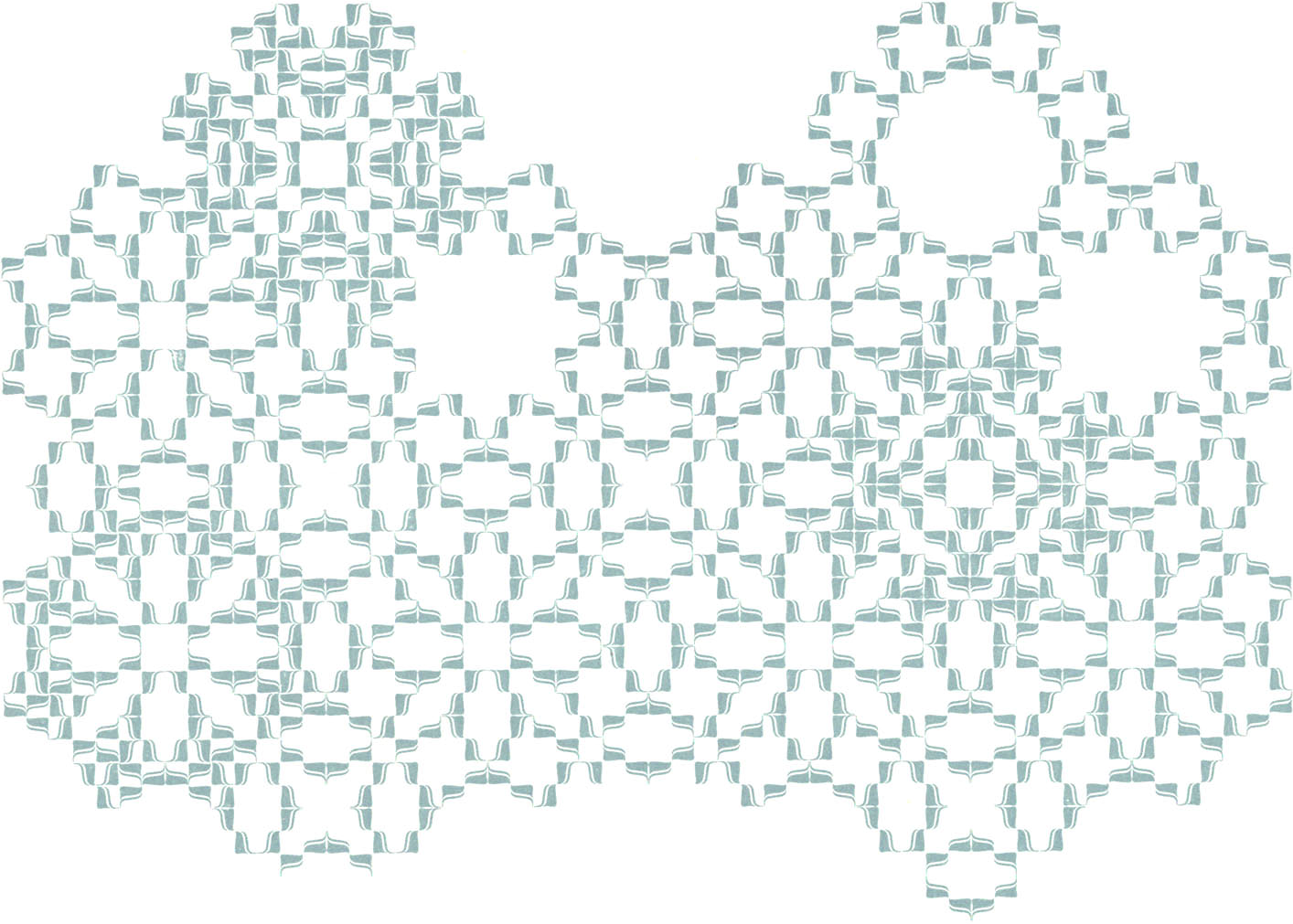
The gridded nature of the letterforms and how they fit with each other not only allows the letters to form patterns on their own individually, but also allows entire words to become the modules for patterns that obfuscate the semantic content 6. It is initially more of a binary switch from image to word instead of a simultaneous experience 7.
Zazz is also an interpretation of how geometrically based letterforms can convey different tones and create different textures. The typeface Orientation 8 is a recent example of what direction geometric counterforms can take, adding a different voice within the geometric typeface classification. ⬥
PRECEDENTS
1 PATTERN TYPE
Eike Dingler / Mauve Type (2015)
Pattern Type was inspired by the ornamentation of medieval initial letters and conceptualized through the lens of generative art. Patterns based on the rectangle or triangle were computationally processed to fit within the outlines of a geometric uppercase, allowing the letters to function as image while maintaining legibility and readability.
2 WIND
Hansje van Halem / Typotheque (2017)
Van Halem is a Dutch graphic designer known for enmeshing letterforms within complex patterns. Due to the systematic nature of her patterns, some of them are translatable into typefaces. Wind is a variable font of one of her lettering projects.
It is constructed like a bitmap font, but aesthetically transforms due to repeating one module. The long and overlapping lines create a texture that lifts off the page. This is another example of how the modularization of letterforms can be something greater than a tangram of shapes and how a typeface can reflect a designer’s body of work.
3 SCHABLONENSCHRIFT
Josef Albers (1926)
Albers’ “Schablonen” (stencil in German) reflects the Bauhaus ideology of reductive geometric abstraction. The configuration of primary shapes and the relationships and differences between the letters show the basic premise of what type generally is: a modular system.
Generating combinations of modules derived from three simple shapes — the circle, square, and triangle — can challenge one’s schema of what a letter is. Albers has also created other reductively geometric alphabets, such as the Bauhaus Lettering Set.
4 TANGLY
Zuzanna Licko / Emigre (2018)
As described by Emigre, the pattern parts in Tangly connect on all four sides, somewhat similarly to script characters. The pattern parts in Tangly also have symmetric, mirrored, and asymmetric counterparts to aid patternmaking.
Tangly is Licko’s fourth pattern “typeface,” following Puzzler (2005), Hypnopædia (1997), and Whirligig (1994).
5 KABA ORNAMENT
Bram de Does (1985)
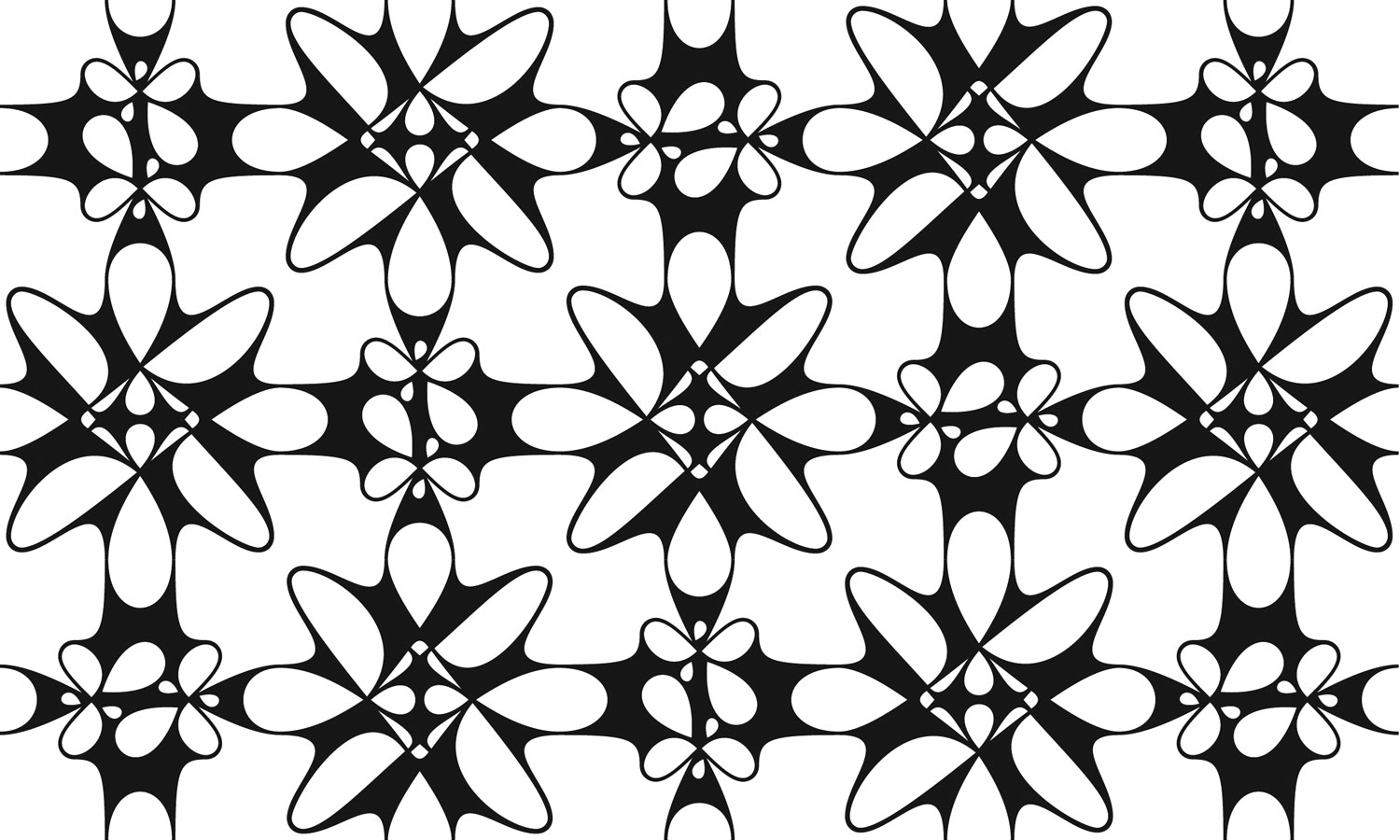
Kaba exemplifies the true spirit of ornamentation: beauty in the multiplied module.
Kaba’s module, a curved shape and a line bounded in a square, seems understated, and the ornament is only made up of a single pair of mirrored modules. But the small set and clarity in form is hardly limiting. The negative shape is similar to the positive, creating a rotational color symmetry within the module itself. When multiplied and transformed through 90° rotations, the symmetries exponentiate and dynamic patterns and images emerge.
6 CALCULA
Shiva Nallaperumal / Typotheque (2017)
Calcula is a typeface that was inspired by a geometric style of ancient Arabic calligraphy. It is composed on a grid, and several ligatures were drawn in order to fit words into rectangular blocks. The words consequently become modules themselves, making them apt for constructing patterns.
7 JURRIAAN SCHROFER
Juuriaan Schrofer (1926–1990) was a Dutch graphic designer and partner at Total Design, the studio co-founded by Wim Crouwel. Schrofer designed increasingly illegible letterforms that were easily manipulated for dimensional effect due to their square proportions.
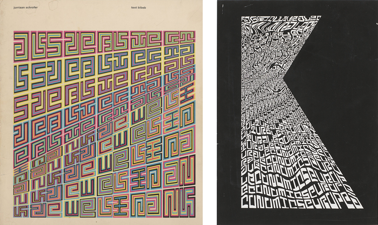
Schrofer also designed geometrically modular alphabets reminiscent of Josef Albers’.
8 ORIENTATION
Sandrine Nugue / Commercial Type (2018)
Orientation is a refreshing interpretation of a geometric sans in a crowd of a otherwise sterile ones. Its triangular counterforms maintain a sophisticated rather than elementary sense of play. Despite the unconventional forms, the typeface is easily readable, as Nugue originally designed it for stencil signage.
9 FIVE STRAND WOVEN
Tauba Auerbach / Diagonal Press (2013)
Auerbach’s fonts are part of her artistic work. In particular, Five Strand Woven, made in 2013, connects to her woven-canvas paintings, made from 2012 to 2015.
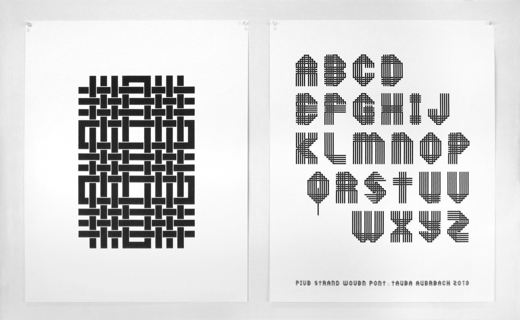
To Auerbach, her fonts are not “tools” for other people but for her own artistic expression: “I've never sold fonts for use because the letters feel very personal — like visualizations of my voice. Seeing one of these typefaces used by a stranger would be akin to hearing my voice come out of someone else's mouth.”