03.06.22collection of thoughts around Ambi font collection (Type West)
I think a lot of people will make a sculpture when they really want to write a paragraph… it takes a lot to make art as critique work.
— Betsy Ellison (source)
Ambi was an attempt at contributing to Vietnamese American visual culture, which is nascent as the first major wave of Vietnamese immigrants arrived in the U.S. in the 1970’s. The project stems from examining the multi-genre typography Vietnamese American or Asian American food packaging and restaurants and extends into layered discourse on Asian American identity. The ambition was to have the type collection itself be an entryway to critically thinking about racial identity and reclamation, hegemonic culture, and the treatment of the banal in design. How does a set of fonts (whether that be a conventional typeface family or a collection) affect typography, and in turn reflect culture broadly (visual, ethnic, identity)? When are fonts actually salient?
Before typography came language
I struggled throughout the project because I did not have all of the language, oral and visual, to communicate my vision. The thoughts were still developing and not quite ready to become things. I unlearned the design process a bit too thoroughly… I was/am writing and editing as I go along. Ambi is a draft.
The people who have largely given me language to think through these ideas are the poets Paul Tran and Ocean Vuong.
1. Exigence
Reflecting on my application to Type West (submitted on Halloween 2020?):
- Language and type are the nucleus to my practice. I think of type as the material for language and my primary medium and am figuring out what that means practically. I am drawn to type that somehow carries poetic and artistic qualities, but I am still at odds with the realities of why type gets made and when it get used (most often for commercial and branding purposes). In any case, it’s clear that something’s there. It’s a peculiarly strong connection point between me and other people. I’m not sure how something like letters, and not even necessarily the words, inspires people and conveys certain ideas. It’s not wholly explainable, which is partly why it’s so powerful. It’s a rare place where I feel I can truly give more than take.
Material of language: Ellmer Stefan in his Letterform Archive talk [+] references a 1960s French-speaking writing group Oulipo which described itself as a workshop for potential literature, what to Ellmer is “type in a nutshell”. I love how potential literature activates type. Potential culture extends it further.
Poetic & artistic: meaning the type itself, its form and system, says something beyond what has already been said. It participates in culture. It encourages dialogue. It reflects critical thought. It does not only look at itself. It influences linguistics and the perception of language.
A rare place…: one in which by circumstance, enthusiasm, support, encouragement I have been afforded a voice, an audience, a potential commmunity. I enter young but am unsure I’ll stick around. There are more effective mediums with through which I can affect meaningful change. It’s such a focused discipline which makes it a bit more manageable to learn, but it lacks reach. Asking all these big questions through type makes me wonder what the fuck I’m doing here. Culture drives type more so than type drives culture. It was therapeutic at one point, but now I perhaps know too much to find that unedited joy, and to be able to focus on something so small. I see beauty in its intersections, a potential to practice multiple interests. But it is not the only creative intersectional space.
- Type West would be a fitting stepping stone for me as I’m interested in further type studies but not quite ready to attend a master’s program. Making type and lettering is natural and a pillar to what I do, but I am skeptical of primarily producing type as a job, as I don’t want to be only a type specimen but a broader library. I can’t predicate what my thesis is; I seem to be only able to do and make in the present and accumulate something over time. Most recently I am wondering what authorship is in type design and what role the hand plays. I am not only interested in what is inside of type, but also what is outside of it. I care less and less about kerning complaints and more and more about the lineage of type, how it develops, and what culture is embedded within it. How does material contribute to ideological development?
Library: my favorite part of my project Zazz is how it is an avenue to a hoard of links and writing about typography, technology, questions about culture, economy, labor. The font is only the surface. My favorite fonts and foundries are similar.
- I’m also drawn to the communities that have come out of such an inherently industrial practice, but at the same time, it’s intimidating. I used to think I was pretty independent and self- motivated, but it’s hard to enter the room or come up without a group. I feel invited by the Type West crew though, and there’s a lot of great people to learn from there. I’ve learned that having a dialogical learning environment with multiple living perspectives is essential for me. Just taking one class, even online, showed me the importance of being around a mix of folks curious about type who have or haven’t been conventionalized or professionalized, so to speak. As much as I like my books and libraries, I also need to be in a field of fruitful, social learning. Although online learning undermines that a bit, it’s a start and really my most practical option as a current midwesterner. I hope to eventually teach in some way as well, so I am interested in learning through a variety of people, institutions, and settings. Type West seems like the best place for me to share and sustain my interest in type at the moment.
without a group…: I came up creating in isolation, in the corner of bedrooms, at my own desk in school. Art and design were self-serving endeavors, an antidote to the routine rigor of memorizing facts for tests or being drilled essay after essay. Nowadays I don’t find much value in centering myself in it, and now that it is work, it is no longer therapeutic. I want to make work in groups and communities that have something to say. Socially I struggle with that. I am still learning how to collaborate and be a good supporter.
2. Context & influence
I saw a student project branding an east coast Vietnamese restaurant. Their visual basis for the identity was Vietnam War propaganda and South Vietnamese Armed Forces tiger stripe camouflage which was later used by US Special Forces during the war. My initial reaction was what…? How does recolorizing these visuals make sense for a restaurant? I was reminded how many people know of Vietnam firstly because of the Vietnam War. Classic American history textbook syndrome. When one who doesn’t know Vietnamese culture tries to go find authentic visuals to use, war is one of their first touchpoints. War, war, war. It’s limiting. Not knowing where to look or learn is part of the problem, but I also wonder if the initial depersonalization and focus on form in education is part of the problem as well. It also signaled to me a lack of visibility of Vietnamese American culture.
With Ambi I wanted to contribute to Vietnamese American culture by acknowledging the existing typographic language, which was heavily shaped by American-made/Eurocentric fonts, and innovating upon that, reclaiming it. Lineage.
–
American culture and economy is built upon appropriating, colonizing, stealing cultures, so much so that we easily forget to ask or even realize when it occurs. If something is in the world, is it up for taking? Context? What about it? Pop culture does it all the time. The model is pervasive. Nobody cares. If I can use it to build my vision, I will. Designers are agents of culture. We synthesize what is around us. The Instagram likes reaffirm us. It is those outside who are able to critique most damningly.
Systematizing cultural forms into a typeface, which is then most often distributed through commodification and divorced from the original context. Do you see the problem here?
3. Intention, accident
(text repeated below)
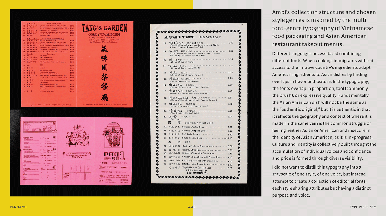
Different languages necessitated combining different fonts. When cooking, immigrants without access to their native country’s ingredients adapt American ingredients to Asian dishes by finding overlaps in flavor and texture. In the typography, the fonts overlap in proportion, tool (commonly the brush), or expressive quality. Fundamentally the Asian American dish will not be the same as the “authentic original,” but it is authentic in that it reflects the geography and context of where it is made. In the same vein is the common struggle of feeling neither Asian or American and or feeling insecure in the identity of Asian American, as it is in-progress. Culture and identity is collectively built throught the accumulation of individual voices and confidence and pride is formed through diverse visibility.
I did not want to distill this typography into a grayscale of one style, of one voice, but instead attempt to create a collection of editorial fonts, each style sharing attributes but having a distinct purpose and voice.
–
Ideas I was interested in communicating through individual fonts:
- in-betweenness (cross-genre)
- reclamation through parody / humor as a disarming way to critique / aesthetic attraction and taste as a way to critique (re: stereotypical ethnic fonts)
–
Non-linearity: The typography of Asian American packaging was not by design, but emergent. Overtime proximity created connotation. What conversations happen when seemingly unrelated fonts are created in proximity? A mistake I made was trying to construct a narrative, a plot line, before knowing the characters. I was always holding different perspectives in my head at once: the one I have learned to make my default (what I was taught in school) and the ones I aspire toward.
Yes the creative process in general is often non-linear, but the thinking and design is still often linear in that the architecture and model of the typeface family is tied to convention, book typography.
–
Latin fonts that stereotype Chinese bastardize Chinese calligraphy by modularizing it in ignorant ways:
Did I bastardize Roman brush calligraphy and the concepts of rotation and translation through abstraction?
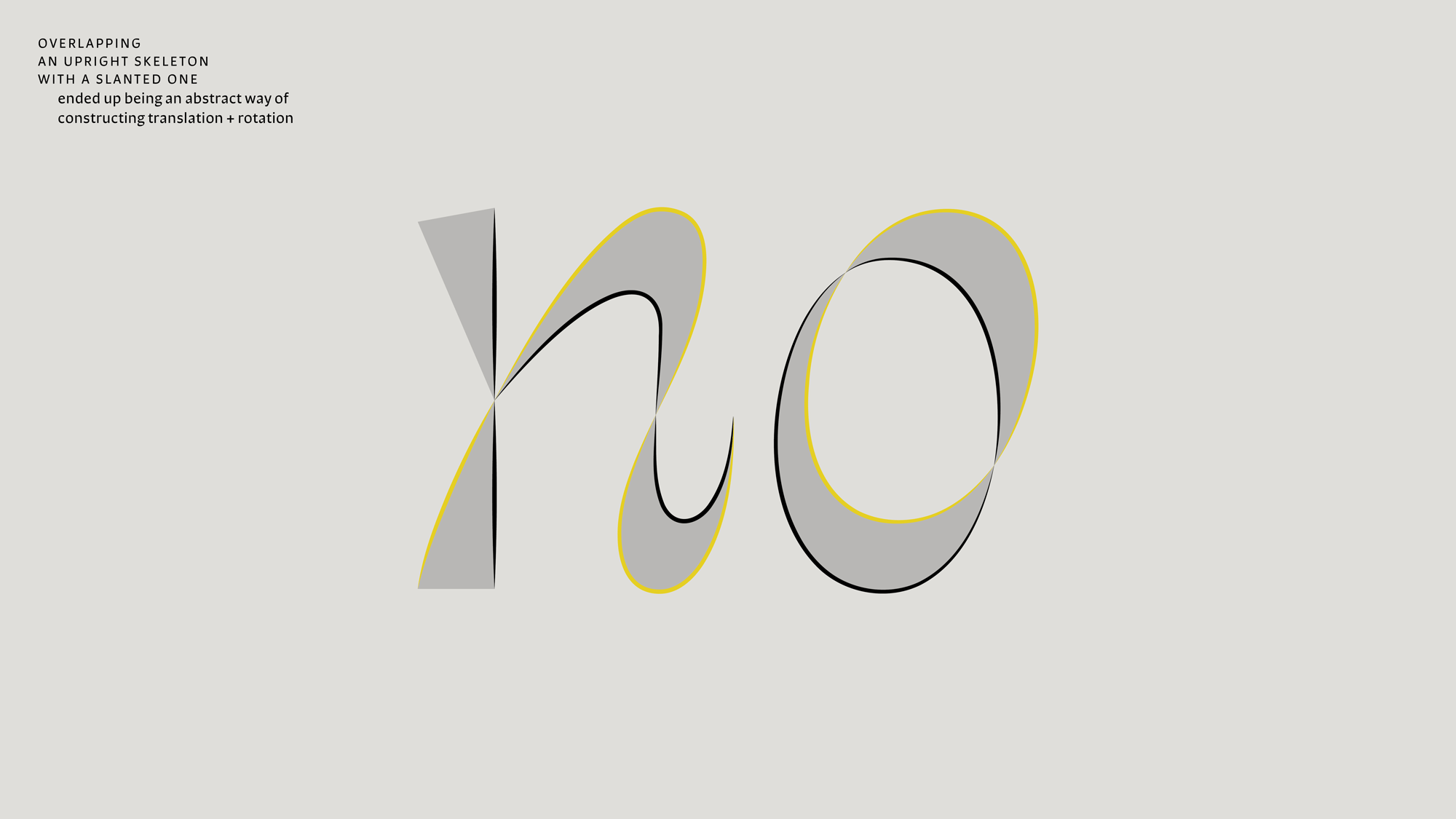
I was drawn to the ambiguous potential and the metaphor of overlapping an upright skeleton with an angled one. I also come from a more geometric/shape-based understanding of constructing letterforms, so this was a way of abstracting the stroke-based model of type design, helping me understand how to build the whole system. Depending on point of view / school of thought, it is either valid or invalid, inventive or naive. I’m conflicted. I am frustrated by the common educational model that you must learn the rules first to break them. Are they rules or conventions? Truth or dominating models?
I do admire the work done before me. It is frictional to break those rules, feeling like I am working in opposition. Rather I seek to make my own rules, existing in parallel. It is difficult to unlearn. What I have to offer is not saying what has already been said or speaking in the same way.
–
Poetry doesn’t only communicate directly. It seeks to reinvent language itself, how form communicates. How does reinventing the structure of form transform language? Re: Univers, Futura.
4. Modes of criticism: the space and frame of education
It is so hard to make design that by itself critiques. Why is that?
–
Curriculum:
- Agency in content, but what about form?
- How do you design a flexible, responsive framework?
- When education is objective based: it does not ask: where do you come from, but instead, where are you [in our framework] and how do we get you all to graduate?
- What are your goals framed in the social context (i.e. beyond the self)?
- Does the curriculum reflect culture, the hyphenated self, or something still rooted in assembly-line thinking? Is there room for tranformation beyond filling the box?
–
Critique is the frame for the conversation and actionable iteration. When the critic is concerned with mechanics when you are concerned with concept, there is not productive conversation.
5. What are the limits when working outside convention?
By building an unconventional type family model, I was limitless. Oops. Overwhelmed.
–
There are different types of perfection. It can be hard to discern which details matter when the intent isn’t clarified. The inability to prioritize compounding typeface edits is paralyzing. Critiques in the moment are a discussion between the critic and your work more so than the critic and you. I didn’t set space to fully reflect on critiques. What the critic sees and what they suggest to do do not necessarily align. Critique brings the project into questioning. Blindly answering, responding without real intent, is a recipe for feeling lost. Consistent reflection is so important, and I did not do that for this project.
6. Post
I struggled figuring out how to write about Ambi, largely because all of my writing on this site is written without an audience in mind. When there is a perceived audience, I feel a need to explain every facet of my thinking. I let go of that here. Perhaps those who get it, get it, and can make inference and connections with these thoughts that are placed in proximity to each other.
–
I still feel I lack a community that fully understands, or I am still choked by my social anxiety, inflated pressure.
I fear how the type being used can betray its intention (appropriation, being stereotyped). Intentional distribution, pre-emptive application, building connotation, and participating in alternative economies is an essential part to the vision.
We do not need to wait 100 years.
It takes a lot to unlearn and innovate when we inherit systems that weren’t designed for today or for us, when our identity was founded elsewhere.
A truer vision of this project would be to invite Vietnamese-[] type designers to contribute fonts to a library. A collection and a culture is not built by one person. I am still learning how to collaborate effectively. I am unsure if I should wait and learn more until attempting to lead a project like this.
+
Huệ Minh Cao made a font whose modules began with Vietnamese diacritics.
Thy Hà on Cooper Black, a font with one foot in American 60’s and 70’s culture and the other in everyday Vietnamese culture.
Any and every Ocean Vuong talk and interview. One.
Also any and every Paul Tran interview. One: being the primary source of our history.