11.02.21vibe check (Type West)
Process writing and regular reflection help me feel confident in my decisions, in that there is proof of lineage and things aren’t arbitrary. I haven’t been keeping up with logging my process, which I have been meaning to. Not doing it has been hindering me. I’ve been getting caught up in capturing a certain feeling in my typefaces that I’m not able to articulate, meanwhile forgetting to look back at where I came from to help define that. Other projects and work have been reminding me how lineage, history, gradual growth overtime are important for me to fully understanding what I’m making. It’s hard to start in the middle of in progress projects, for example.
I feel behind in the context of the program, as we are nearly halfway through the last term, but at a good pace in the whole of things or if I had been attempting to do this project on my own. Creating a whole family in a couple months is quite a bit when you’re not doing it full time and attempting it for the first time.
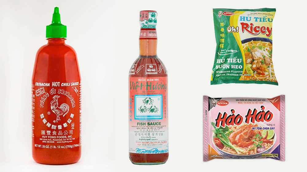
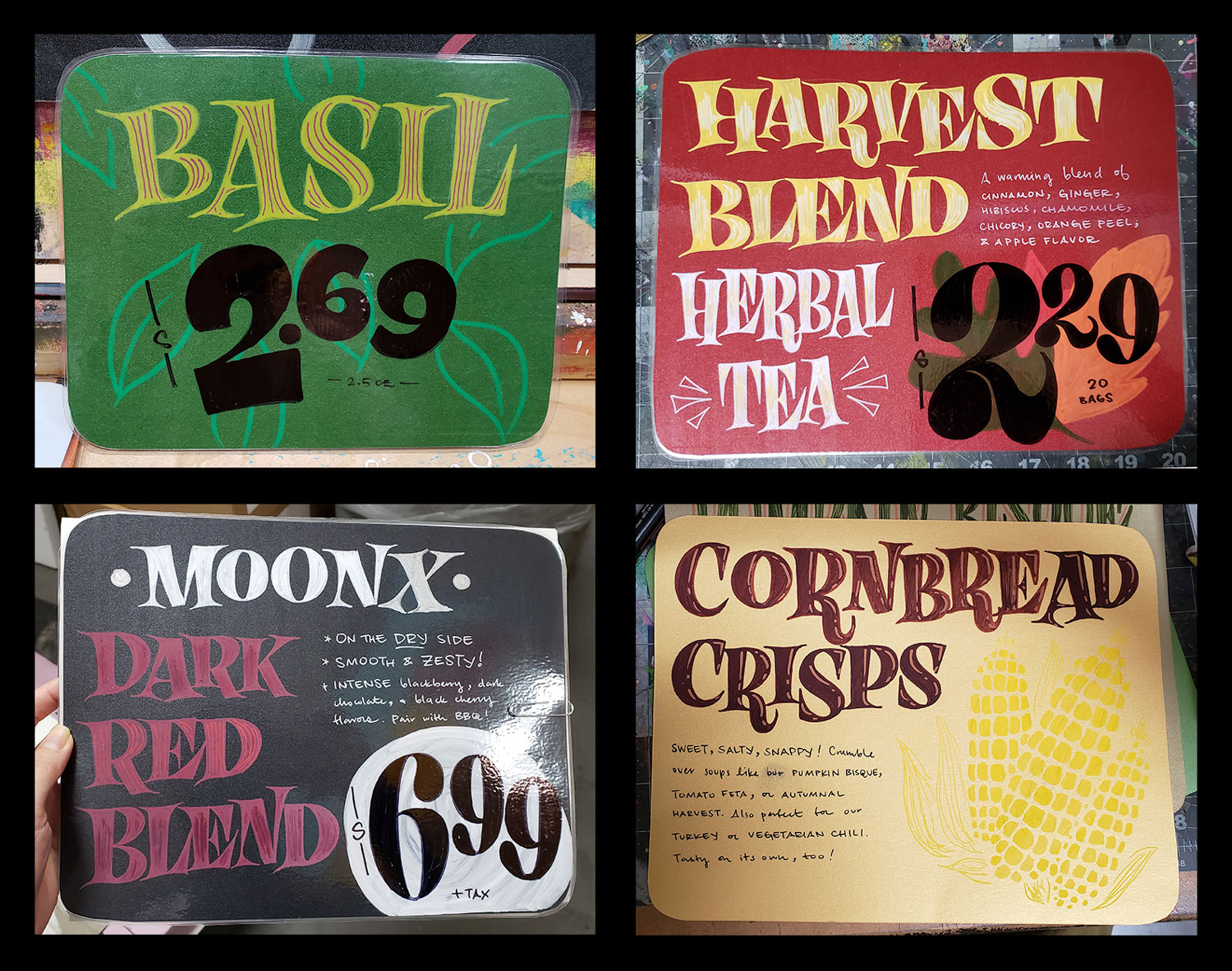
The prompt last term was vaguely to create a typeface family. How we decided to interpret “family” was open. I have been interested in the composed complexity of Asian food goods and restaurants and wondering how it is not a single typeface but the overall typography and the different fonts as a collective that creates a shared identity or baseline generic theme across these goods and environments. The sriracha bottle for example uses a mix of American fonts and Chinese ones. Brush fonts are often used in Asian goods, as they correlate with brush based Chinese scripts. I wanted to create a brush based serif as that is not a heavily explored space and fit the tone I am going for. Understanding the brush is a whole ’nother level though and I didn’t explore enough in time to get to where I aspired.
I still have a lot of Vietnamese typography to see. One of my classmates, Ðức Cao, is part of a Vietnamese typography collective. There’s an interesting cultural exchange between American-made fonts and Vietnamese typographic culture since written Vietnamese is Latin based, due to French colonialism.
Using American fonts in this way contributes to what banal Asian American visuals are. It relates to how Asian immigrants adapt American groceries and produce to Asian dishes. There are shared qualities in the alternative ingredients, but they are not the exact same. The dish can still be delicious, even it is not “authentic.” But adapting a dish to one’s new home and geography is authentic in itself.
Asian Americans often struggle with what is authentic, what is truly Asian, to their current generation vs. the generations before them. Generational transitioner. Generational transistor. Asian American is a complex synthesis, different for every individual.
A lot of the reason why I was lacking energy to flesh out the collection more clearly last term was because I was still working 4-5 days a week at Trader Joe’s. I have been full-time there for about 2 years. In early October I went down to 3 days to focus on Type West, which helped, but then I went down to 1 day after unexpectedly saying yes to some freelance work. Then I realized how draining food retail is and how much I actually do like doing certain design work. Big moves vs. pushing pixels.
I was inspired to think of a family as a collection of fonts that conveys a typography and a culture. I also thought it would be more fun and motivating to work on different fonts simultaneously, such as jumping from a fun, puzzling display to a more straightforward sans. It is fun and ambitious, but also overwhelming. But the limits of time do that — it limits ambition and promotes efficient, linear, interpolatable systems.
Some things that have been on my mind are how interpolation is an industrial product that reflects technology, how that allows type designers to greater capitalize on their work. Interpolation does reveal how expressive a typeface can be at different weights though, and other axes. But I am interested in the idea of releasing collections of fonts, like fashion collections. That seems more fun than laboring over several interpolatable styles. A lot of culturally impactful fonts are one offs.
So I don’t really regret trying something that is less of a straight line. I still plan on trying a bold though. It is instructive and useful to employ interpolation as a design exploration tool. I think it’s just not the type of puzzle I’m interested in solving.
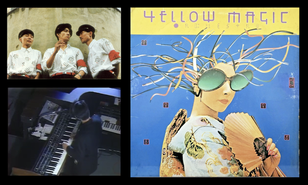
Another major inspiration and discovery of the year has of course been Yellow Magic Orchestra, who in the 80’s reclaimed and transformed Japanese musical identity by skillfully parodying American perceptions of the Pacific East and leveraging Japanese stereotypes via the new and unfamiliar synthesizer. I love that you can still appreciate the band without knowing that context.
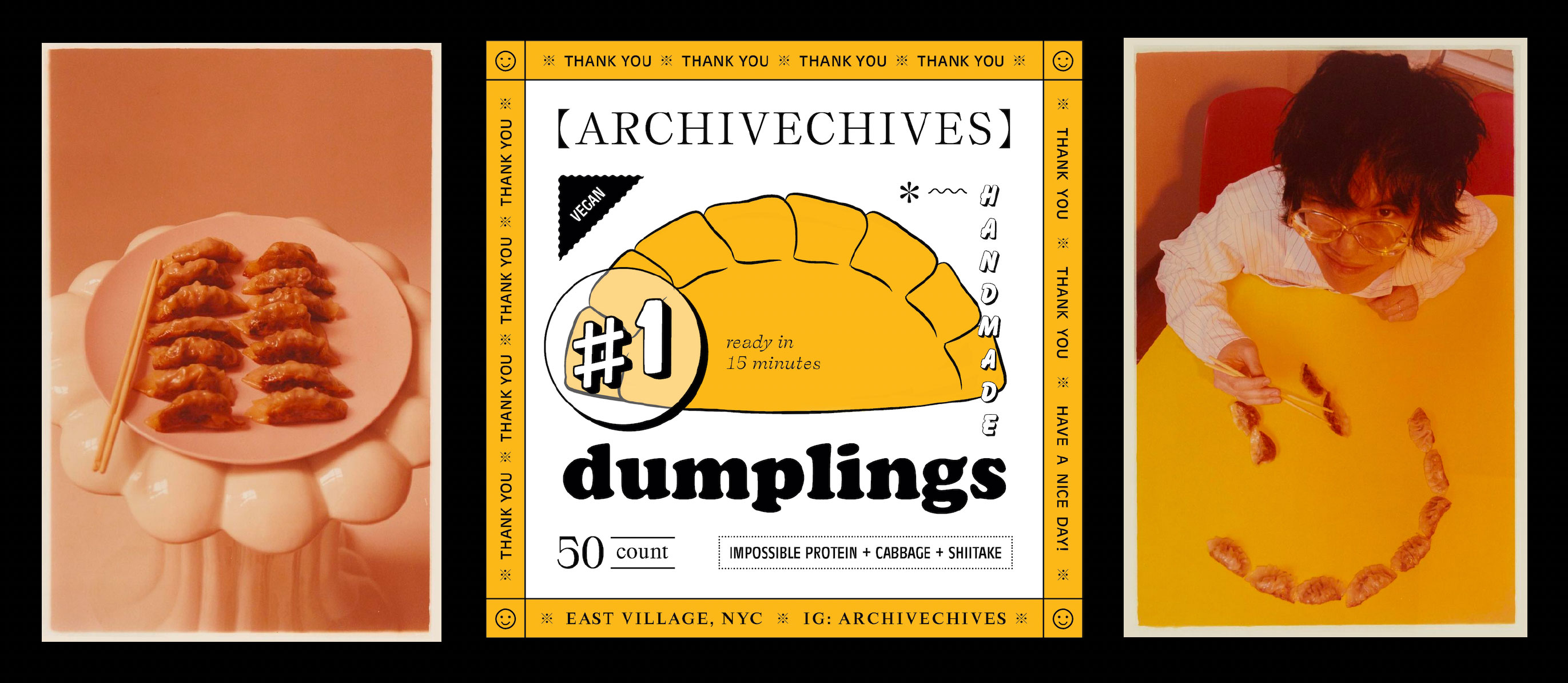
photos by Sophia Wilson
Earlier this year I designed a sticker label for my young brothe’s vegan dumplings. I had been collecting images of Asian food packaging before this. Yellow taxis, yellow race. I really enjoy talking with him about his food ideas and collaborating with a sibling is uncomparable.
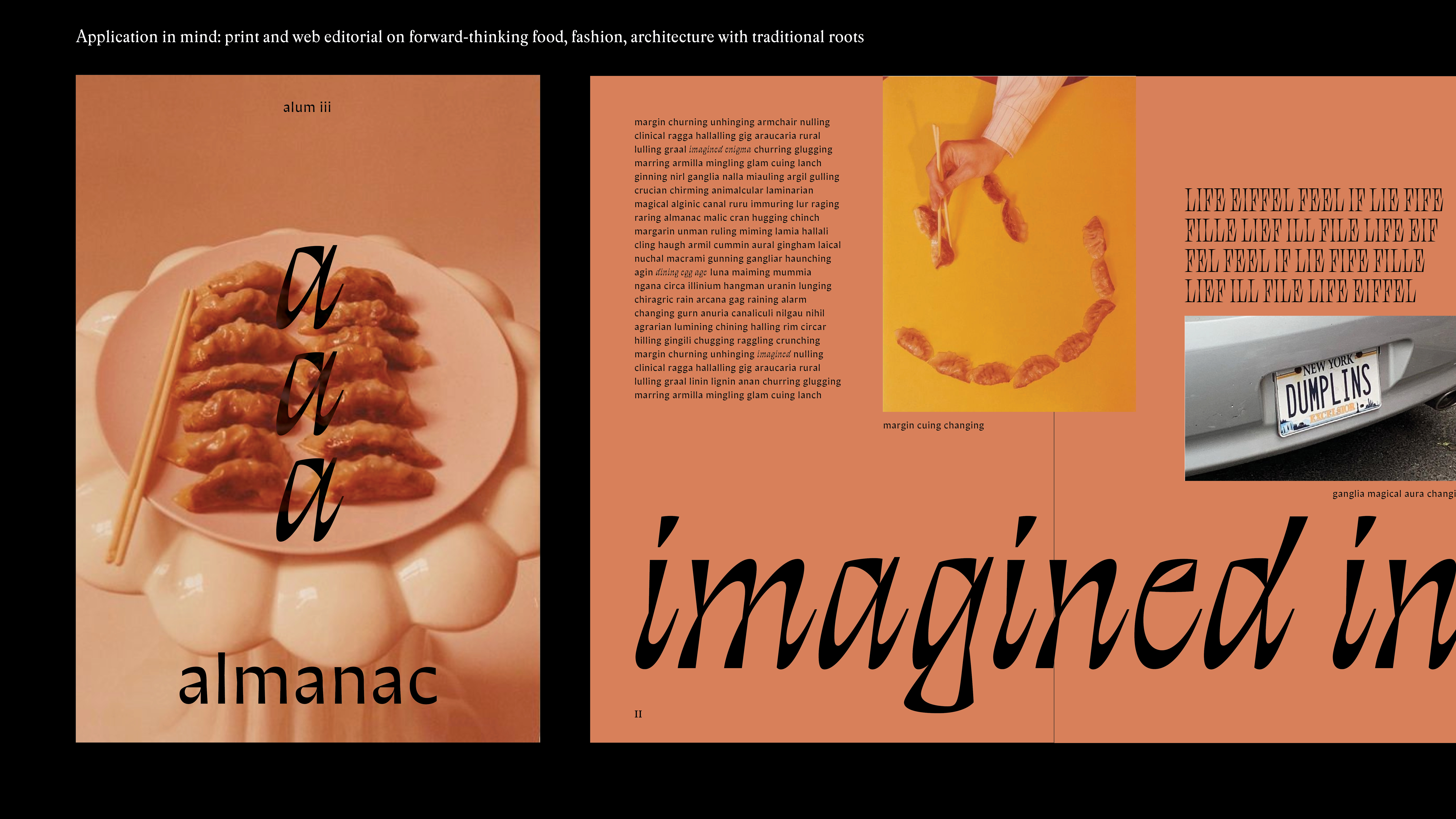
The fashion designers Private Policy and Bode have also been in the back of my mind. The way they think about materials and silhouettes of history and today is incredible. Again the work can be appreciated without the context, but there is clearly a story present. The way they think about the architectural and local presentation of their work is also strong. This week at Type West we’ve been encouraged to think about our type specimen and showings. One of my interests going into Type West was figuring out how to engage type with layers beyond itself, one of those layers being culture. I’m currently thinking about how the type specimen can be a lookbook of sorts, how each font is an article of clothing to be combined and styled with other pieces. The default medium is the page itself. I am wondering how I can create a dynamic frame within that, whether through illustration or creating photographic type compositions. Take-out menus are another inspiration.
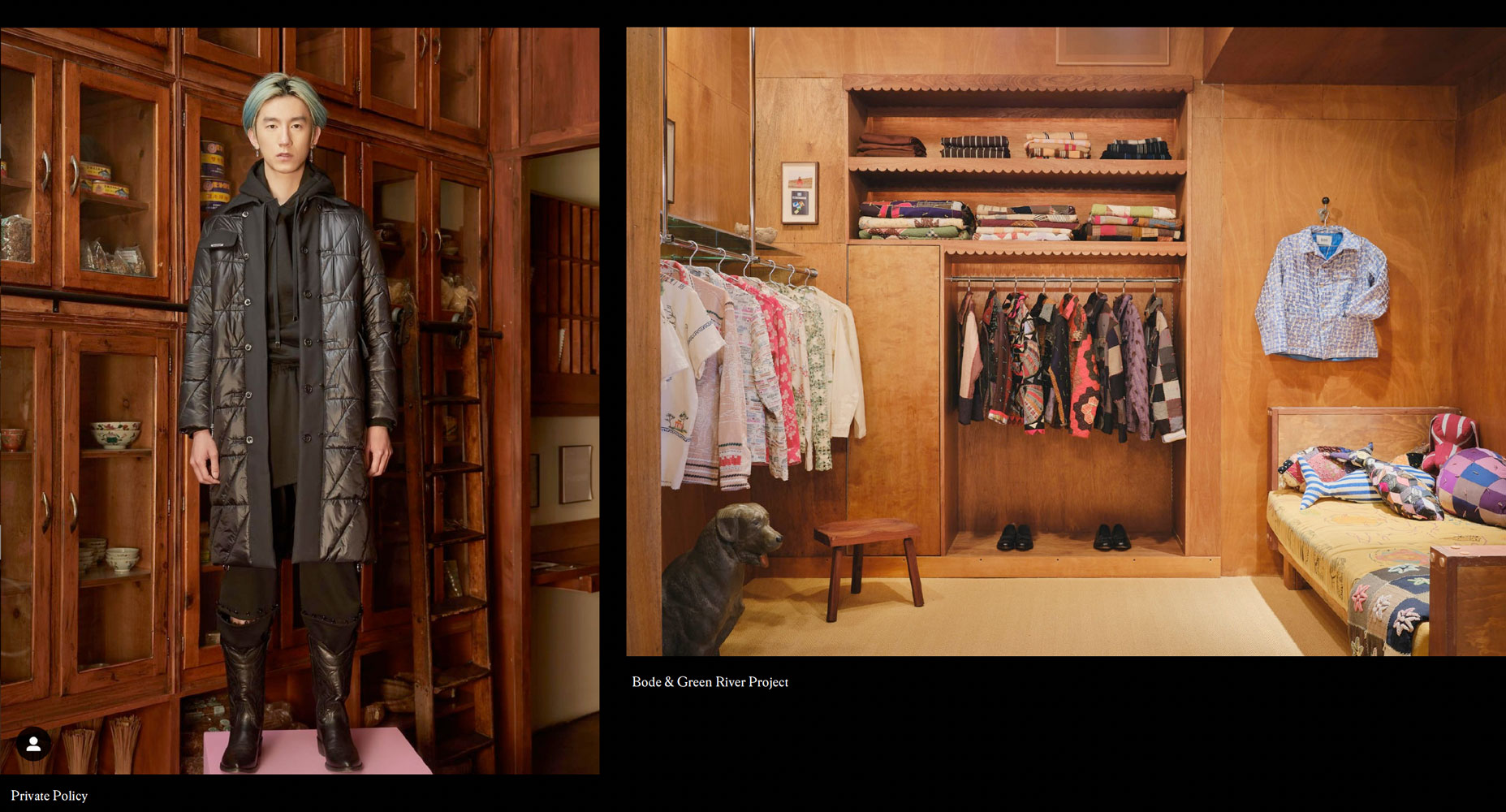
Private Policy FW21 & Bode store designed by Green River Project
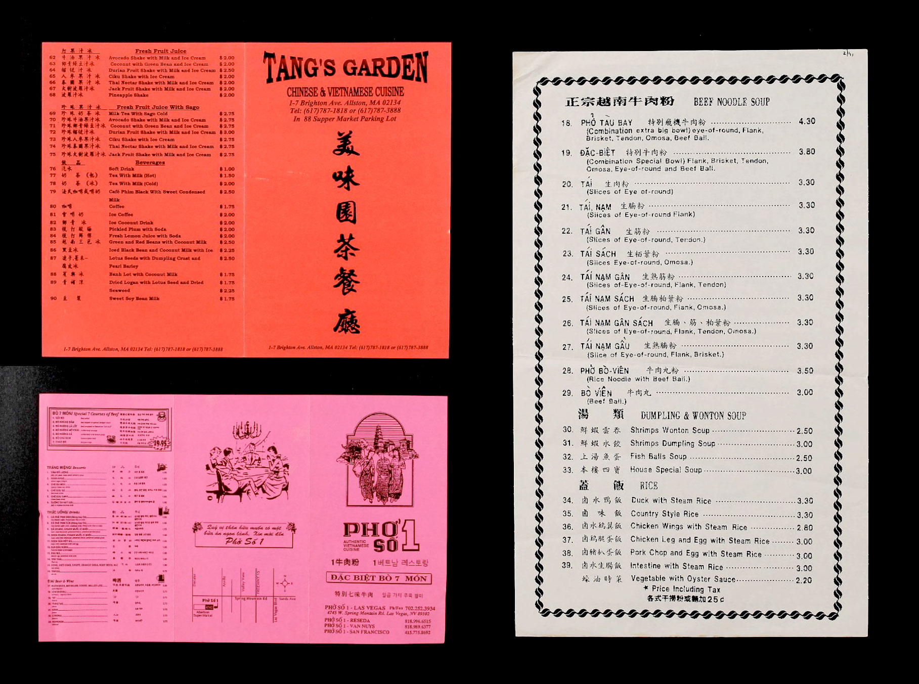
from University of Toronto’s menu collection
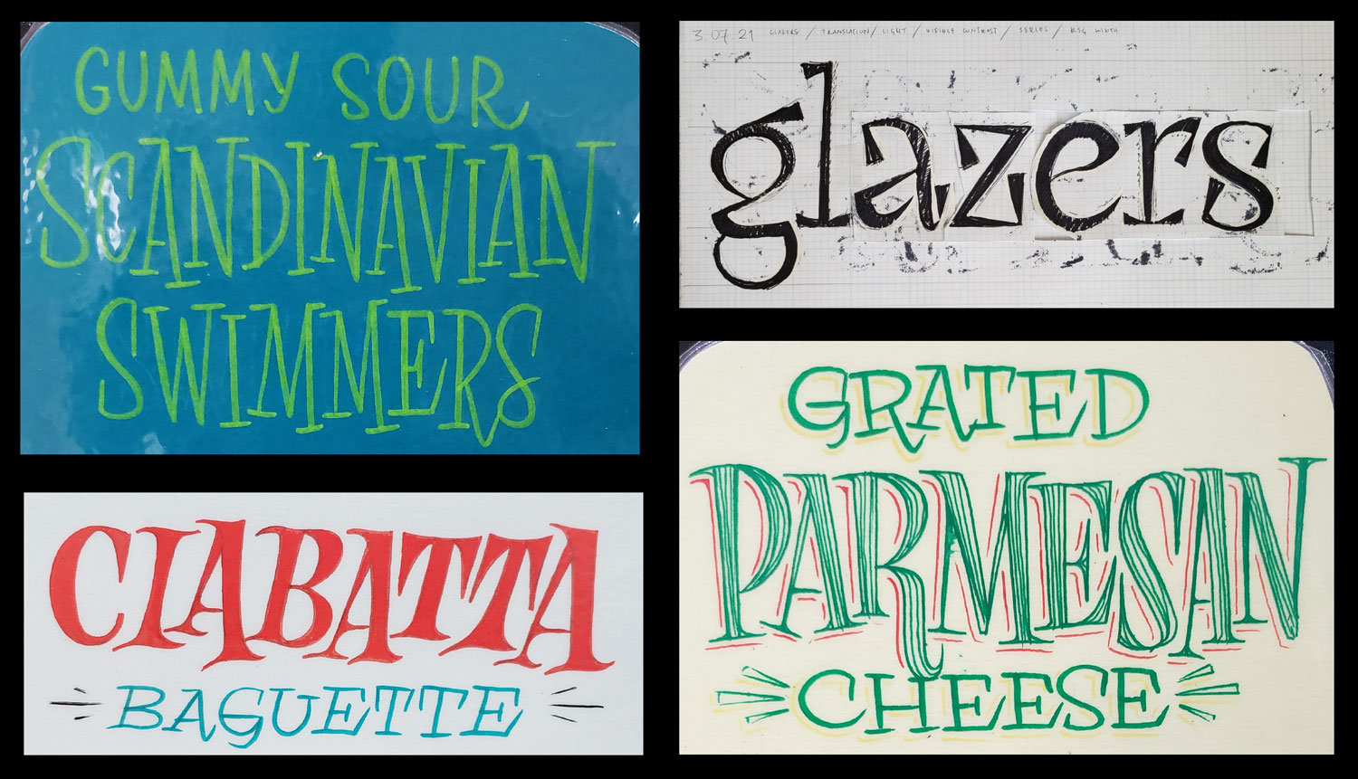
What I have been collecting and have been interested in says some things, but what I’ve been draw-writing says another.
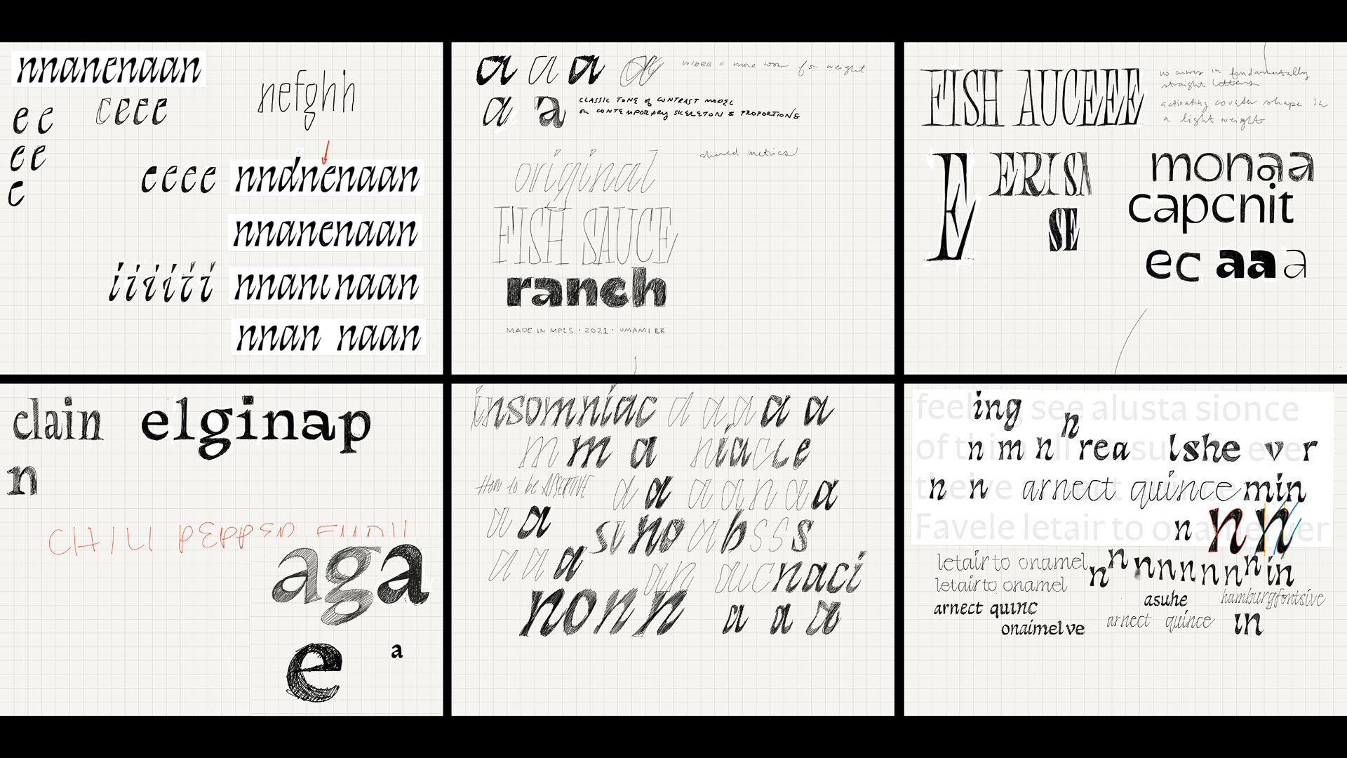
I learned a lot from Gen Ramírez’s Roman capital brush lettering workshop. It led me to creating a new lettering style at work, but also fundamentally changed how I think of serifs. Though I had been told that serifs come from the brush, I didn’t fully understand how, so serifs seemed quite ornamental. But painting them first hand proved otherwise. I also love the flexibility and expressiveness of the brush. It is more compatible to how I write letters and what I appreciate about them, as opposed to broad nib or pointed pens. I need to make time to do more brush work.

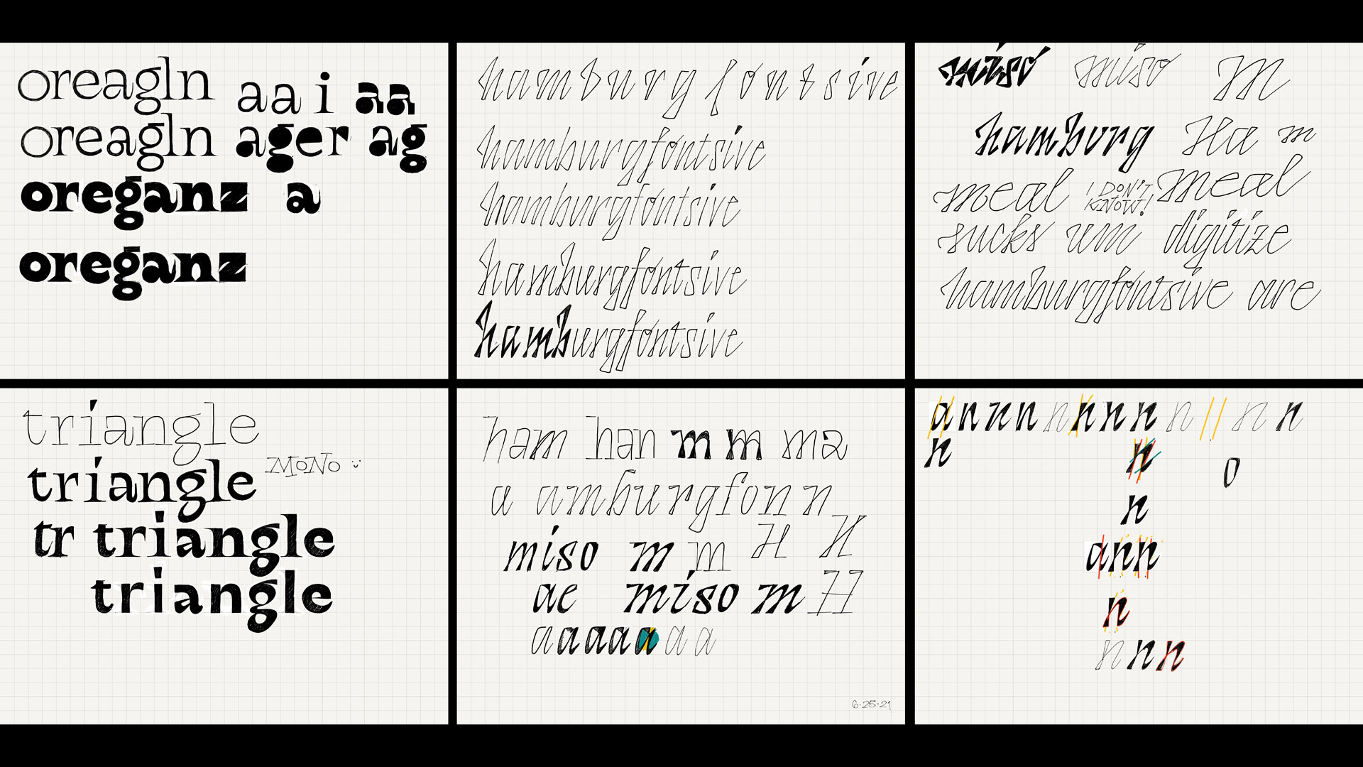
I am insecure about drawing things beyond shapes and letters, but have been trying to think about everything as shape. I like how I drew the corn. I see overlaps with lettering and illustration and think I would like to explore illustration more, less so in a narrative way and more so in a formal sense. It’s a great way to dynamically use color as well, which is a dimension missing in black and white type design.
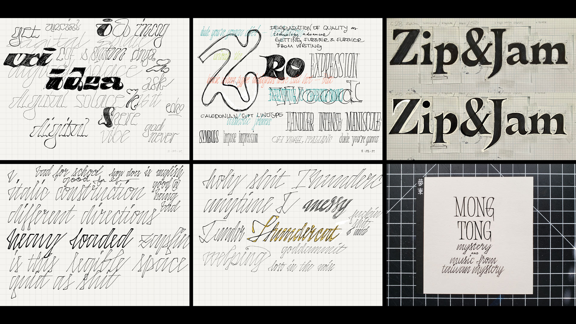
the italics workshop with Rob Saunders was also informative, specifically in understanding why the flat-top a’s occur
one of my early ideas was to add Roman cap style serifs to a contemporary geometric sans model, but it felt quite postmodern 90’s and too much like a joke I wouldn’t want to use or work on long term
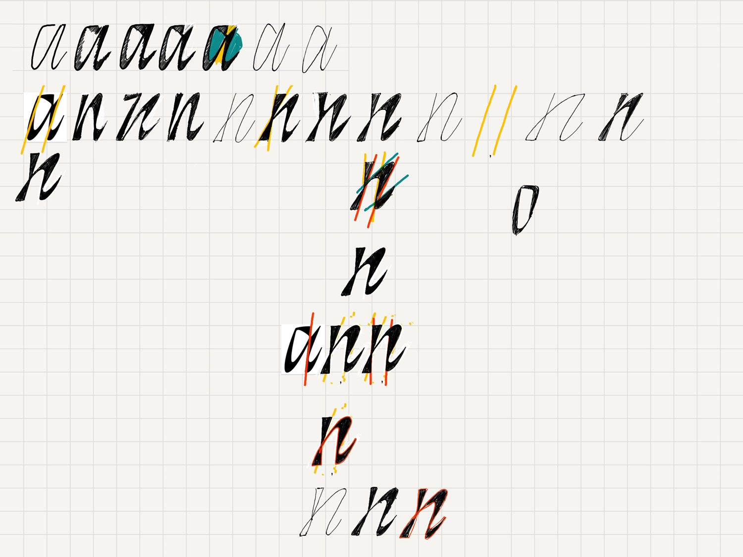
Early attempt at trying to figure out this triangular skeleton + broad nib + sliced italic. The idea of parallel guideline sets at different angles was sort of there, but not quite systematized enough for a sustainable typeface. This italic began to feel like a tricky in-between of lettering and type design. It’s stuck at the moment and very much specific to width and weight, so I decided to move on to a different system that expresses a similar but different idea with the potential for more range.
I was applying Blaub’s process to this italic since I thought that’s just how I work. But then I came to realize how that process was specific to Blaub and not applicable to every font. It is exciting to see the different ways I have to work for each font I make.
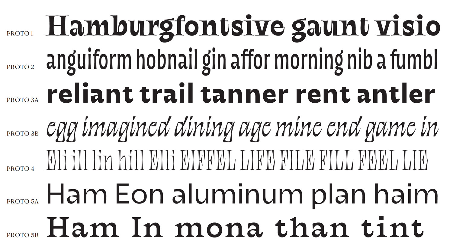
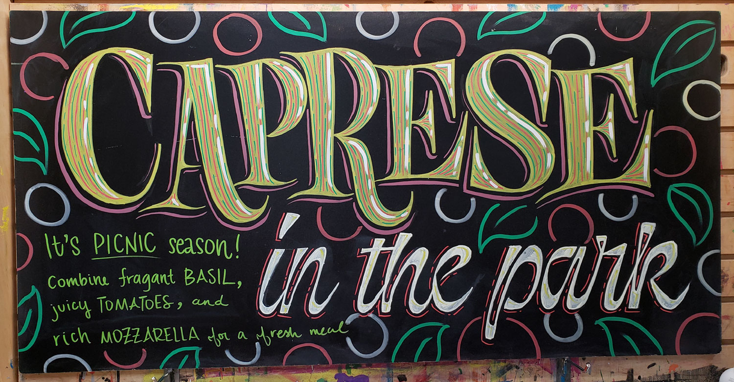
Prototypes from term 2. A lot of the things I try to digitize end up having this playful friendliness to them, along the lines of my Trader Joe’s lettering, and part of the struggle was challenging myself to get away from that and figure out what moves to make to have things not feel mean, but more ??? Modern and clean isn’t what I’m interested in contributing either. A diffuse personality, elegance, edge, unfamiliarity I guess. That maybe sounds annoyingly pretentious.
I ended term 2 with this family plan.
the atmosphere I’m envisioning
I reread something I had written and can’t remember where I wrote it but it was something along the lines of:
the roots are visible but it’s going elsewhere
not in a futuristic, speculative sense, but one based in reality, an implicit momentum and direction reflecting the cumulative current
the last two are from this term; I included the third as a reminder to make a chili pepper emoji. If there are any two symbols I’m connected to, they’re 😎 and Thai chili peppers.
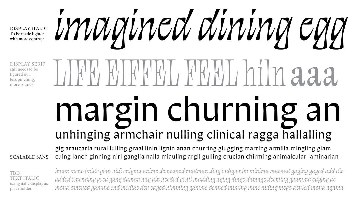
where I’m at now
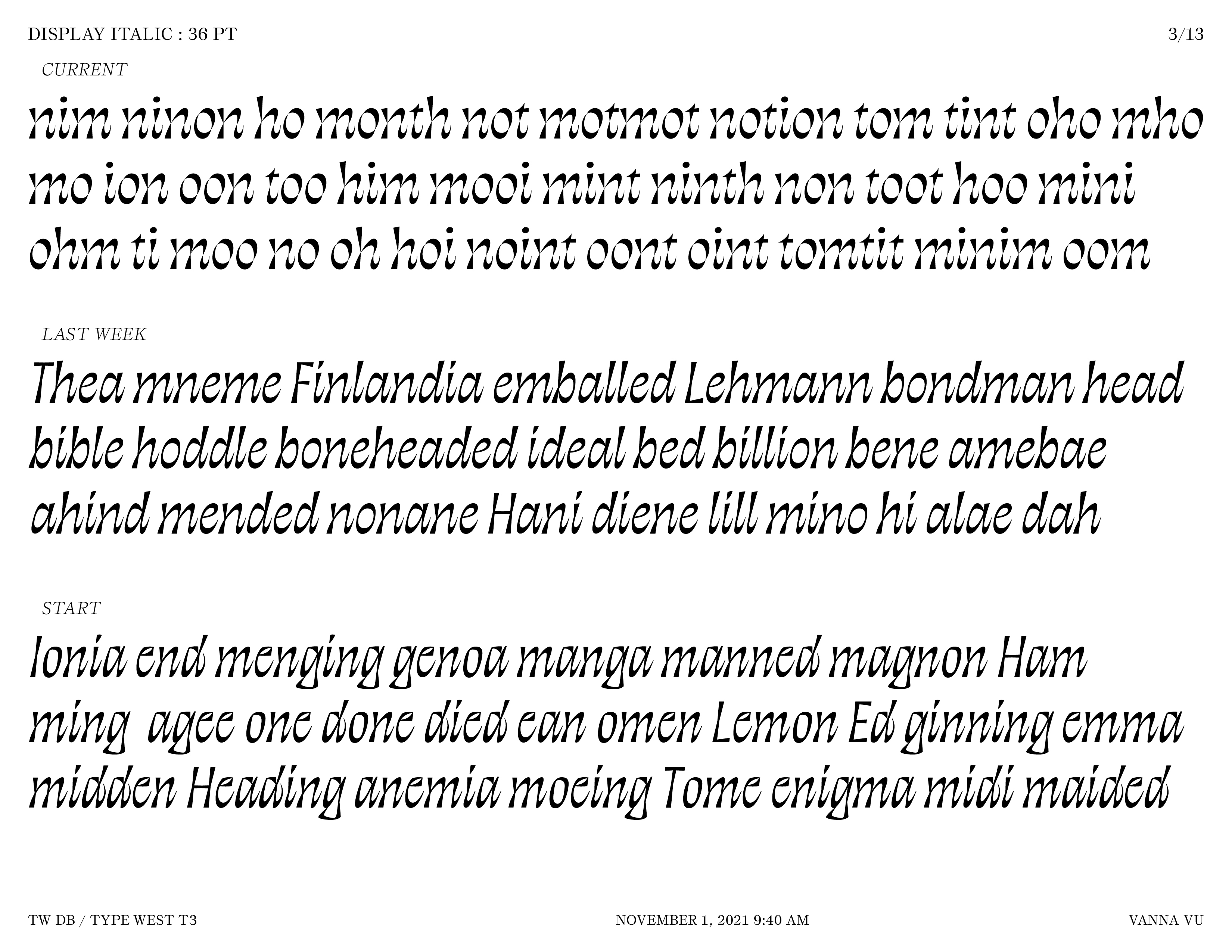
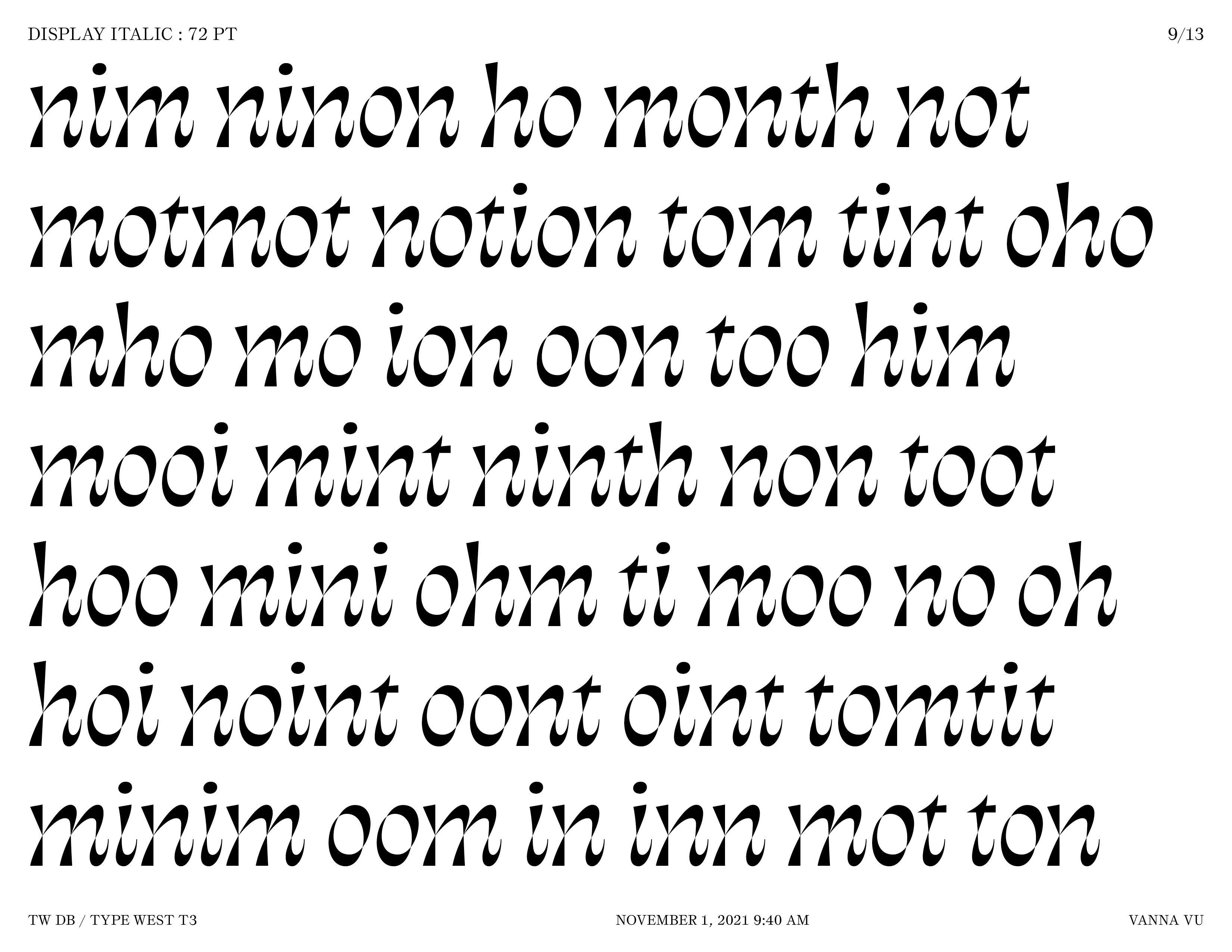
I am forcing myself to commit to this italic now. The idea of this italic is overlapping an upright skeleton with an angled one. I have been interested in inbetweenness. Alternatively this italic idea reflects my indecision — pro synthesizer over here.
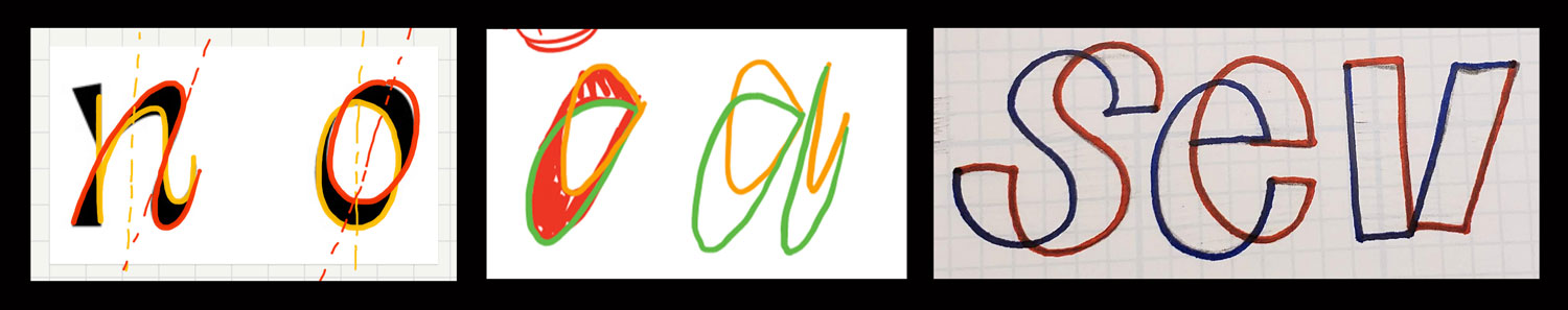
In the first image, I finally figured out a sensible method for drawing this thing. The middle drawing is from one of the instructors, James, who in an earlier critique was trying to help me figure out how to draw the original italic and find the logic in the pen I invented. He learned this method of drawing to figure out where the thins should go from the Dutch stonecarver Françoise Berserik. The last drawing was a sketch I did in 2018 and liked, but never quite figured out what to do with it.
maybe I should go for this reaction
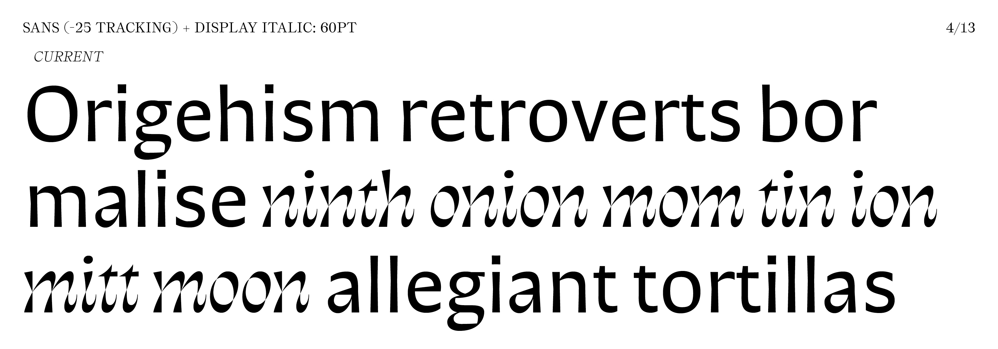
The sans came from Proto 5A, which felt too slick. I applied the pinching from the original italic to the sans and liked the feeling better. But after pairing it with the new italic, it reminded me of how I’ve seen Minérale and Infini paired. It was feeling like a lesser version of Inifini, but I knew how I got where I got, so I tried to stay committed to the sans and not rethink another style. But then in critique, one of the instructors Graham also saw correlations to Infini. The pinching was also artificially applied to the sans form and not inherent to it or tied to any real logic or tool. So its time to rethink the sans, which can be tricky since it can seem generic, though I was really liking how well it was working at small sizes. The original plan was to also have a serif to create a nice trio of italic, sans, and serif, but I didn’t get to a good point with one, plus it’s a lot to attempt to do an unconventional collection of 3 different styles in a couple months. I mention this because I might return to my geometric serif idea and create some inbetweener of a seriffed sans. The Gerstner Original font, an in-between or alternative to sans and serifs, still takes up memory in my brain.
—
Agh, I really should have written this sooner as my concept is clearer now, but I don’t have time to fully execute it. Still don’t know how to talk about it all succinctly though.